Author: Jermyn

  • Laying out the mirror panels

    Laying out the mirror panels

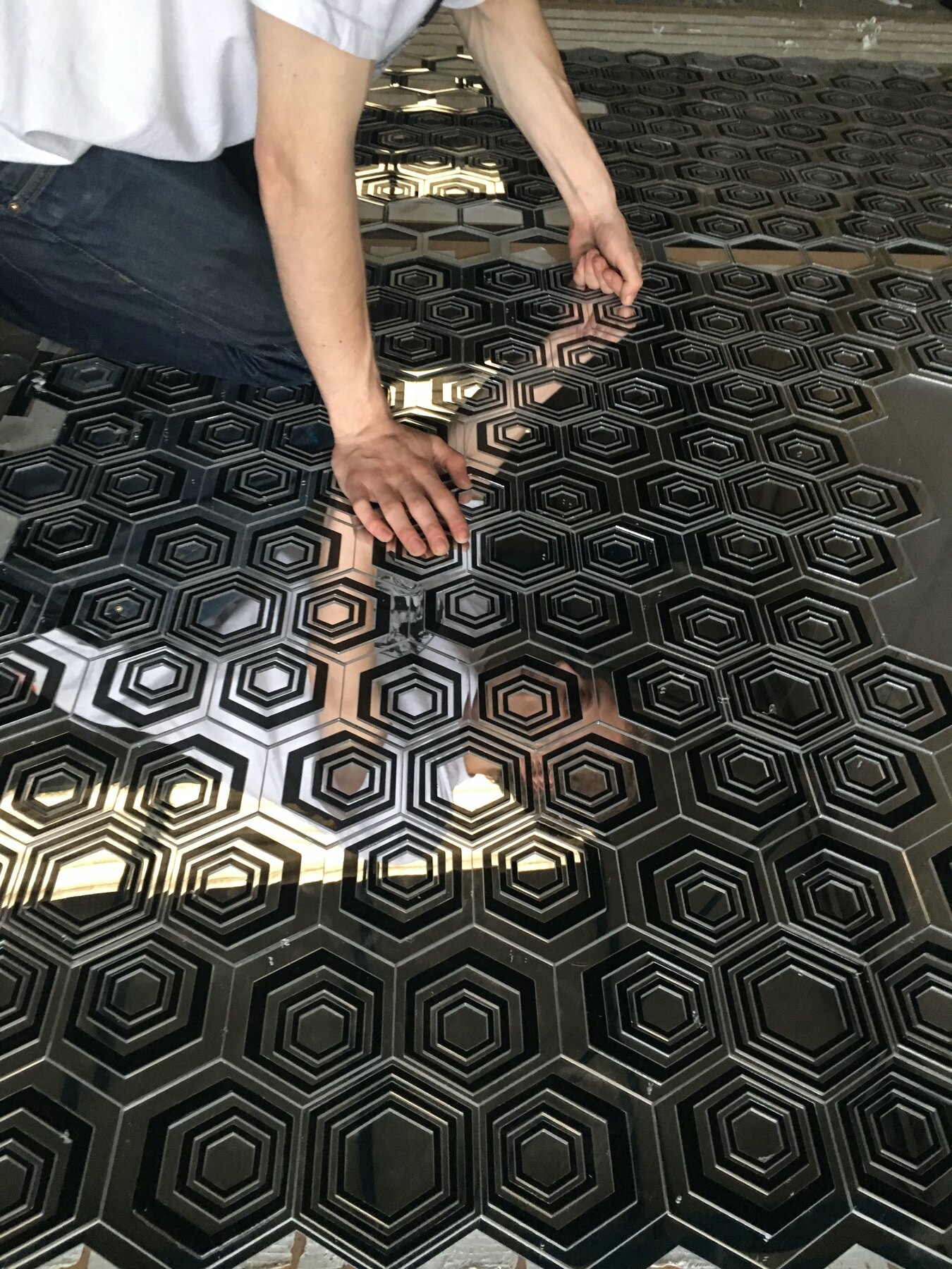
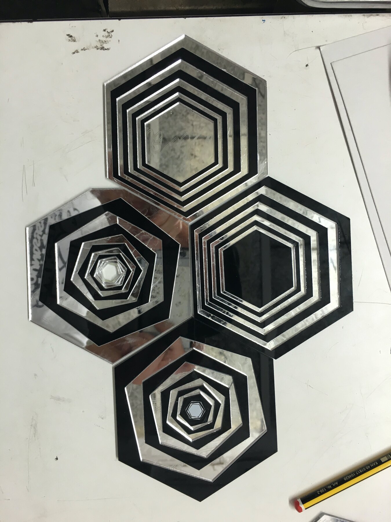
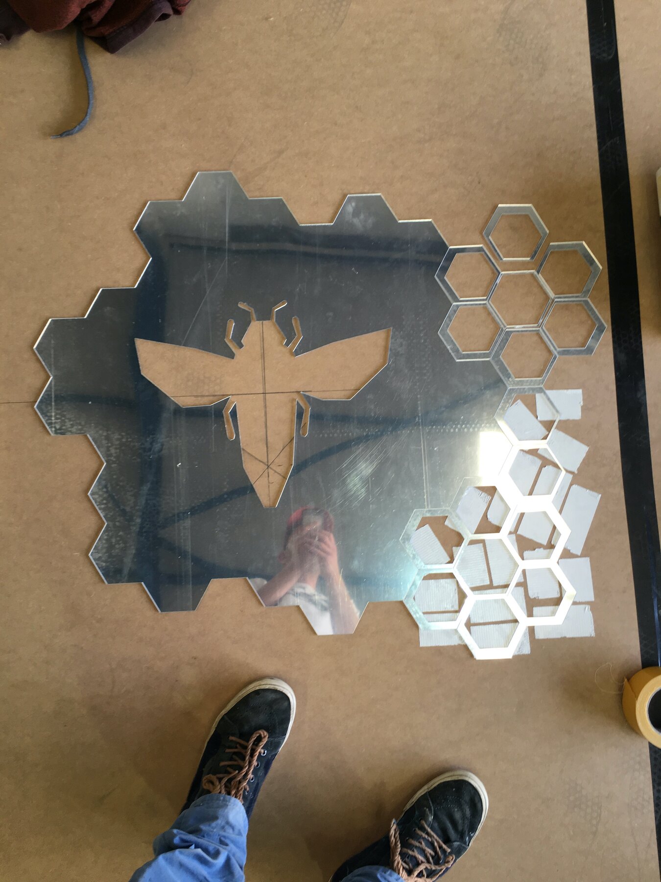
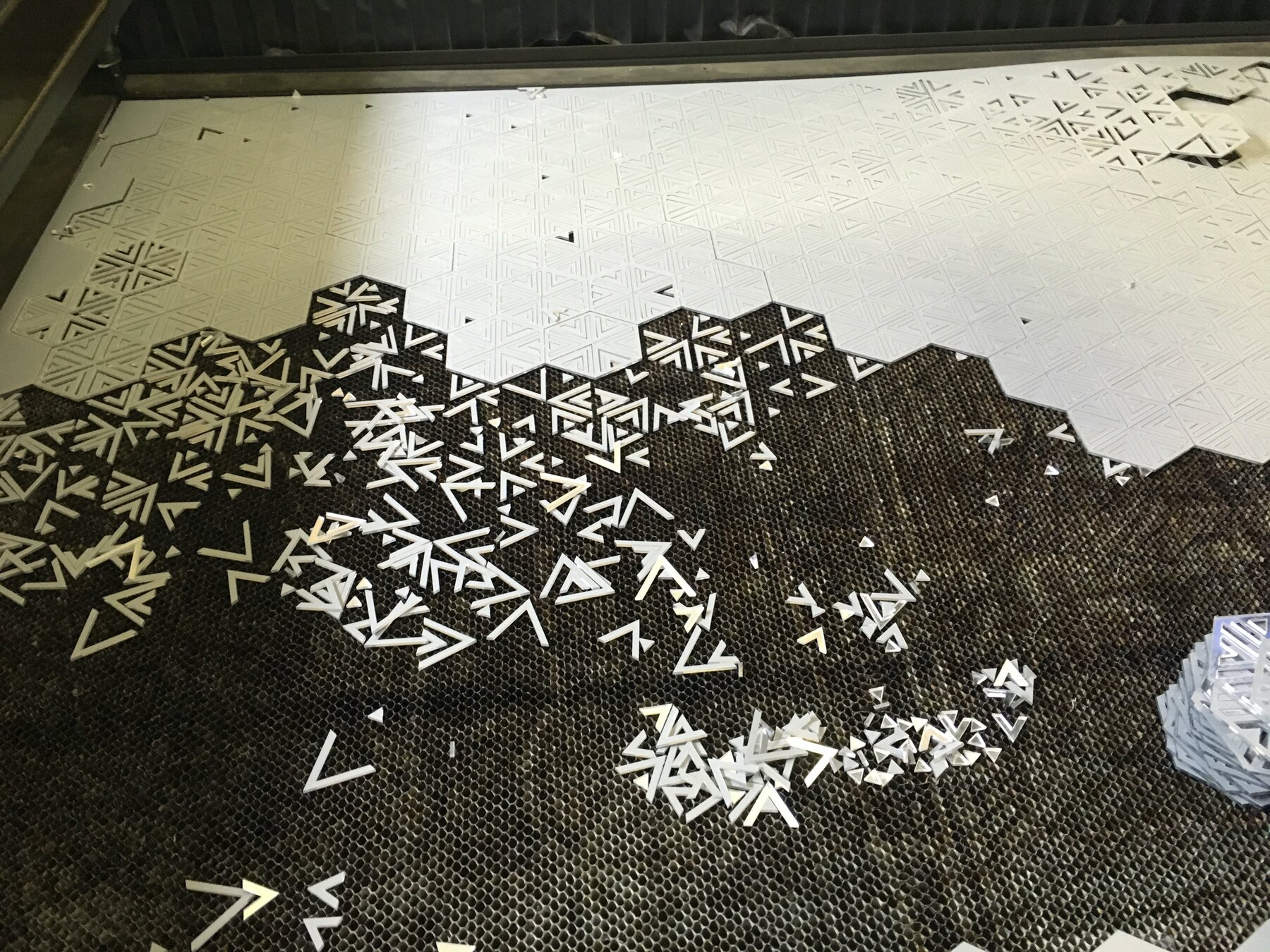
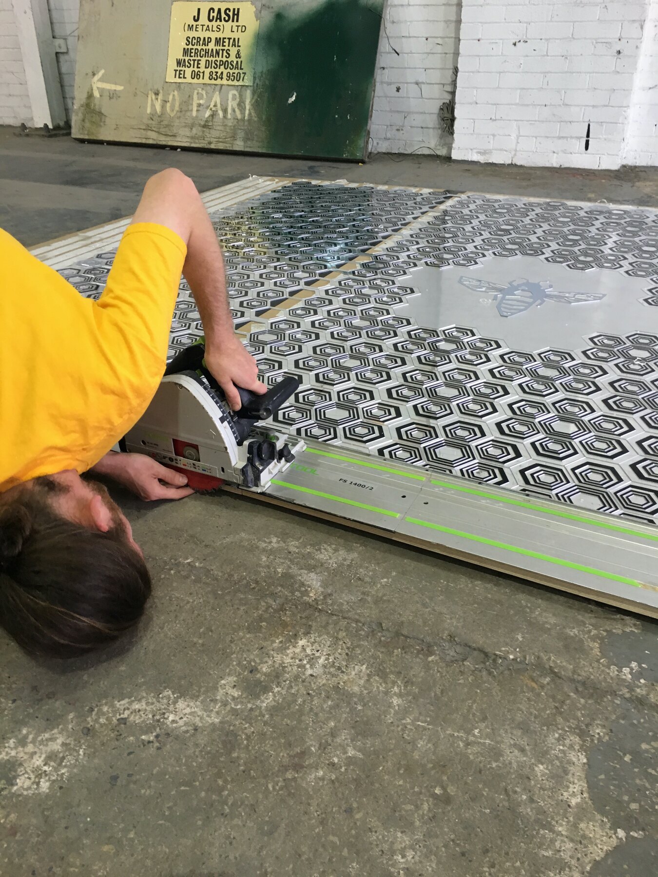
    Six days on a big empty floor, laying out the mirror panels for the Palace. Hexagons in black and mirror, tessellated tight, then breaking apart at the edges so the pattern seems to dissolve.

    At the centre of one panel sits a worker bee in mirrored perspex, ringed by honeycomb. A Manchester bee for a Manchester building.

    Track saw, spacing battens, an extra pair of hands, and thousands of tiny offcuts swept up at the end of each day. The panels go in this weekend.
    Laying out the mirror panels, Moderate Studio journal, 2016
    Laying out the mirror panels, Moderate Studio journal, 2016
    Laying out the mirror panels, Moderate Studio journal, 2016

    Part of The Palace Hotel Commission.
  • Off the laser

    Off the laser

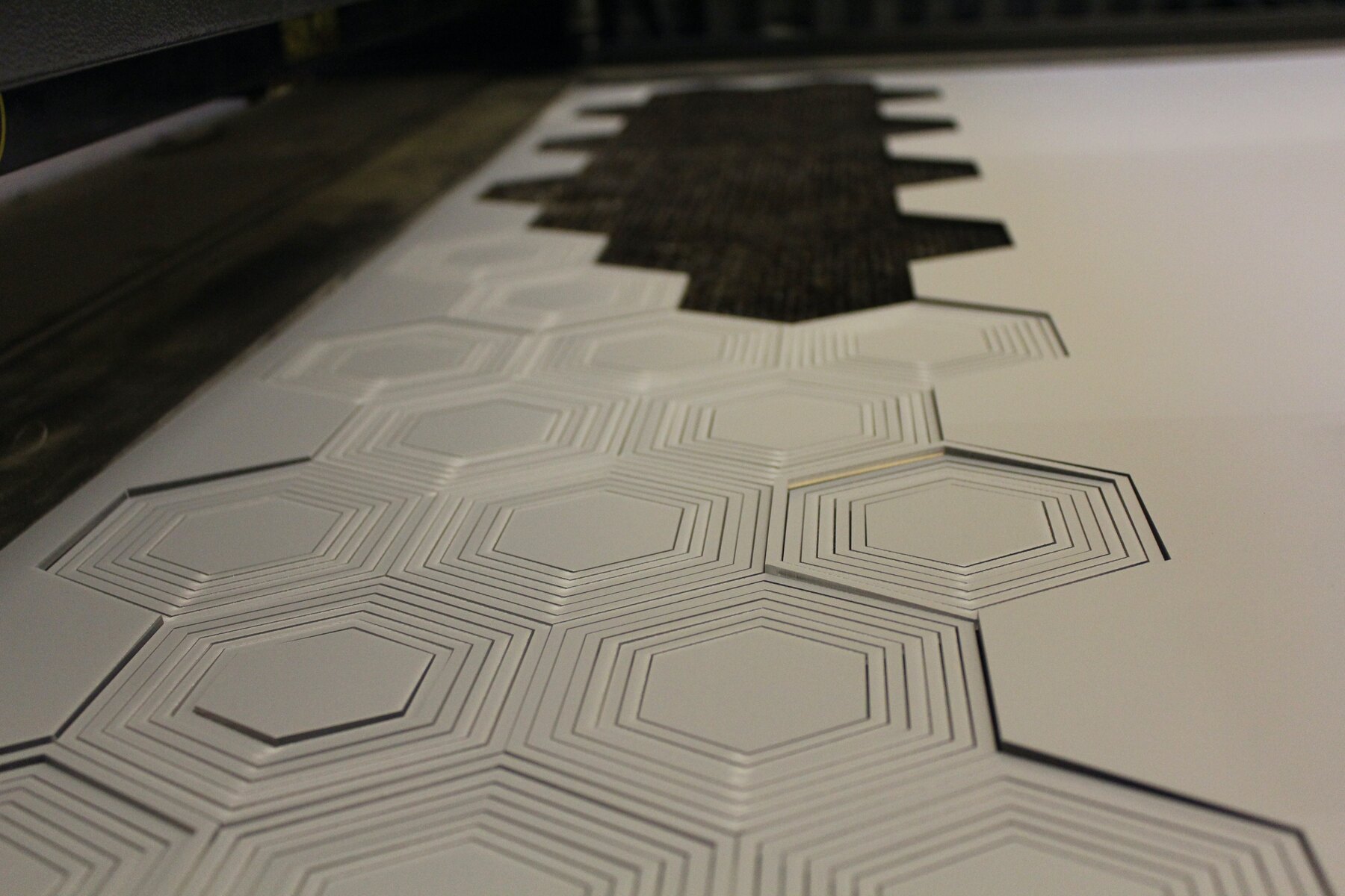
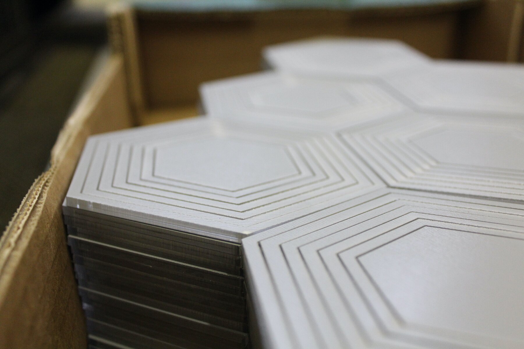
    Boxes of hexagons came off the laser today, each one etched with concentric lines, packed in cardboard trays like bathroom tiles. Hundreds of them, identical until you look closely.

    On the cutter bed they look industrial. In the hand they feel like counters from an oversized board game. Repetition is most of this job: the same shape again and again until there are enough to cover a room-sized object.

    Next comes assembly, then the interesting part, seeing what mirror does under that dome.

    Off the laser, Moderate Studio journal, 2016

    Part of The Palace Hotel Commission.
  • The show travels to Bristol

    The show travels to Bristol

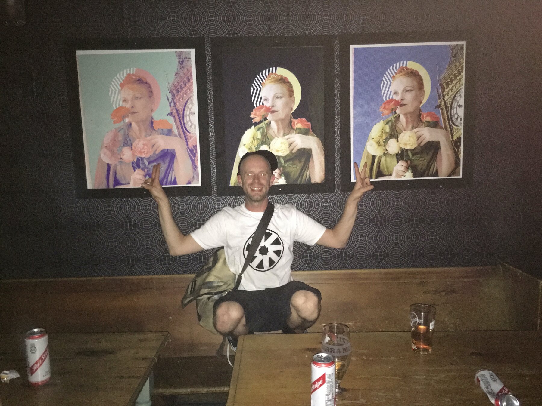
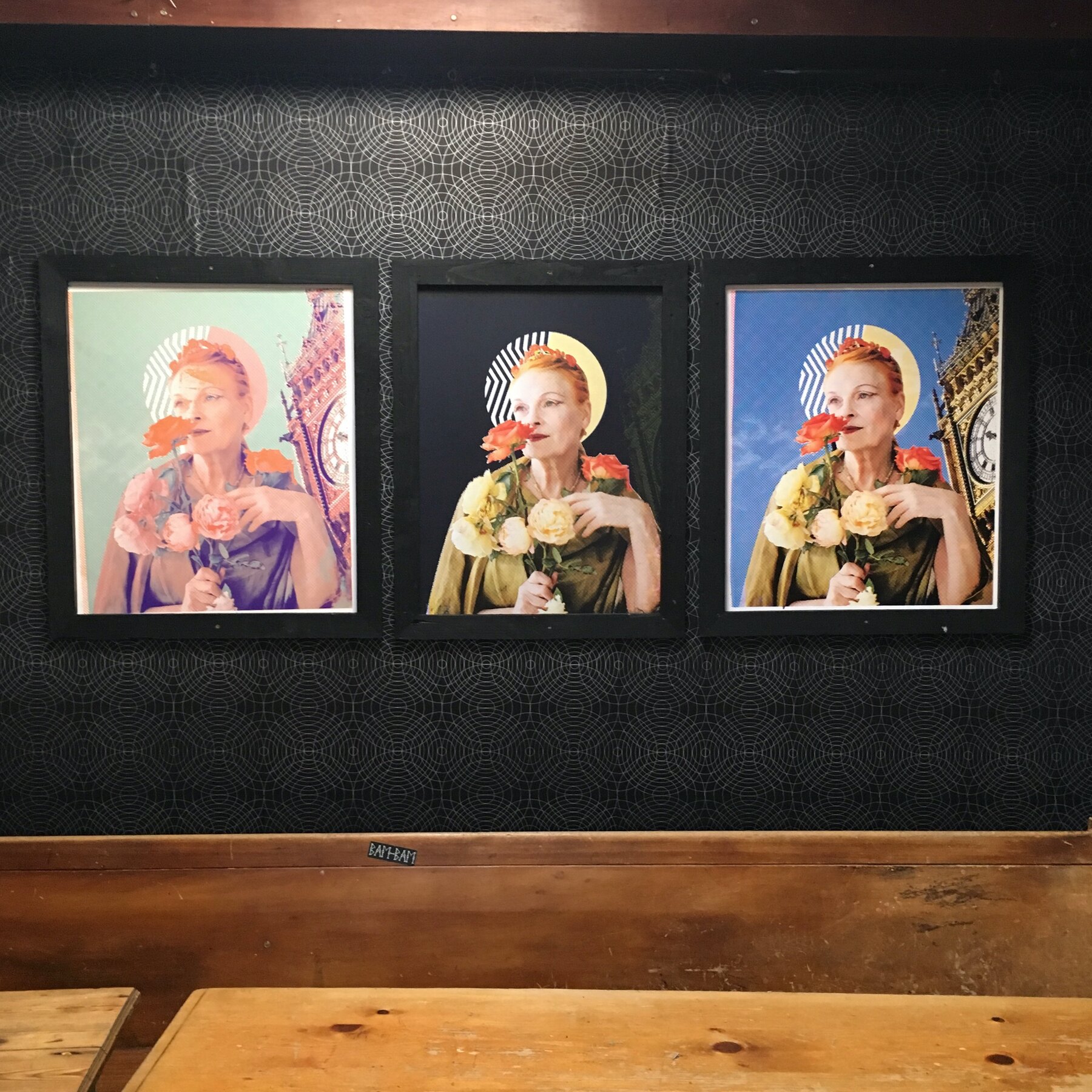
    In August the show travelled south to the Plough in Easton, Bristol. The three prints went back up on a dark wall, a length of the wallpaper installed alongside them, and the night ran the same way it had in Manchester, prints, a DJ, a garden full of people.

    Taking it to another city made it feel less like a one-off Manchester thing and more like something that could pack up and move. Same three prints, same DJ set, a different room and a different crowd finding their own way into it.

    The show travels to Bristol, Moderate Studio journal, 2016
    The show travels to Bristol, Moderate Studio journal, 2016

    Part of the Vivienne Westwood case study.

  • Printing the Refuge wallpaper

    Printing the Refuge wallpaper

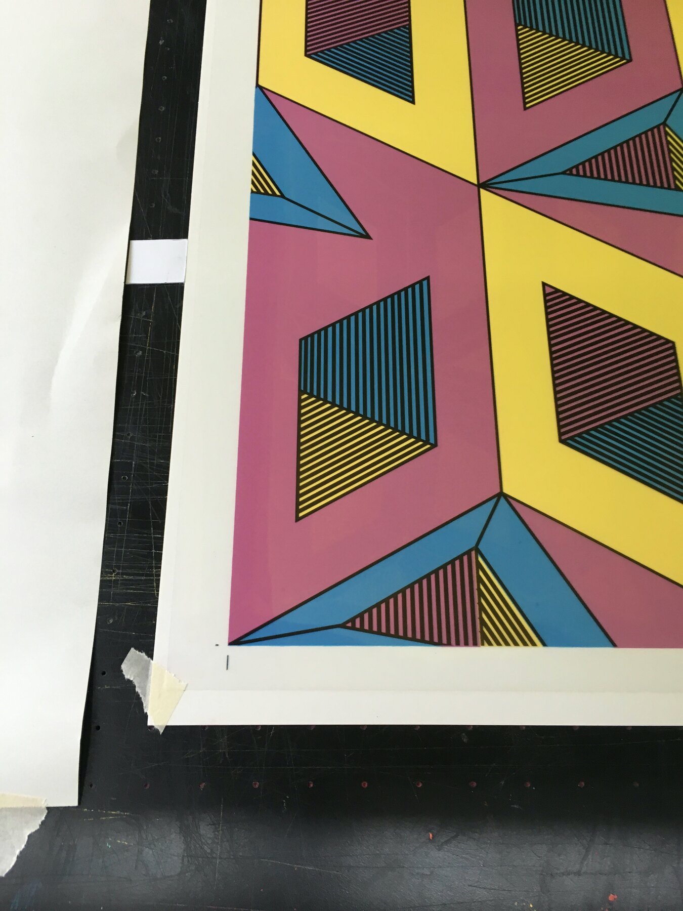
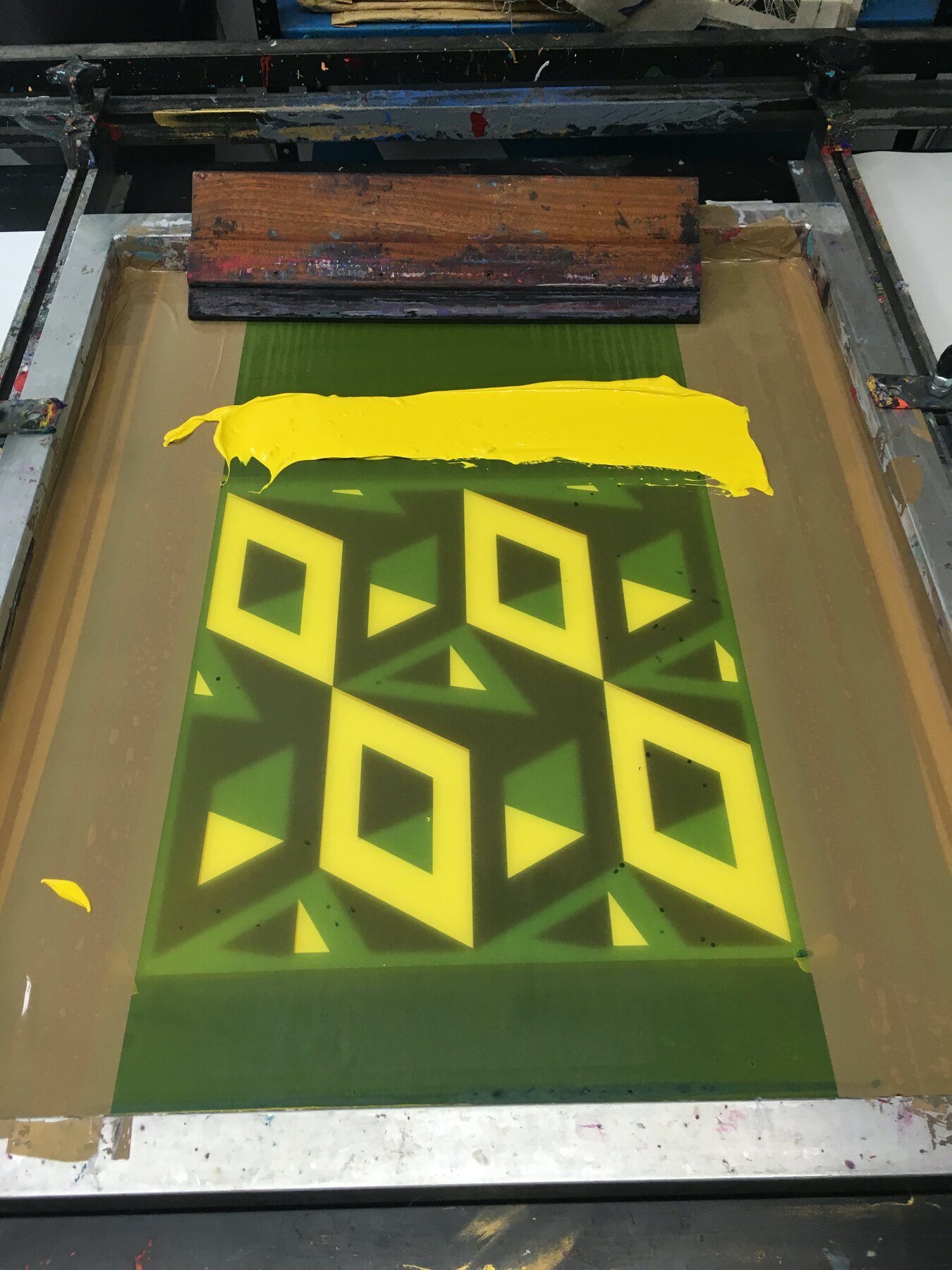
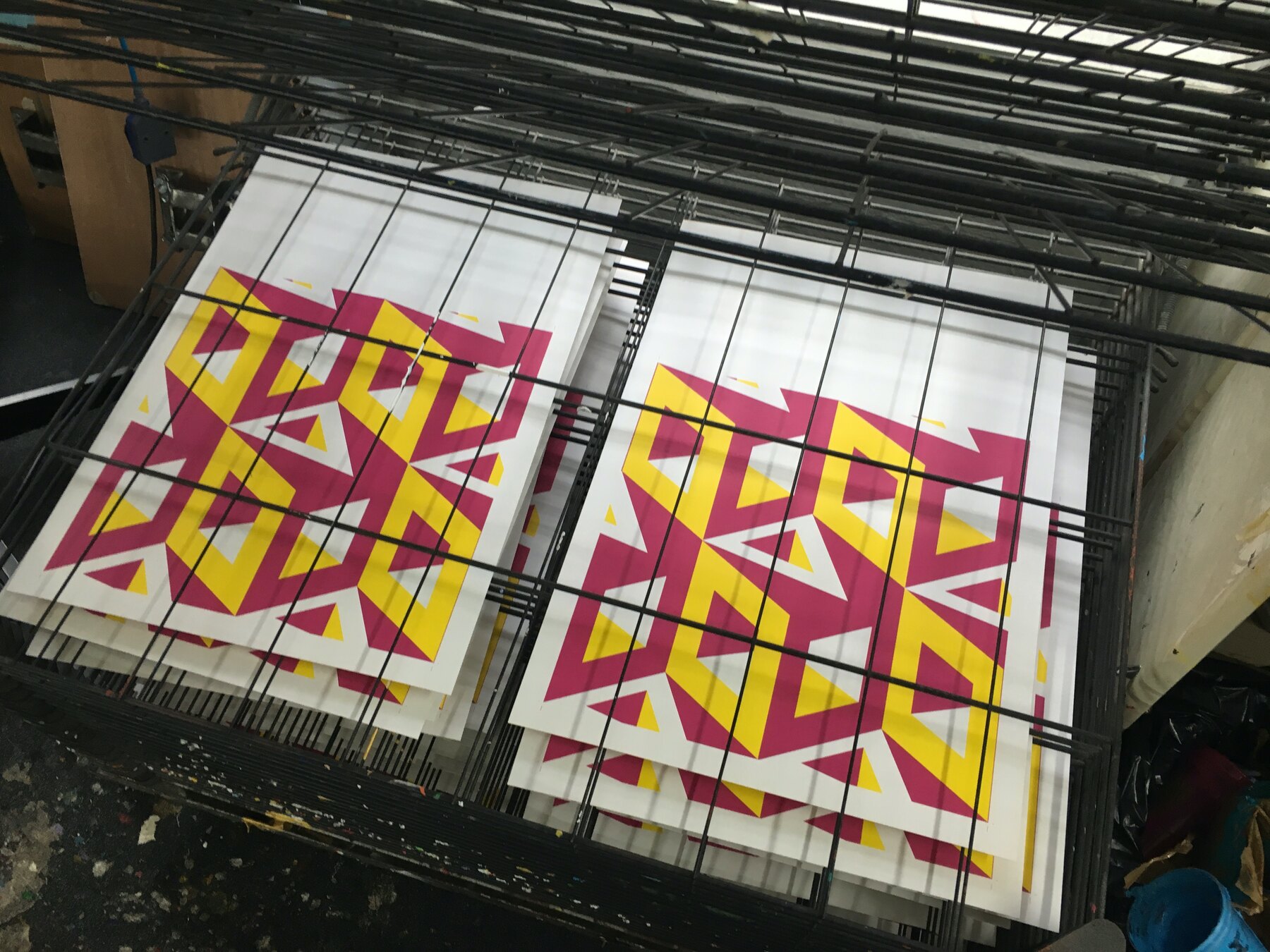
    Two days at the press printing the Refuge pattern at one69A. The isometric diamond design, cut into layers, pulled in colourway after colourway: yellow on green, magenta on cream, orange on white, and a full multi-colour version with fine linework over the top.

    Squeegee, lift, rack. Squeegee, lift, rack. The drying racks filled faster than I could clear them and the studio floor became a sorting yard.

    Some of these sheets are for the bar. The rest have another job coming that the city does not know about yet.

    Printing the Refuge wallpaper, Moderate Studio journal, 2016
    Printing the Refuge wallpaper, Moderate Studio journal, 2016

    Part of The Palace Is a Refuge.

  • More posters, and printing on glass

    More posters, and printing on glass

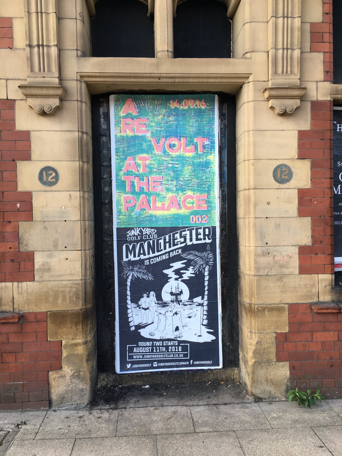
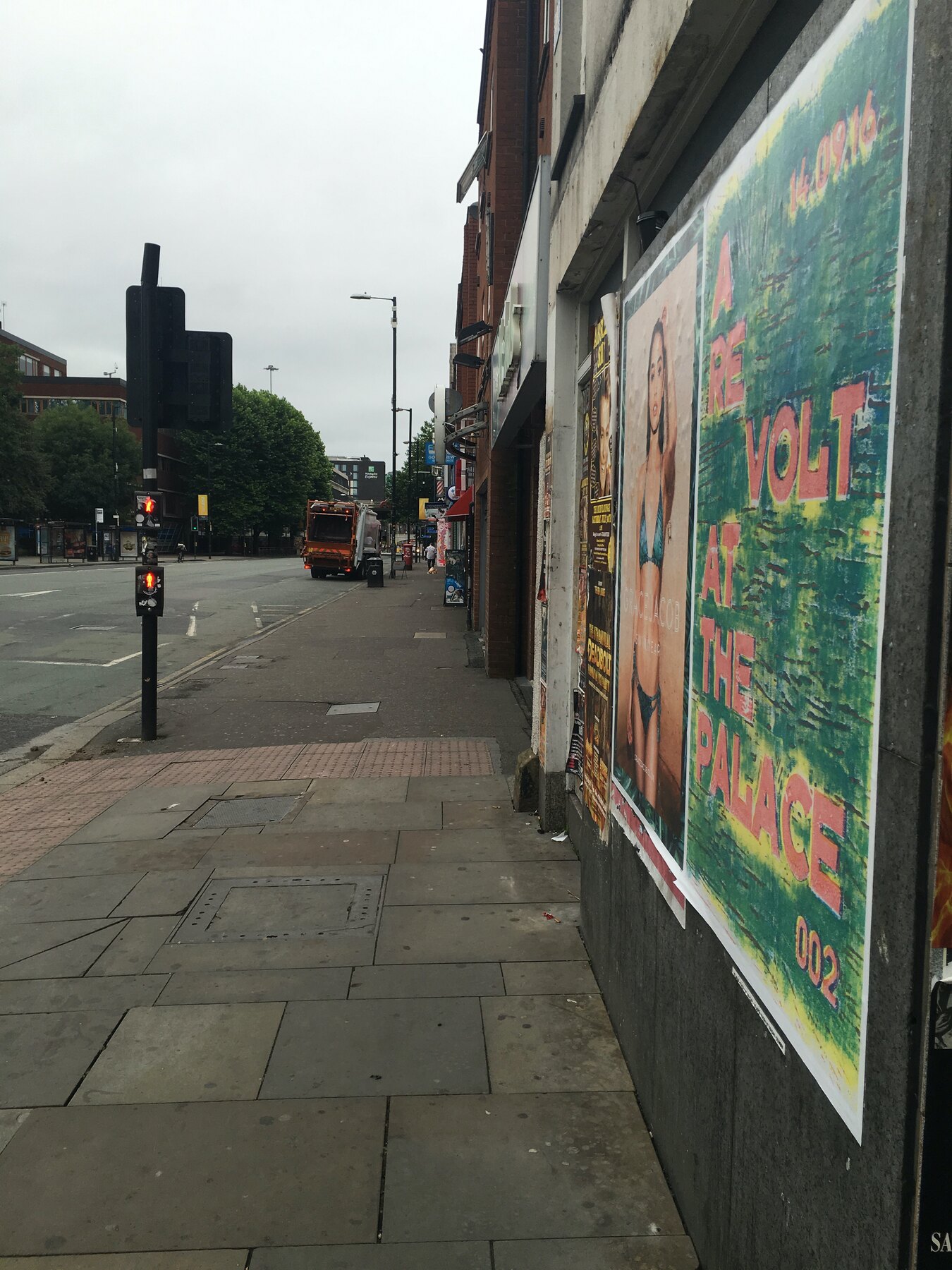
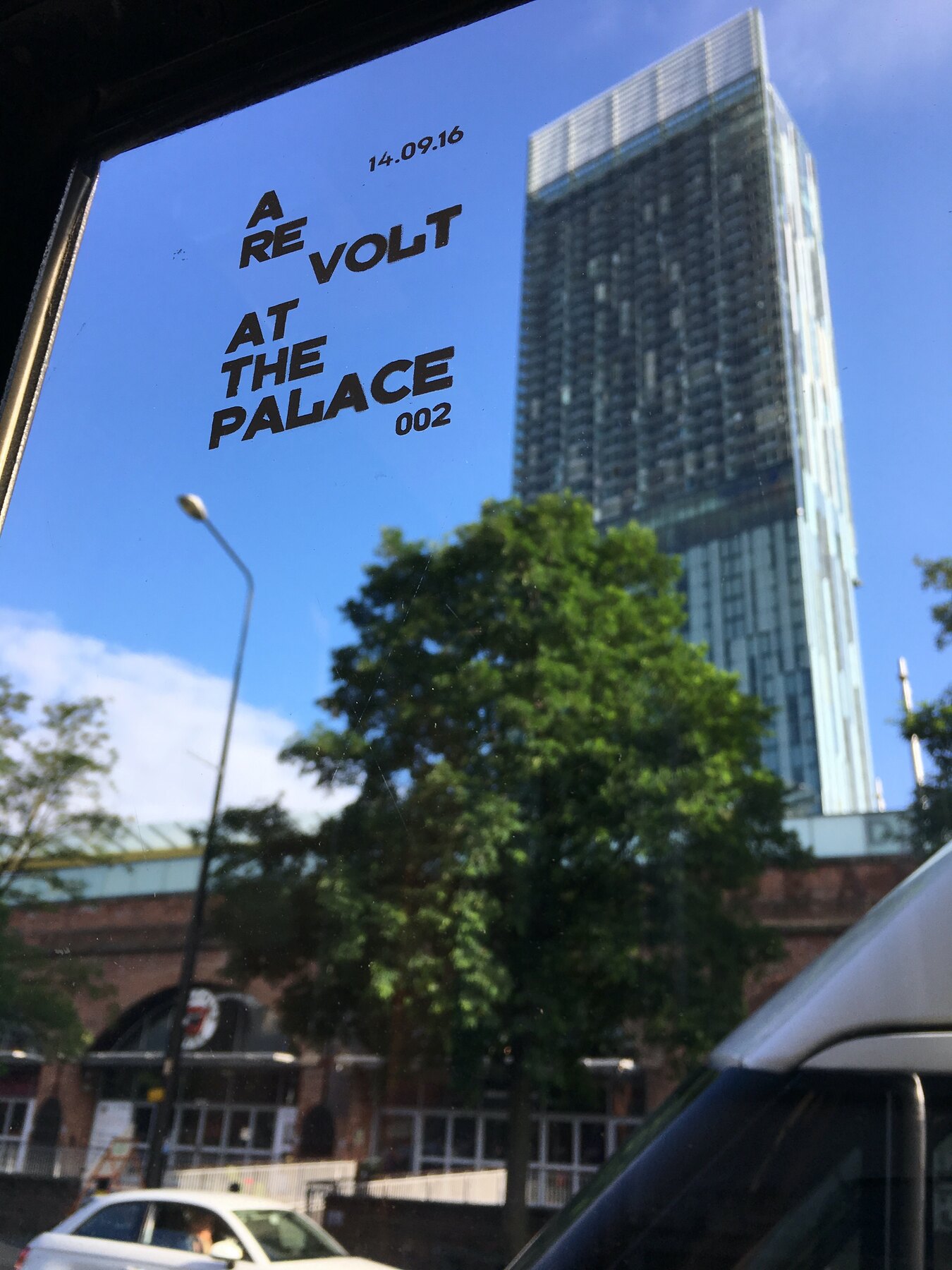
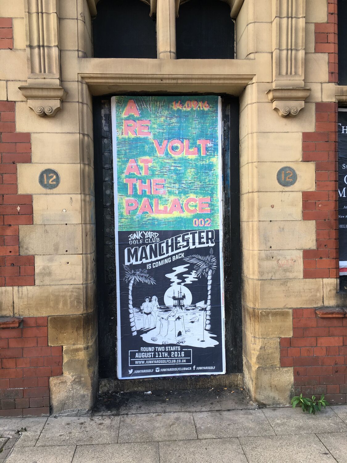
    The 002 posters keep spreading: doorways, hoardings, the boards outside Junkyard Golf. And a new move, printing straight onto the streets. I built a mobile screen printing kit into an old 7 inch record box, a screen, ink and a squeegee in a case made for singles, and I have been tagging the city with the statements in white ink.

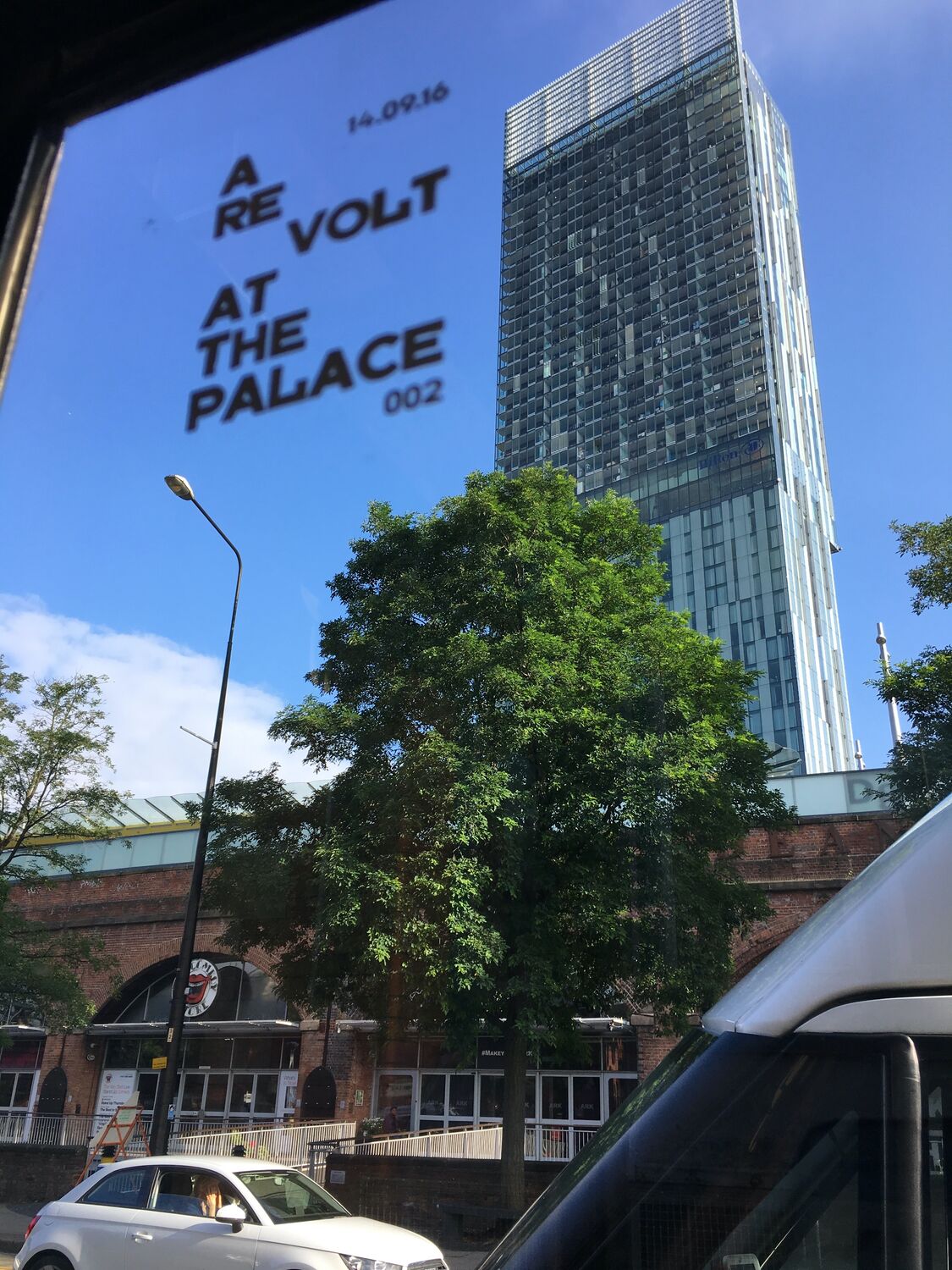
    A RE VOLT AT THE PALACE floating over Beetham Tower through a window is my favourite accidental composition of the campaign so far.

    Paste, print, move on. The date is six weeks out and the question is starting to circulate: a revolt at which palace.

    More posters, and printing on glass, Moderate Studio journal, 2016
    More posters, and printing on glass, Moderate Studio journal, 2016

    Part of The Palace Is a Refuge.

  • A Revolt at the Palace

    A Revolt at the Palace

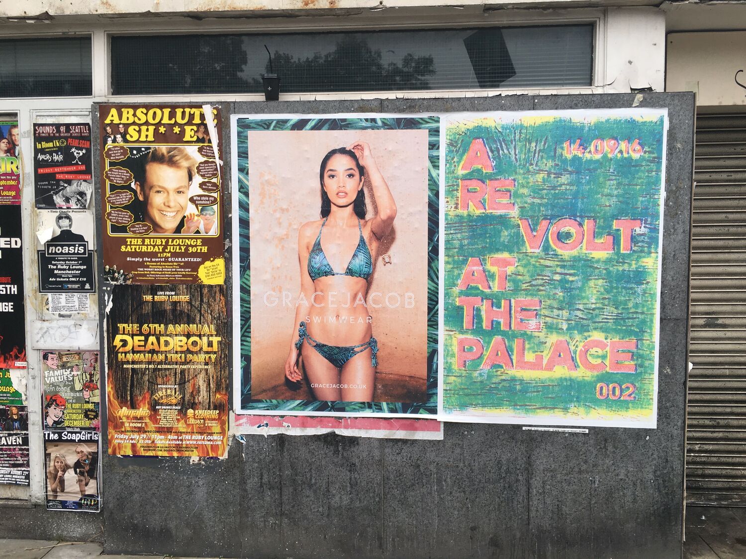
    Work around Manchester under the banner A Revolt at the Palace, a green-and-pink glitched design carrying the number 002 and the date 14.09.16. Some of it went up as posters, pasted where posters go, on boarded windows and over the top of other people’s ads. Some of it I printed straight onto the street itself, onto the surfaces of the city, so the work was in the fabric of the place rather than stuck on top of it.

    The street is a decent gallery. A poster on a hoarding, or a print pulled directly onto the ground, gets seen by more people in a day than a print in a show gets in a month, and it has to work fast, from across a road, out of the corner of an eye. Getting the work out onto the city, uninvited, is a habit I have never really shaken.

    A Revolt at the Palace, Moderate Studio journal, 2016
    A Revolt at the Palace, Moderate Studio journal, 2016

    See also The Palace Is a Refuge.

  • Come as you are

    Come as you are

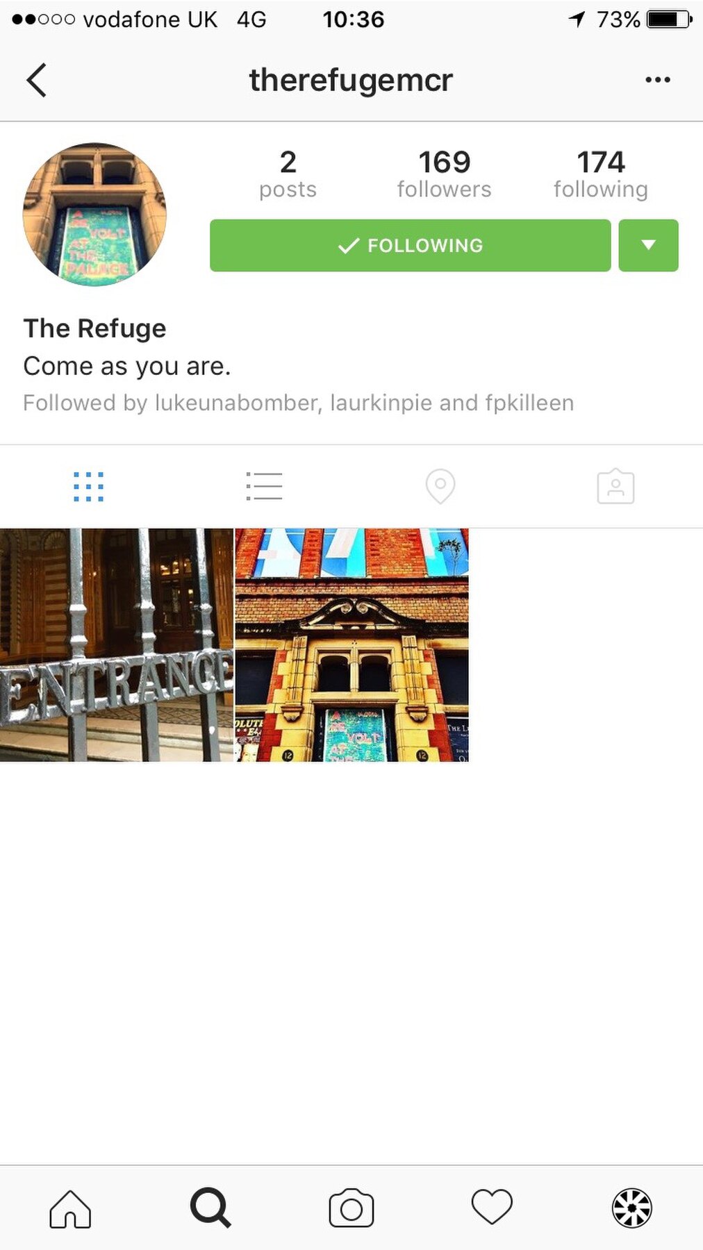
    The Refuge went public this week. The Instagram bio reads Come as you are, which says it better than any press release would.

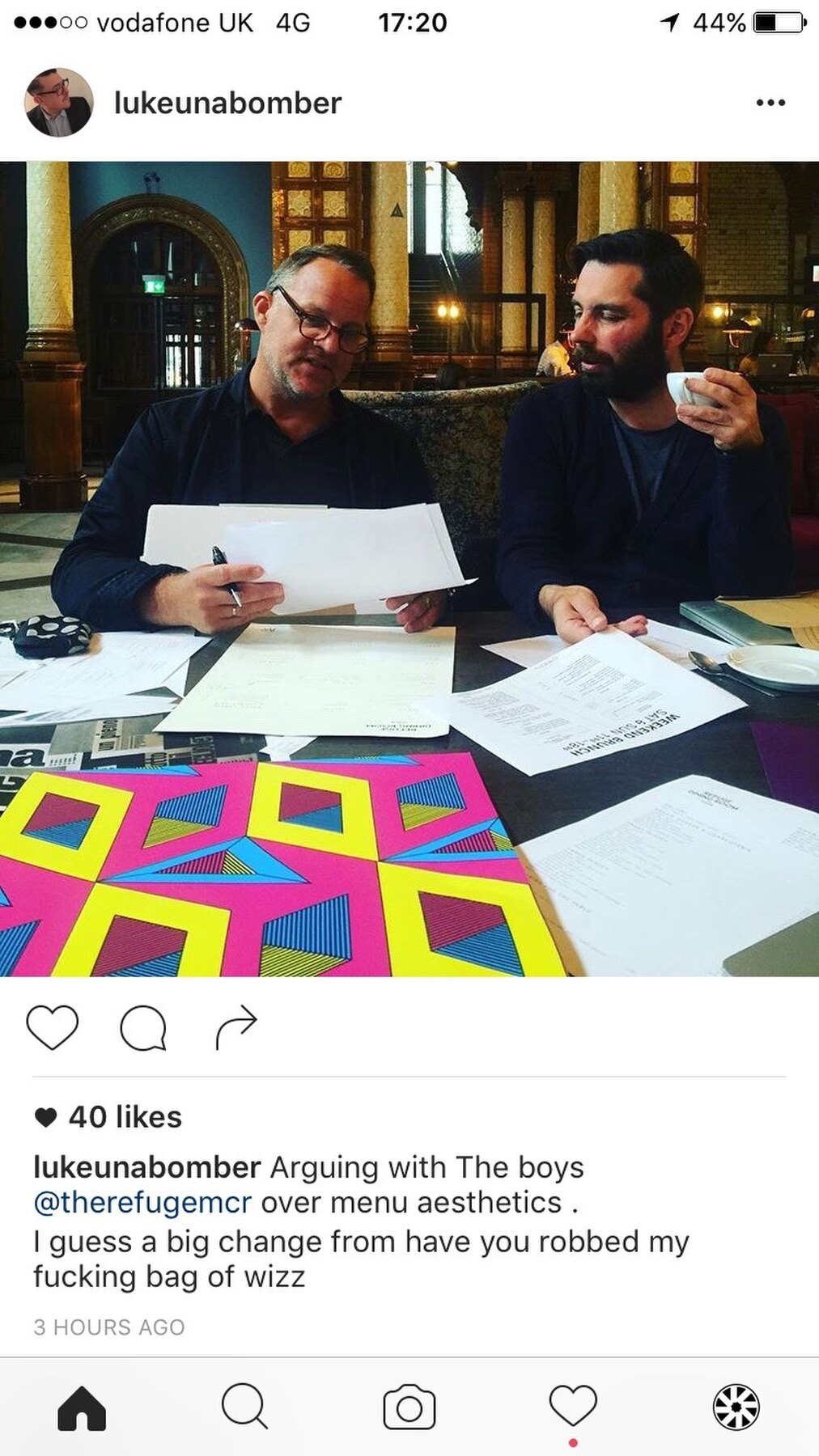
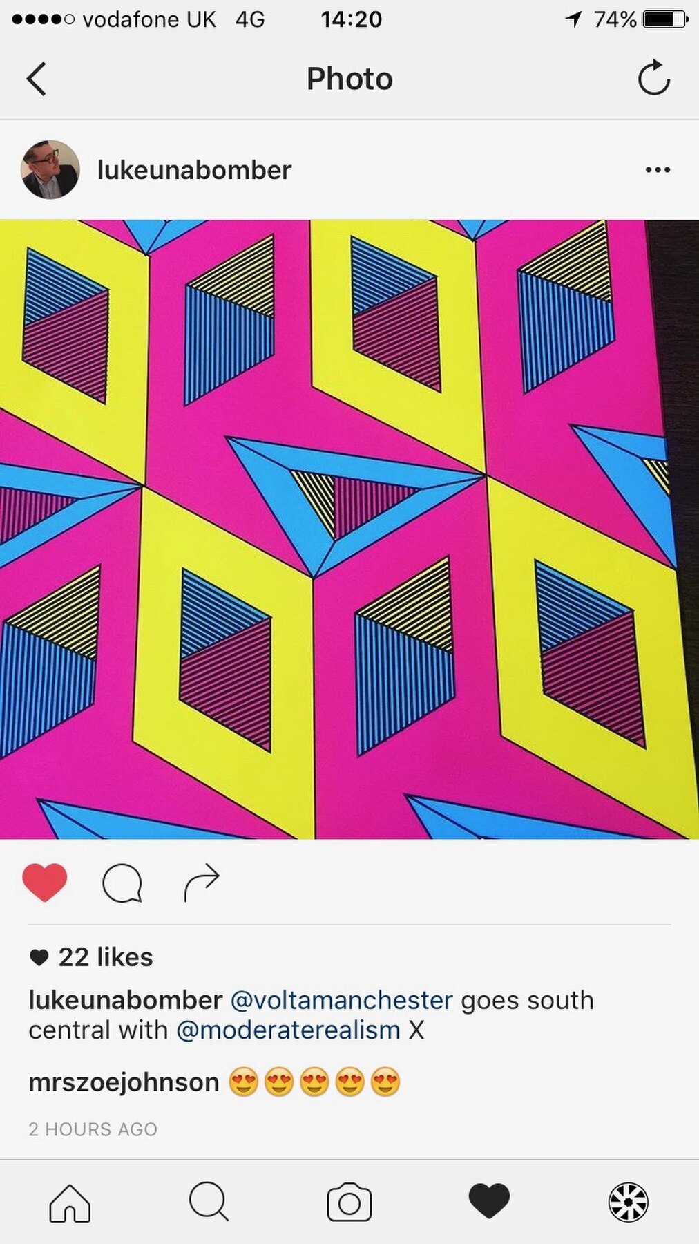
    My prints are already in the feed. Justin Unabomber at a table covered in the diamond patterns, arguing over menu aesthetics according to the caption. Another post sends one of the designs out into the world with a line of thanks.

    Strange and good, watching work leave the studio and turn up in someone else's story of the same project.

    Come as you are, Moderate Studio journal, 2016
    Come as you are, Moderate Studio journal, 2016

    Part of The Palace Is a Refuge.

  • Colour tests inside the Refuge

    Colour tests inside the Refuge

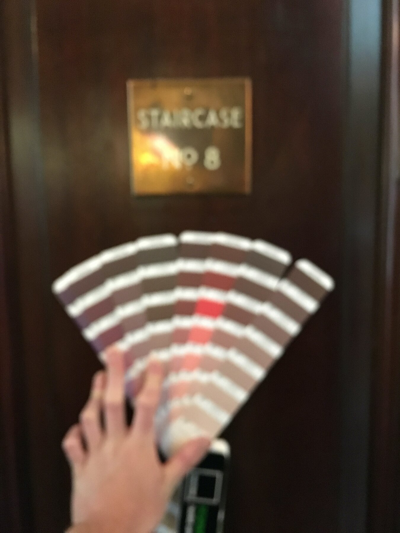
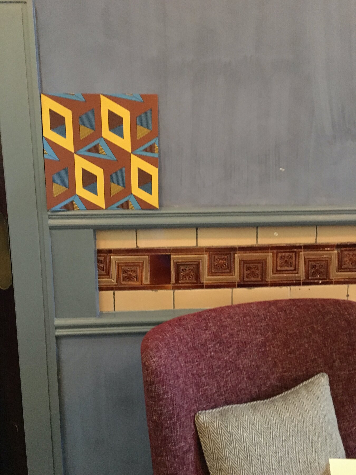
    Inside the bar with the Pantone books. Fans held against the brass Staircase No 8 plaque, the glazed brown dado tiles, the grey plaster. Test prints of the diamond pattern taped up next to the banquettes to see how they read across the room.

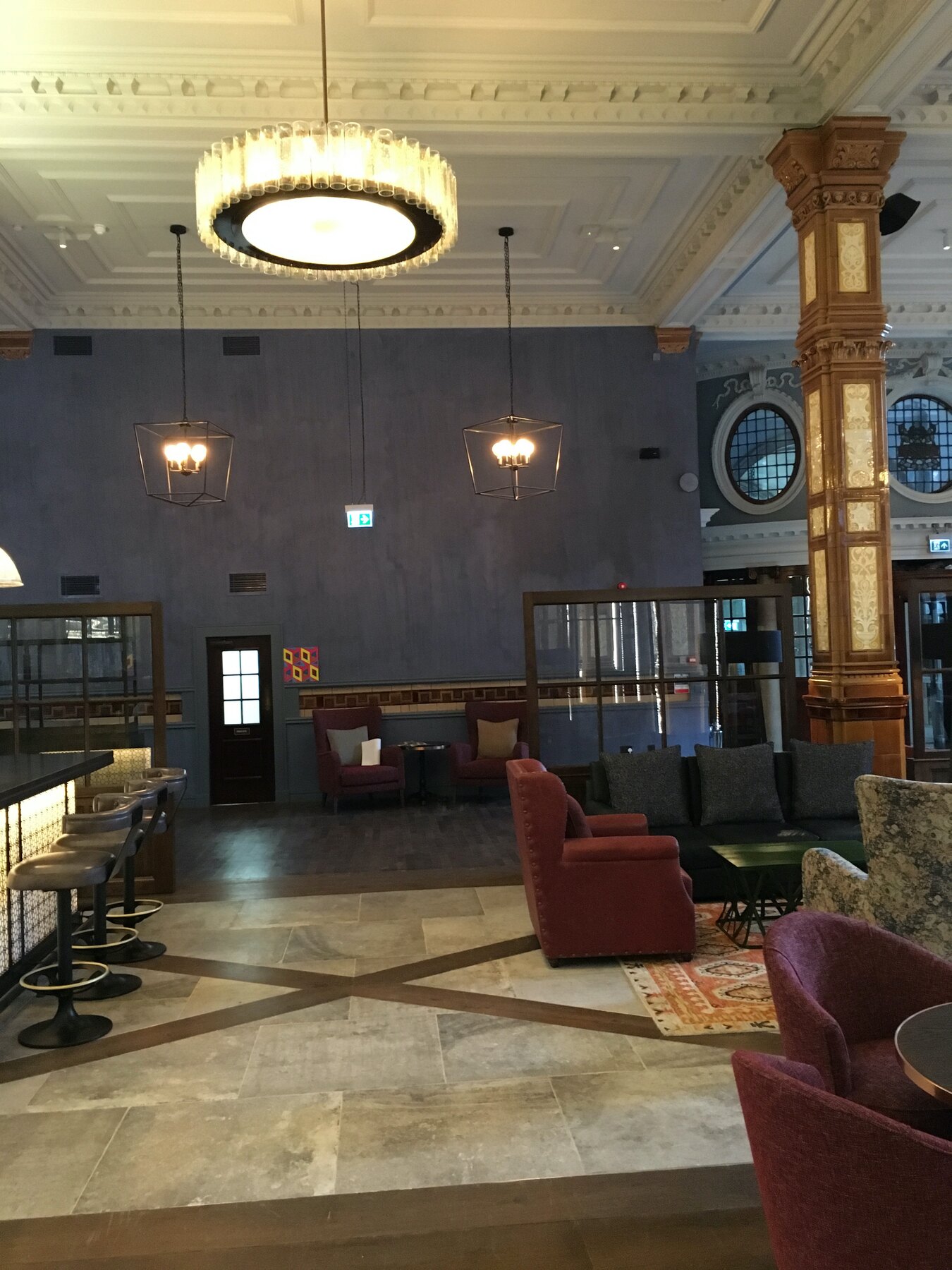
    The interior is nearly there now: chandeliers up, chairs in, that long low light. The wallpaper has to earn its place against all of it.

    Some colours that sang in the studio die in here. The oranges hold.

    Colour tests inside the Refuge, Moderate Studio journal, 2016
    Colour tests inside the Refuge, Moderate Studio journal, 2016

    Part of The Palace Is a Refuge.

  • Circles on black

    Circles on black

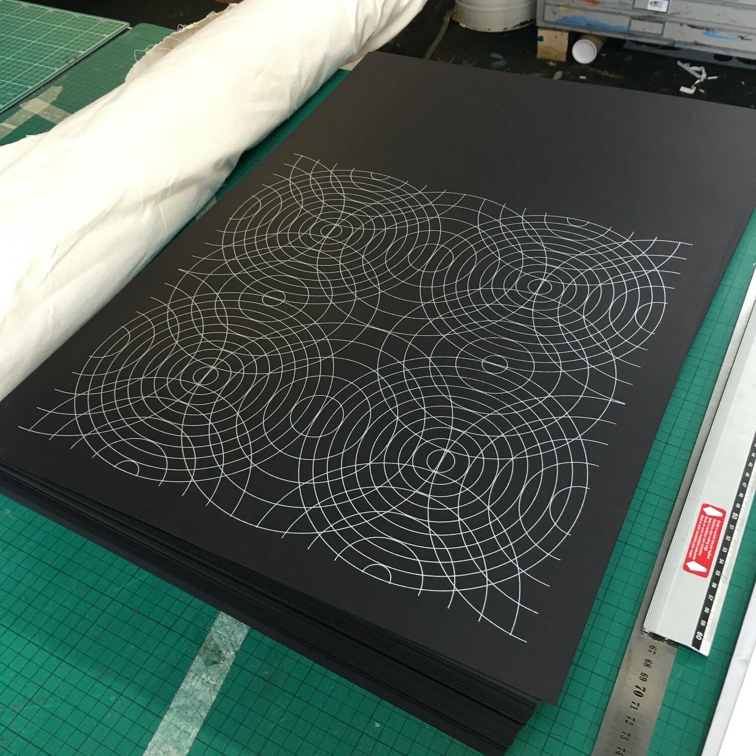
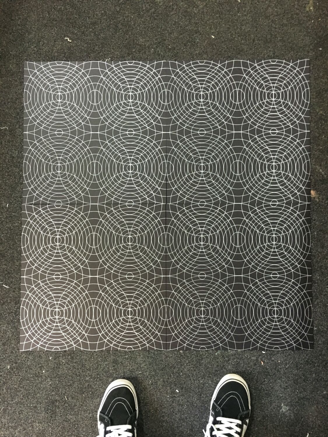
    A wallpaper design of fine white lines on black, overlapping circles and grids building up into a pattern like ripples crossing on dark water. Where the other prints are all solid colour, this one is nearly all empty black, the pattern drawn in thin bright line and left to breathe.

    Printing white line onto black stock cleanly is its own small test, the ink has to sit up on the surface without spreading, and at this fineness there is nowhere to hide a wobble. Hung up, it does the quiet opposite of the primary-colour wallpaper, less a wall of colour than a dark surface with light drawn onto it.

    Circles on black, Moderate Studio journal, 2016

    Part of The Pattern Works.

  • Hexagons, first cuts

    Hexagons, first cuts

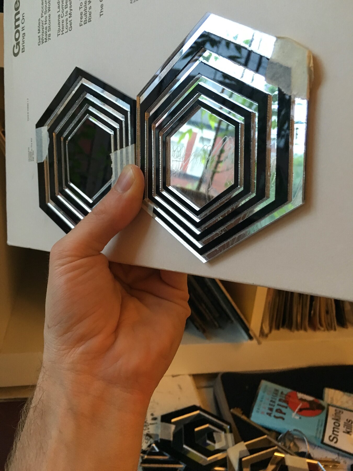
    Tests for the next stage. Layered hexagons cut from mirrored and black perspex, concentric rings stacked into relief, a honeycomb cluster small enough to hold in one hand. A lattice stencil too, which might become something or nothing.

    The painted box was always temporary. Whatever replaces its surface has to work harder in that room, with all that glass and gold above it. Mirror seems right. It borrows the building instead of competing with it.

    Hexagons, first cuts, Moderate Studio journal, 2016

    Part of The Palace Hotel Commission.