Author: Jermyn

  • First posters on the streets

    First posters on the streets

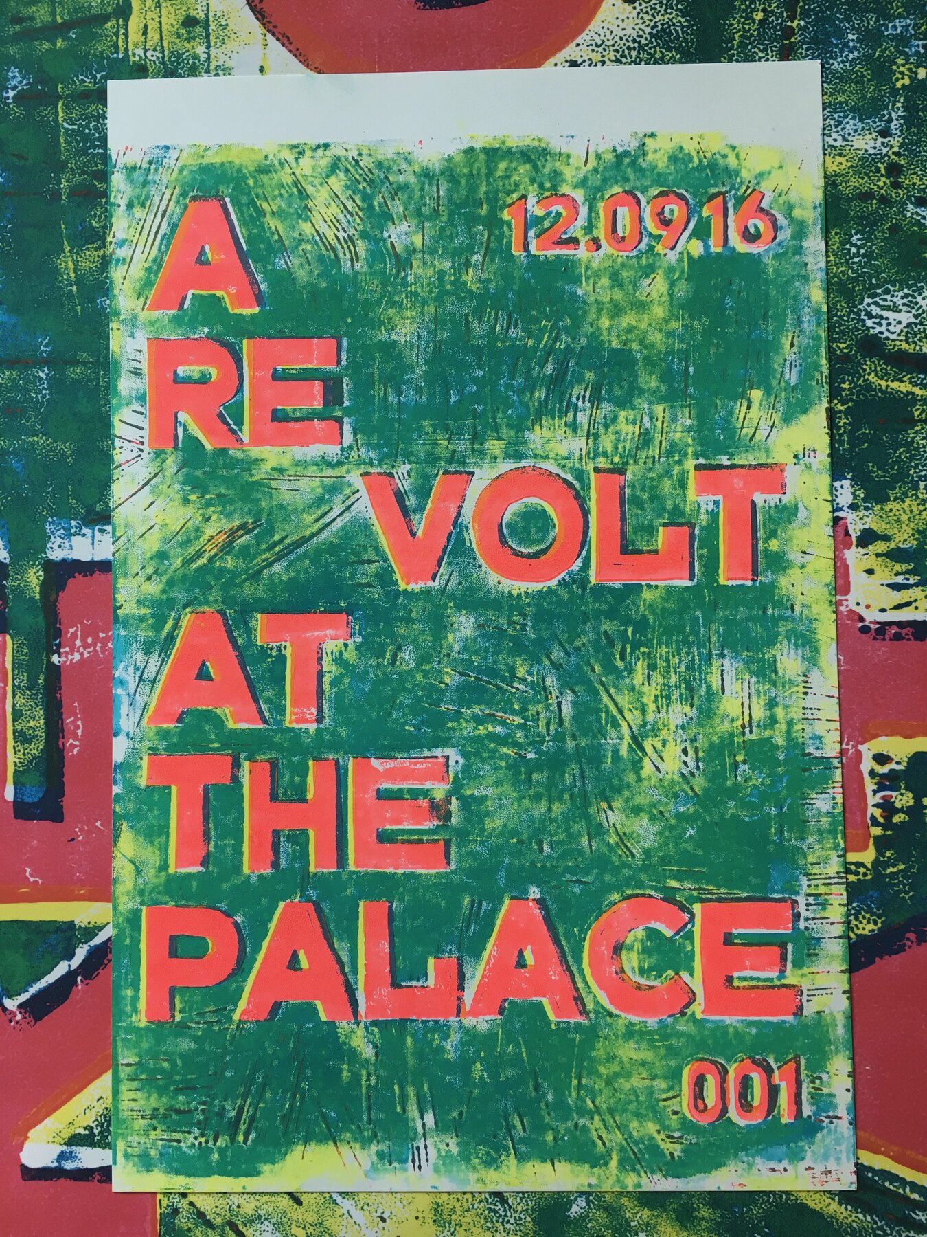
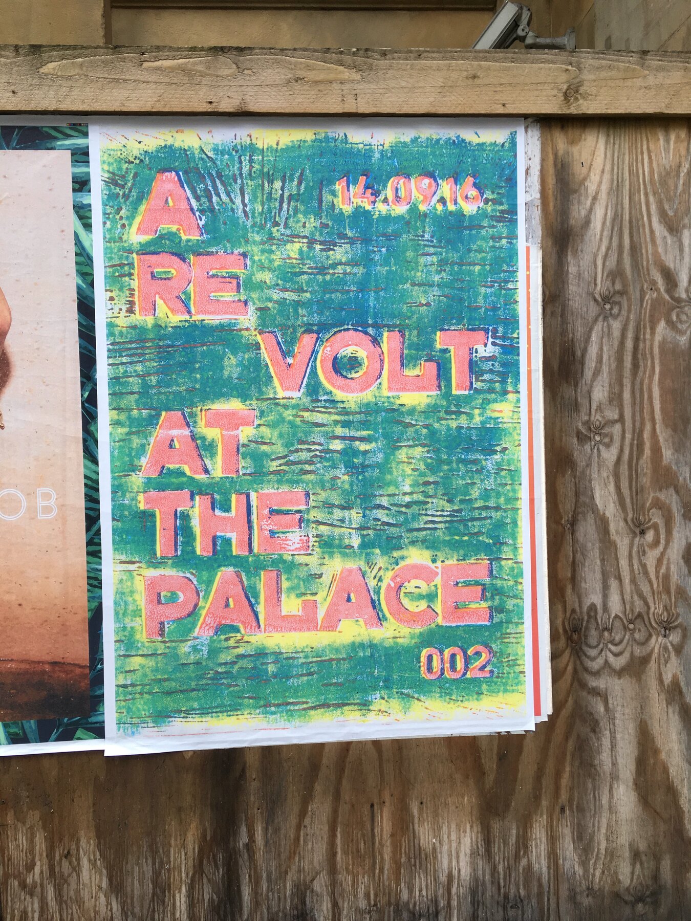
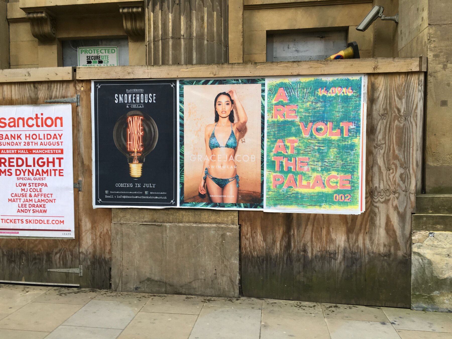
    The re-cut poster is up. A RE VOLT AT THE PALACE, 002, 14.09.16, pasted onto hoardings alongside club nights and gig bills, green and pink against the weathered boards.

    No logo, no explanation, no venue name anyone could look up. Just a phrase and a date. The idea is to let the city wonder for a while.

    I went back an hour later to check the paste had taken and someone was already photographing one.
    First posters on the streets, Moderate Studio journal, 2016

    Part of The Palace Is a Refuge.

  • Artworks in the bedroom

    Artworks in the bedroom

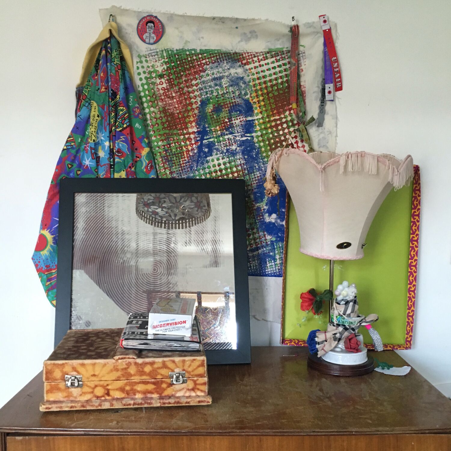
    A corner of my bedroom with a selection of my own work in it. A halftone print pinned to the wall, a framed mirror piece, a lampshade rebuilt over a Burberry-check base, a green-bordered board and a velvet box, all of it made or reworked in the studio and then lived with at home. The work does not stop at the studio door.

    It is a good picture of how the practice actually sits in a life, not on a white gallery wall but propped on a dresser next to everything else, a bit dusty, in use. Keeping your own work around you is part of it, seeing the pieces every day, next to the Andervision case and the odd lamp, until they are just furniture.

  • The exhibition, with Sally Gilford

    The exhibition, with Sally Gilford

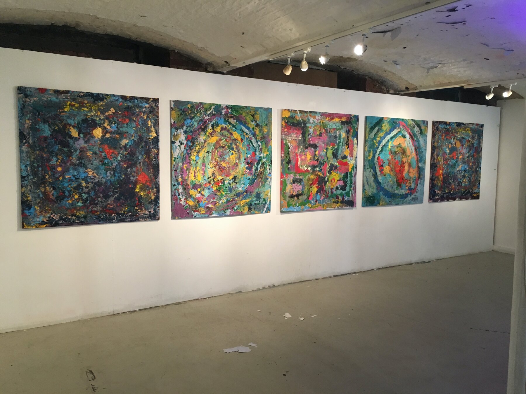
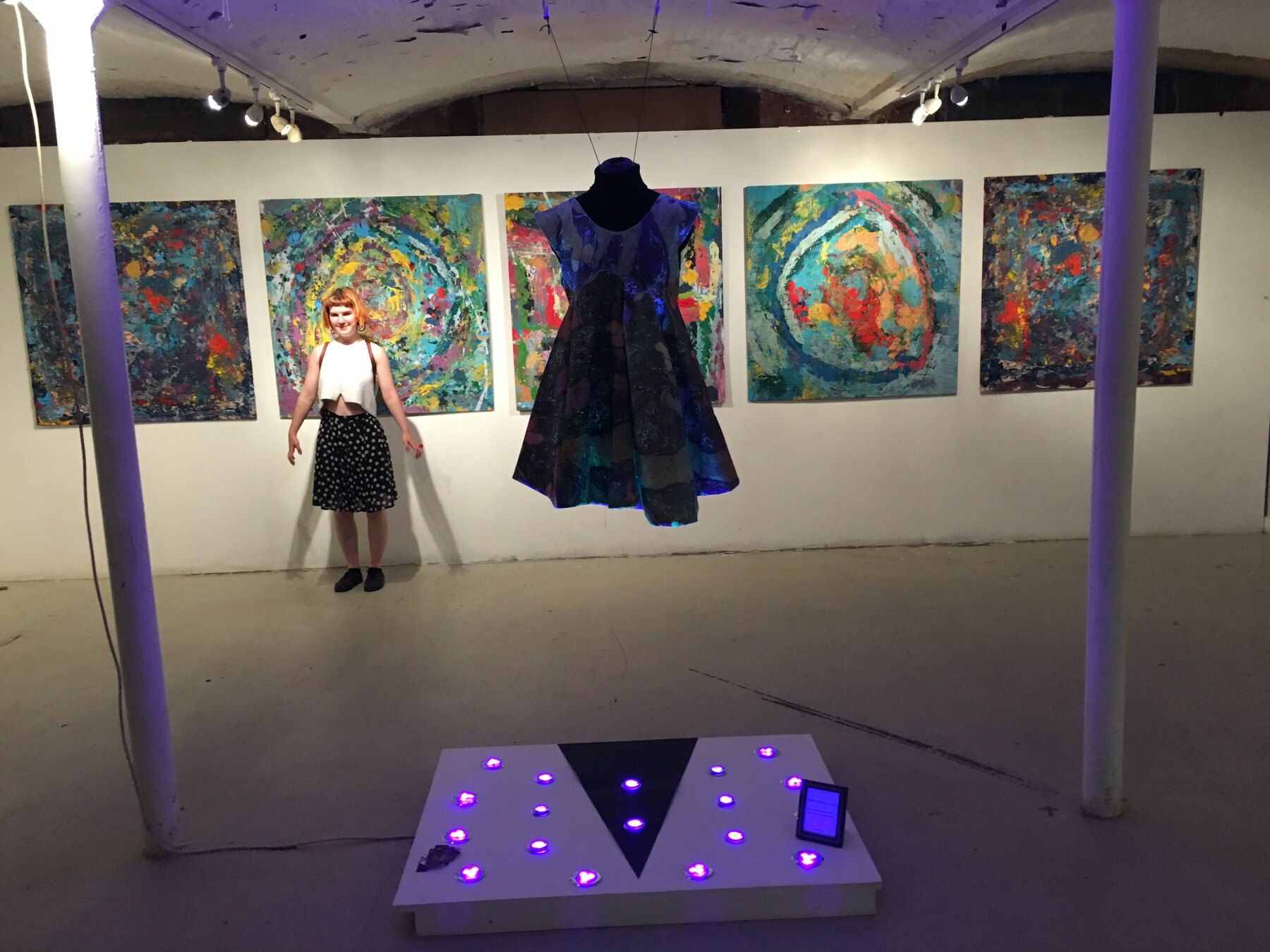
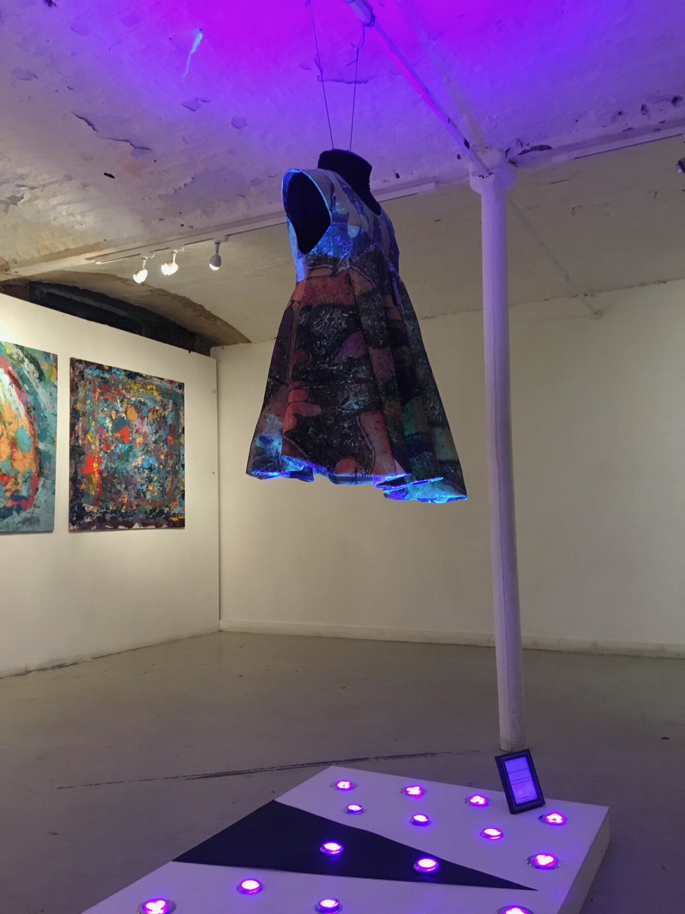
    The paintings and rubbings went up at Islington Mill in Salford, a joint show with the artist Sally Gilford. Five paintings hung in a row, and in the gap at their centre Sally’s dress, made from one of the rubbings, hung headless with its arms out over a low platform lit with candles set in a triangle.

    It was meant as a quiet tribute rather than a homage. No portrait, no lyrics, just the same circling gesture repeated across a room and a dress made from it, marking a loss through the making rather than the likeness.

    The exhibition, with Sally Gilford, Moderate Studio journal, 2016
    The exhibition, with Sally Gilford, Moderate Studio journal, 2016

    Part of the David Bowie case study.

  • A print behind a band

    A print behind a band

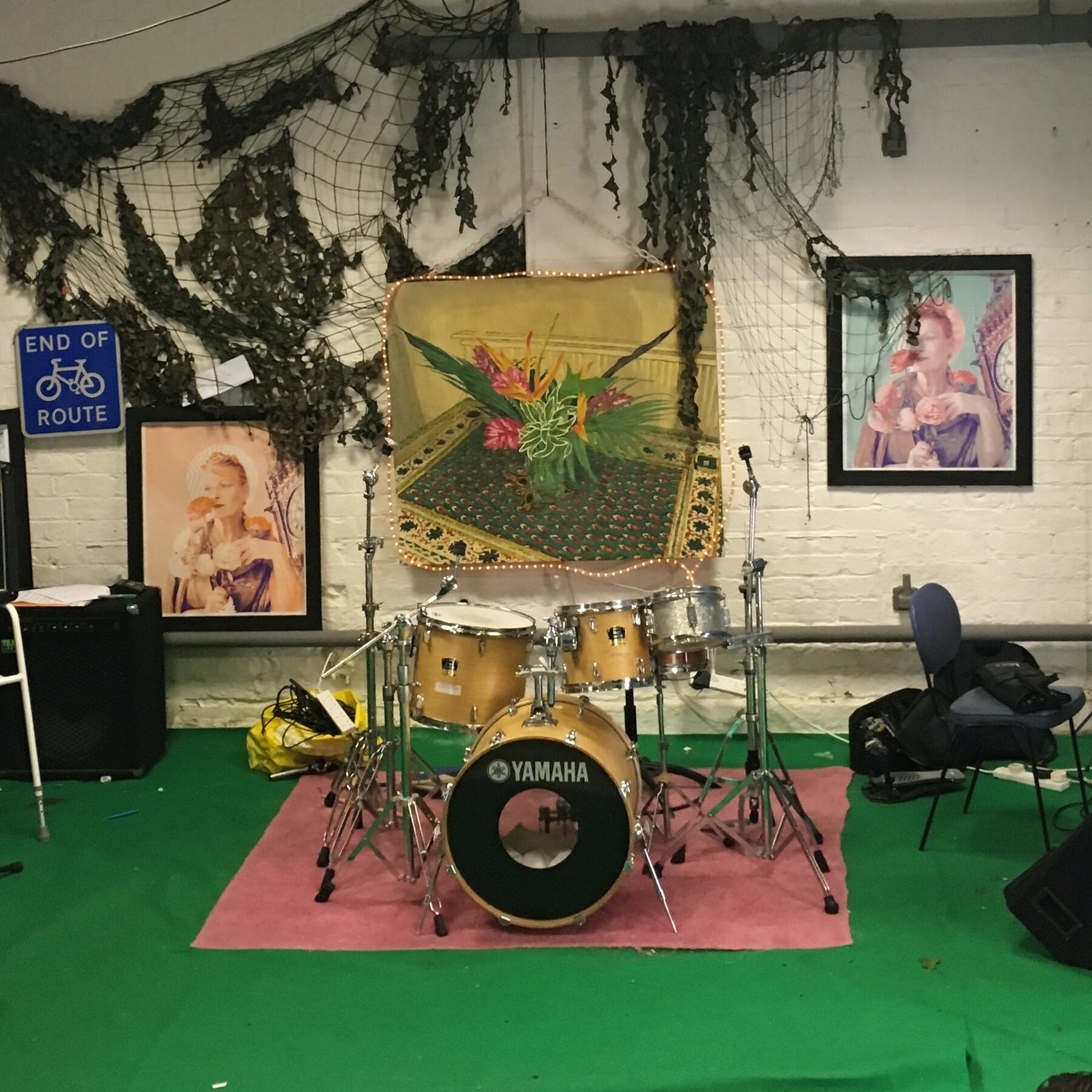
    The prints turned up again as a backdrop, this time in a rehearsal room behind a drum kit, hung on the wall with the camo netting and the strip lights for a music video shoot.

    Saint with Flowers and Cannon Portrait framed on the brick, a bigger cloth print pinned behind the kit. Made for a gallery and ending up on a green-floored practice room wall, which suited it. The work kept finding rooms I had not pictured it in.

    Part of the Vivienne Westwood case study.

  • Printing for the show

    Printing for the show

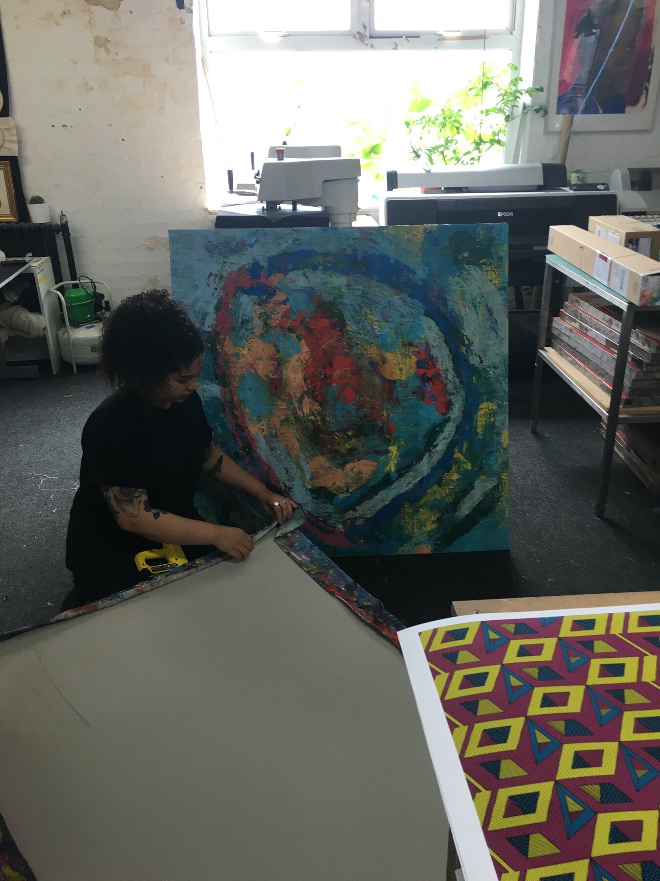
    In the week before the exhibition the studio filled with rolled prints. The last of the rubbings pulled and stacked, the racks full, another pair of hands on the squeegee to get through them, sunlight coming in off the Mill windows.

    Six months on from the night that started it, the work had turned into something that needed hanging space and a plan. What began as a way to get through an evening now had a room booked and a date on it.

    Quiet, repetitive days of printing before it all went up on a wall.

    Printing for the show, Moderate Studio journal, 2016

    Part of the David Bowie case study.

  • Jody Hartley photographs the box

    Jody Hartley photographs the box

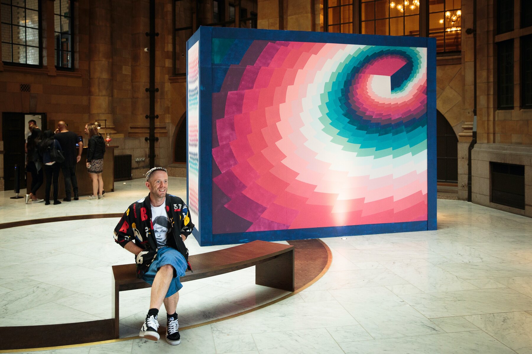
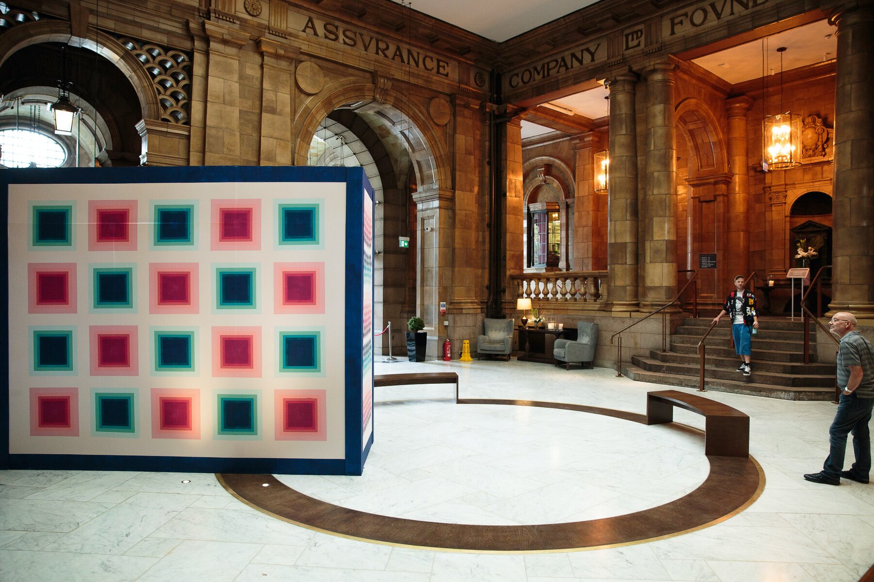
    Official photographs today. Jody Hartley came to the Palace and shot the box properly: wide under the dome, straight on, details of the squares and the spiral.

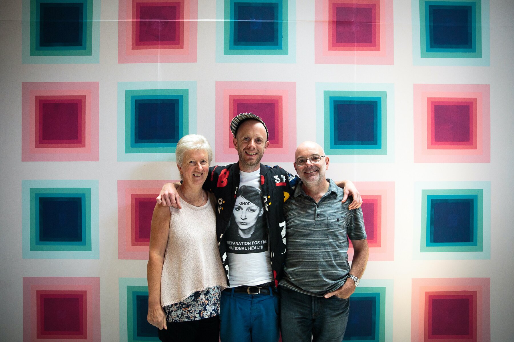
    My mum and dad came in for one of them, stood together in front of the squares, slightly formal. Of all the frames from today, that is the one.

    Having work photographed well changes how you see it. In Jody's pictures the box looks like it was always meant to be there, holding the middle of that huge room on its own.

    Jody Hartley photographs the box, Moderate Studio journal, 2016
    Jody Hartley photographs the box, Moderate Studio journal, 2016
    Jody Hartley photographs the box, Moderate Studio journal, 2016

    Part of The Palace Hotel Commission.

  • Back inside the Palace, looking closer

    Back inside the Palace, looking closer

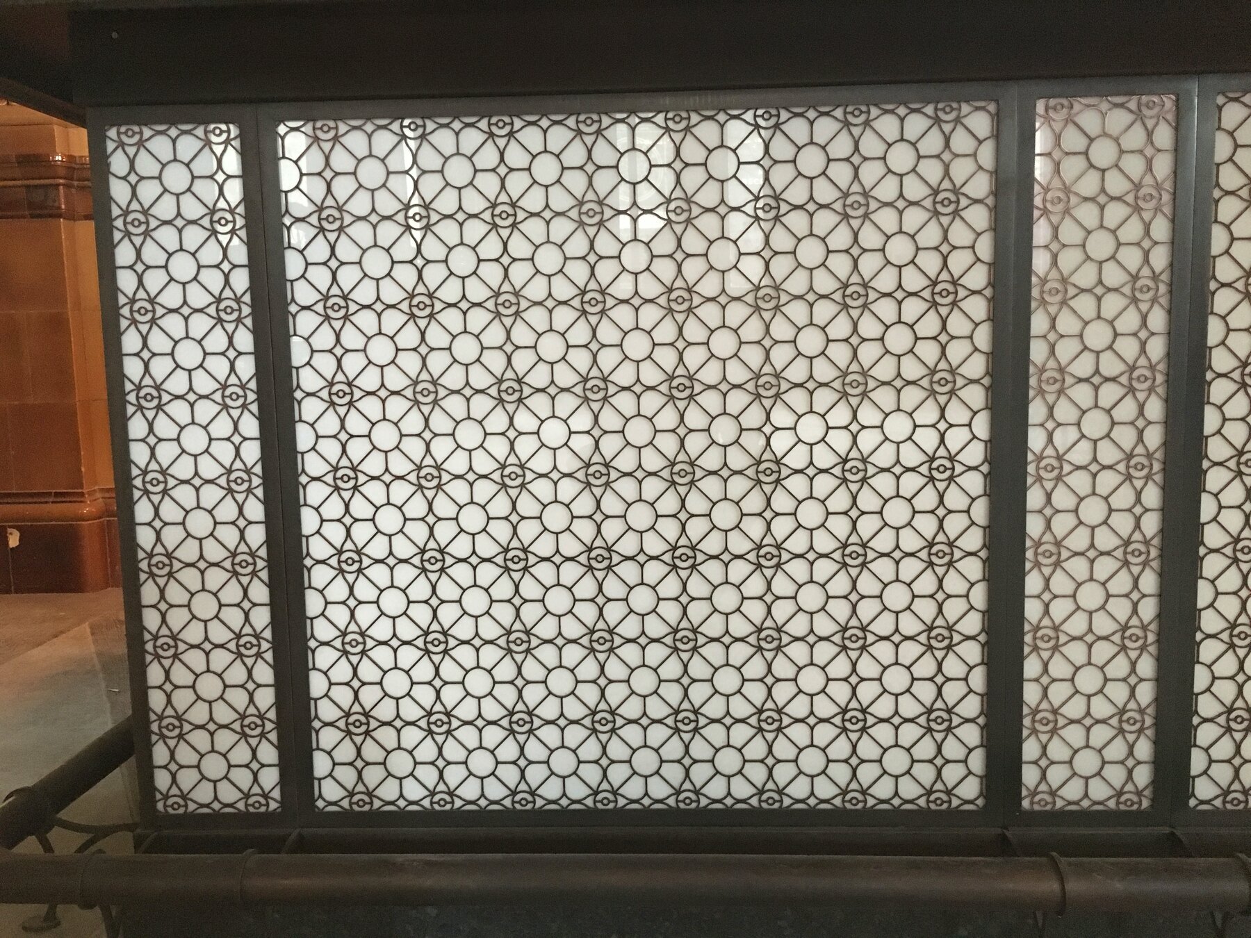
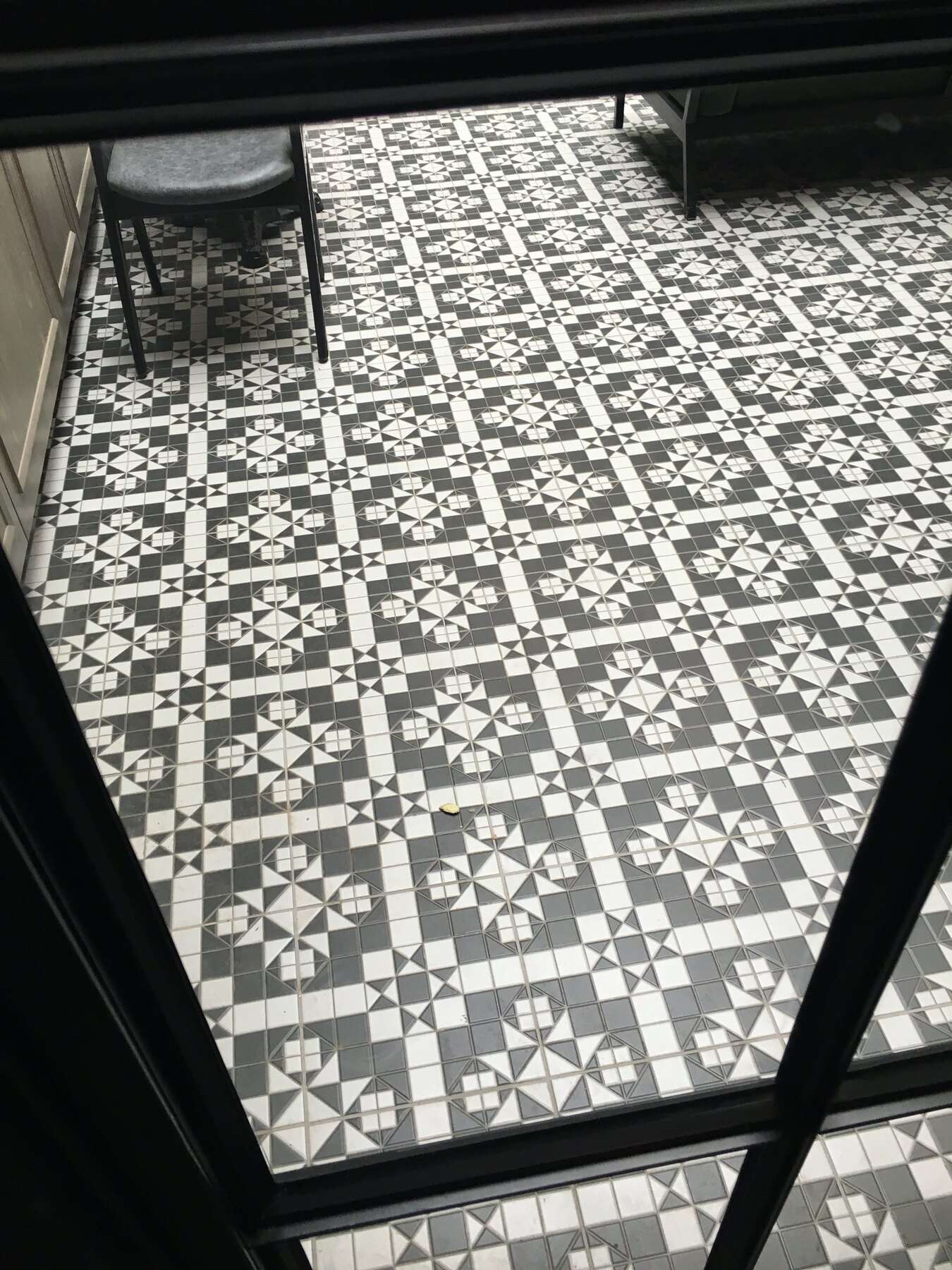
    Another walk through the Palace, this time looking at surfaces rather than spaces. The pierced geometric screens over the windows. The tiled floors. The banded faience on the columns, cream and oxblood and sage.

    The building is already a pattern library; whatever I print for the Refuge should feel like it grew out of these walls rather than landed on them. I filled a camera roll with details nobody notices on their way to reception.

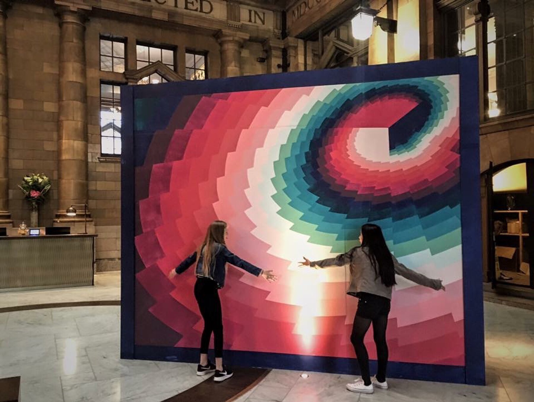
    Two visitors stopped to pose with the spiral face of the box on my way out. Still doing its job.

    Back inside the Palace, looking closer, Moderate Studio journal, 2016
    Back inside the Palace, looking closer, Moderate Studio journal, 2016

    Part of The Palace Is a Refuge.

  • A Re Volt at the Palace, 001

    A Re Volt at the Palace, 001

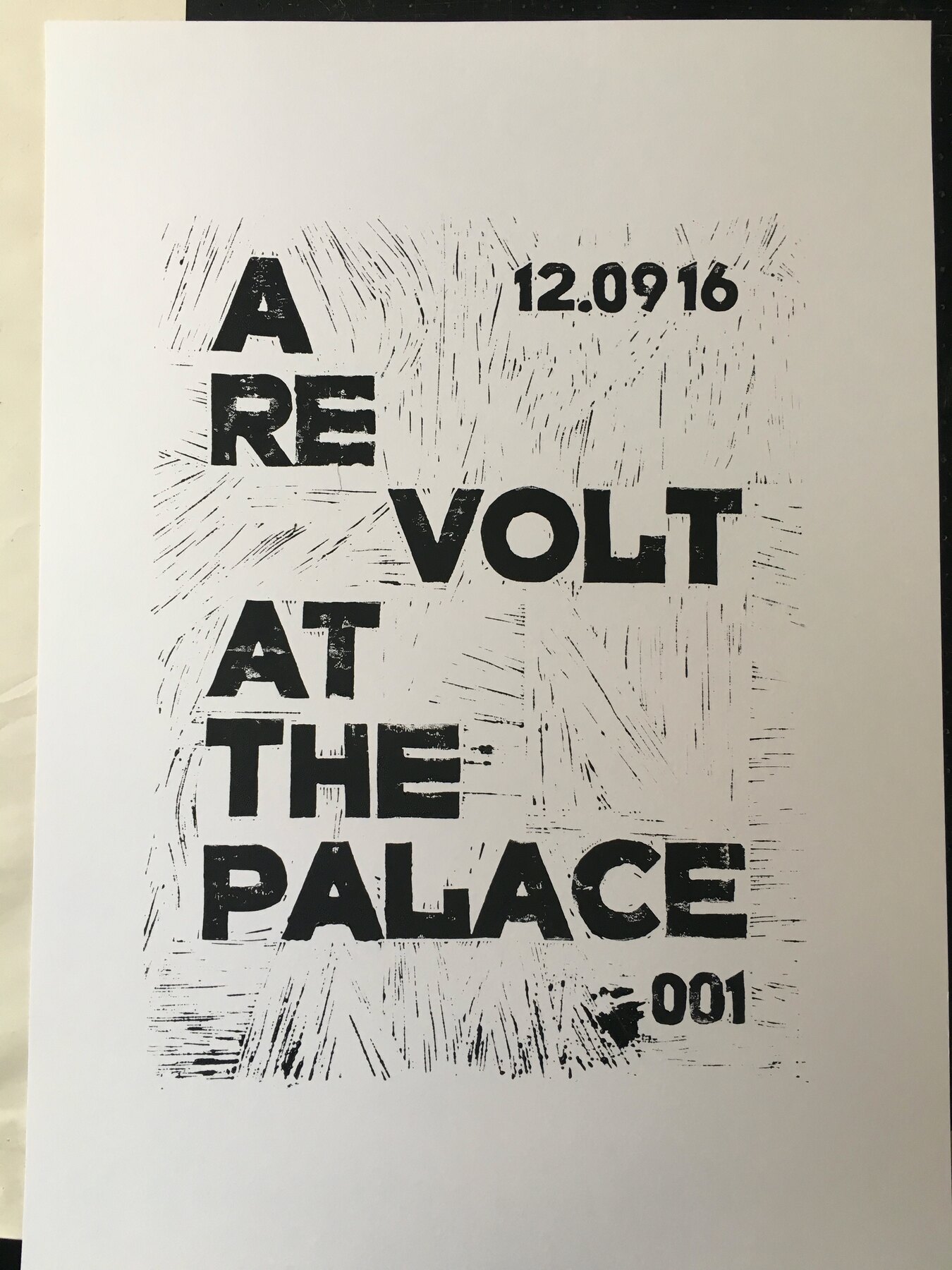
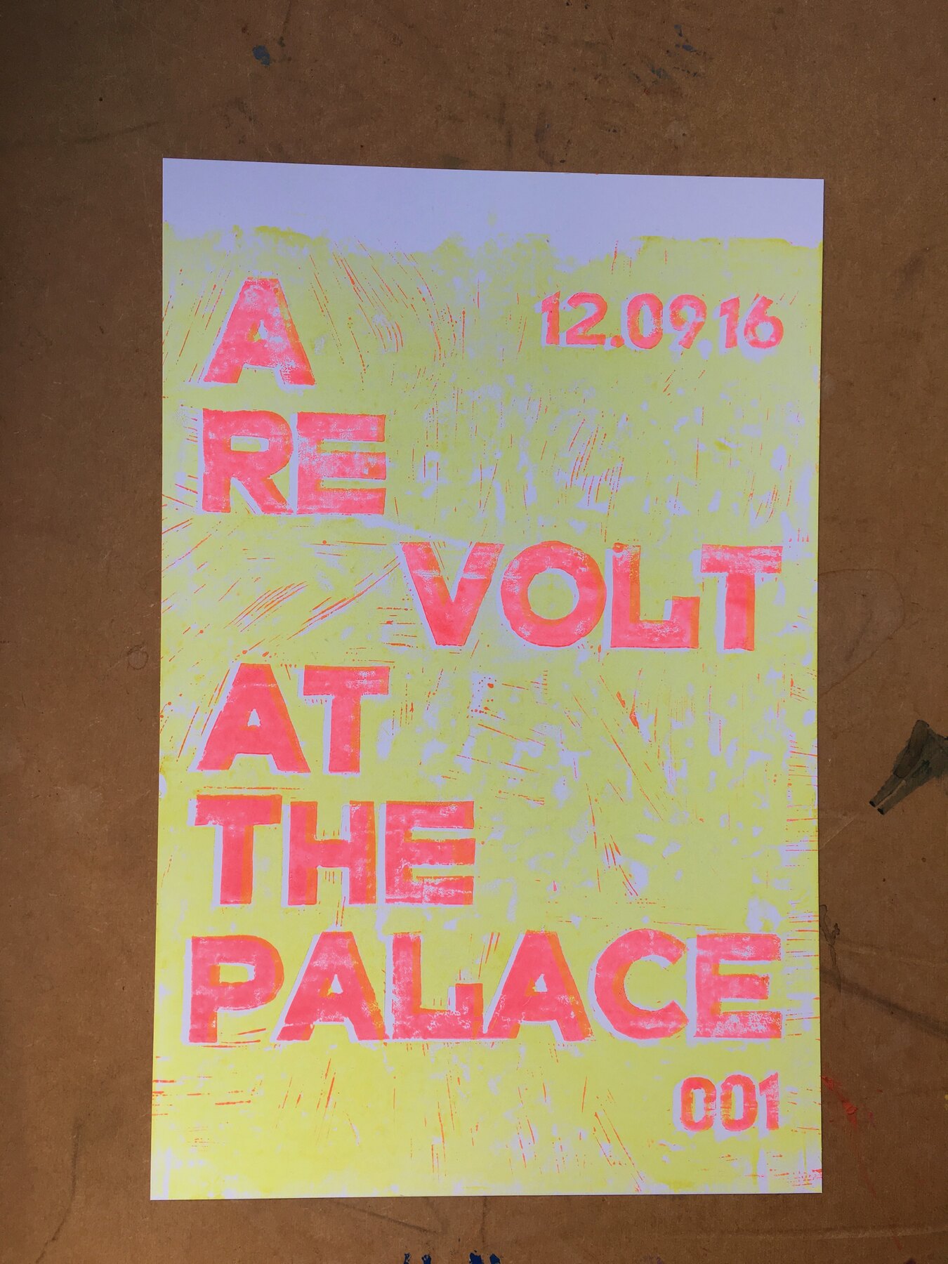
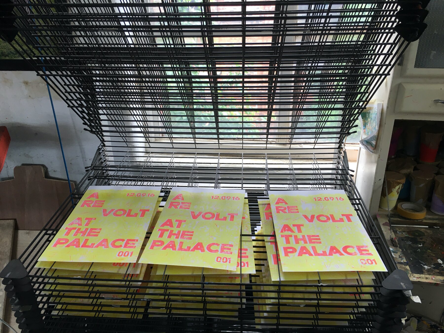
    The first poster is cut and printed. A RE VOLT AT THE PALACE, hand-cut letters, edition 001, the opening date worked into the block: 12.09.16. Black on white first, then layered pulls in yellow, green and pink over a textured ground, drying on every rack at one69A.

    That date came from the Palace. It later turned out to be wrong, the opening moved to the 14th, and the block had to be cut again. Which is why, when these finally hit the streets, the first one pasted up says 002.

    Nothing about hand printing rewards a wrong date. You just start again.

    A Re Volt at the Palace, 001, Moderate Studio journal, 2016
    A Re Volt at the Palace, 001, Moderate Studio journal, 2016
    A Re Volt at the Palace, 001, Moderate Studio journal, 2016

    Part of The Palace Is a Refuge.

  • A0 test print

    A0 test print

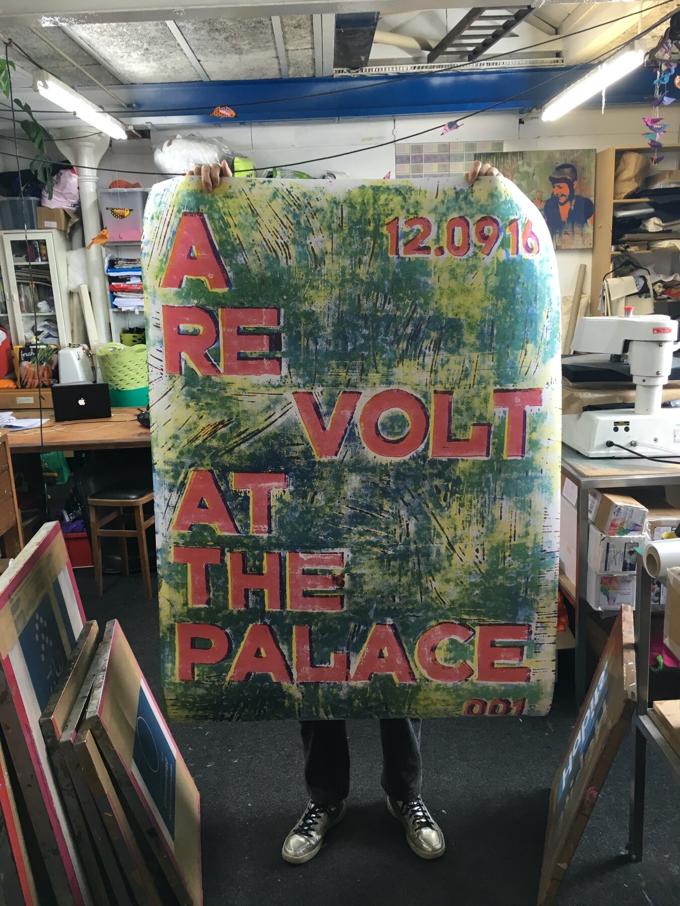
    Test print at A0, run off on the large format digital printer. Big enough that holding it up hides everything but your ankles. The layered ground swallows the room and the red letters sit on top of it like they were pasted there.

    The blocks are cut by hand; the street needs scale, and this is how a one-person campaign gets it. The size is right. A street poster should be seen from a bus.

    Part of The Palace Is a Refuge.
  • A wallpaper in primary colours

    A wallpaper in primary colours

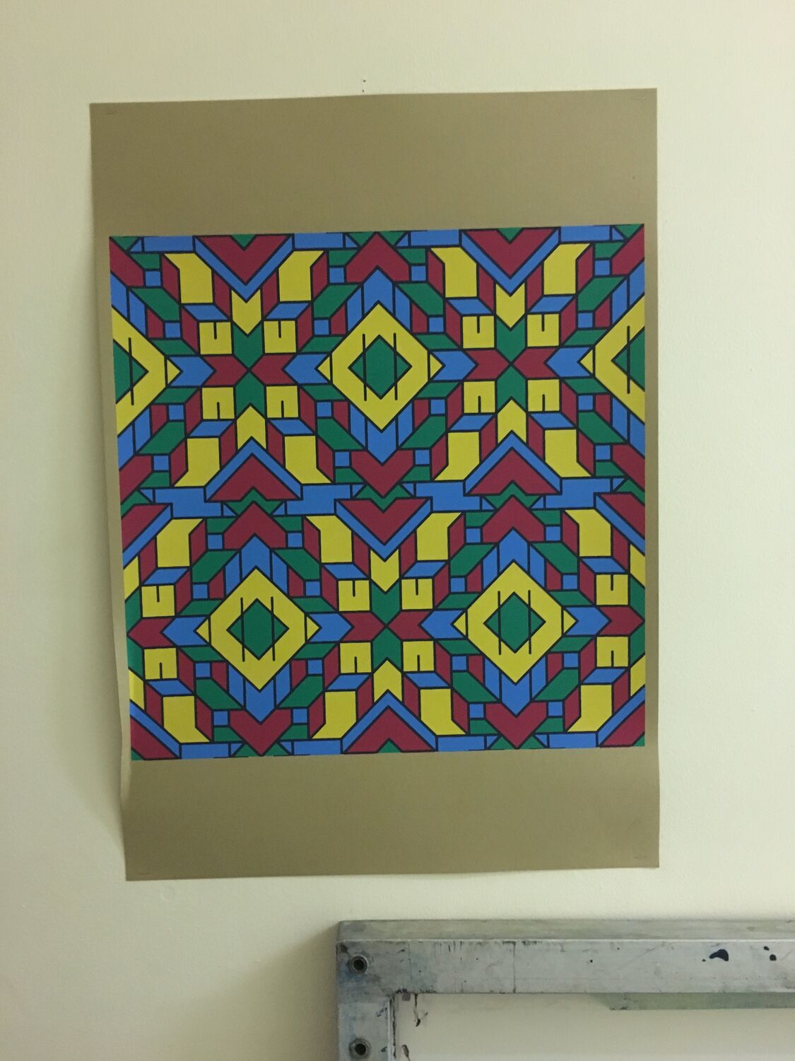
    A wallpaper design in flat primary colours, red, yellow, blue and green locked into a hard-edged tessellation like a stained-glass window with the lead taken out. Big diamonds and arrowheads and stars, no shading, no halftone, just solid blocks of colour butting up against each other and repeating.

    This is the opposite end from the fine line-work and the halftone prints, the geometry at its most direct. Printed by hand and hung on the studio wall to see it at length, it is the kind of pattern that reads from across a room and does not ask for a second look so much as fill the whole space with colour.

    Part of The Pattern Works.