Author: Jermyn

  • A show in an empty office block

    A show in an empty office block

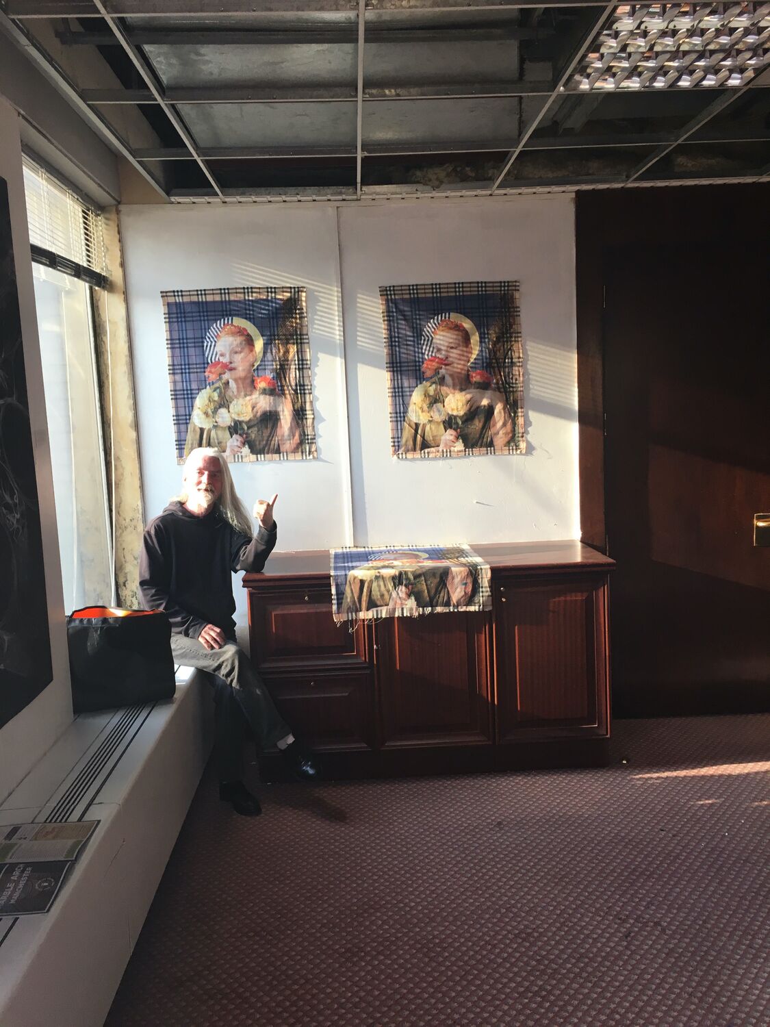
    A group art show in an empty office block at 24 Mount Street in Manchester city centre, one of those buildings between tenants that gets handed to artists for a weekend before the next lot move in. My prints went up on the bare partition walls, framed and unframed, with the city lit up hard through the big windows and an old rug thrown down on a desk.

    Shows like this are the backbone of it, no gallery, no polish, just a floor of an office block, a lot of work on the walls and everyone crammed in. There are pictures of the rooftop too, up above the city with the towers going up all around, which is where half the actual conversations at a show like that end up happening.
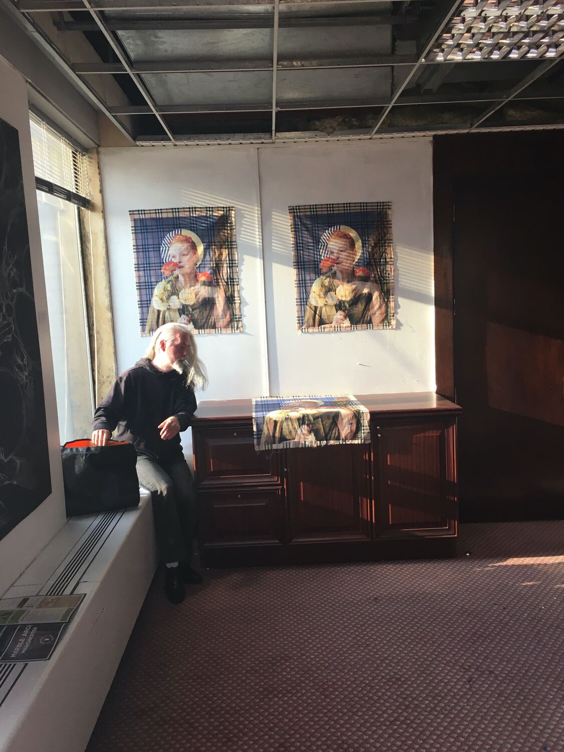
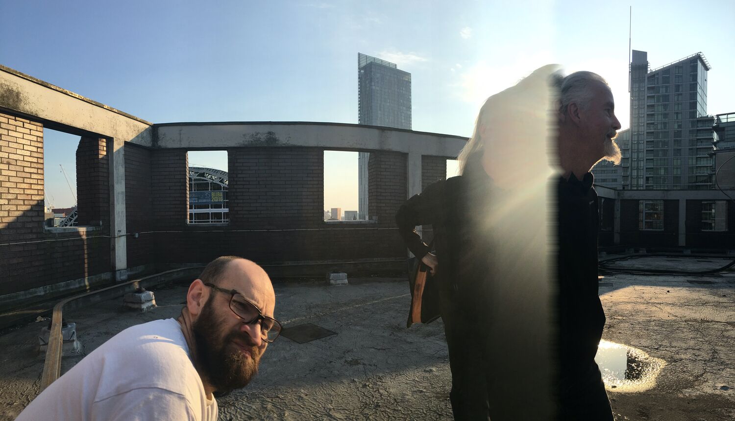
    A show in an empty office block, Moderate Studio journal, 2016
    A show in an empty office block, Moderate Studio journal, 2016
  • A mirrorball for the festival

    A mirrorball for the festival

    An outfit I made for Sounds From The Other City, a hooded suit in a soft pastel print topped off with a full mirrorball for a head. A one-person disco walking around the festival, catching the light and throwing it back in little squares wherever it went.

    It is the sort of thing the festival is made for, a costume with no purpose other than to turn up and be looked at. A mirrorball where a face should be, wandering Chapel Street on a bank holiday, which is its own small kind of public art.

    Part of the Islington Mill case study.

  • A rubbing as a backdrop

    A rubbing as a backdrop

    One of the rubbings found another use as a backdrop. Hung on the studio’s white wall with painted card cones set in front of it, pink and green and yellow, a camera on a tripod facing the lot.

    The work kept moving between things. Painting, then rubbing, then a flat printed cloth standing in for a set. I liked that it would not settle into one object.

    The Bowie spiral behind the geometric shapes, doing a job it was never made for.

    Part of the David Bowie case study.

  • A print at the Golden Lion

    A print at the Golden Lion

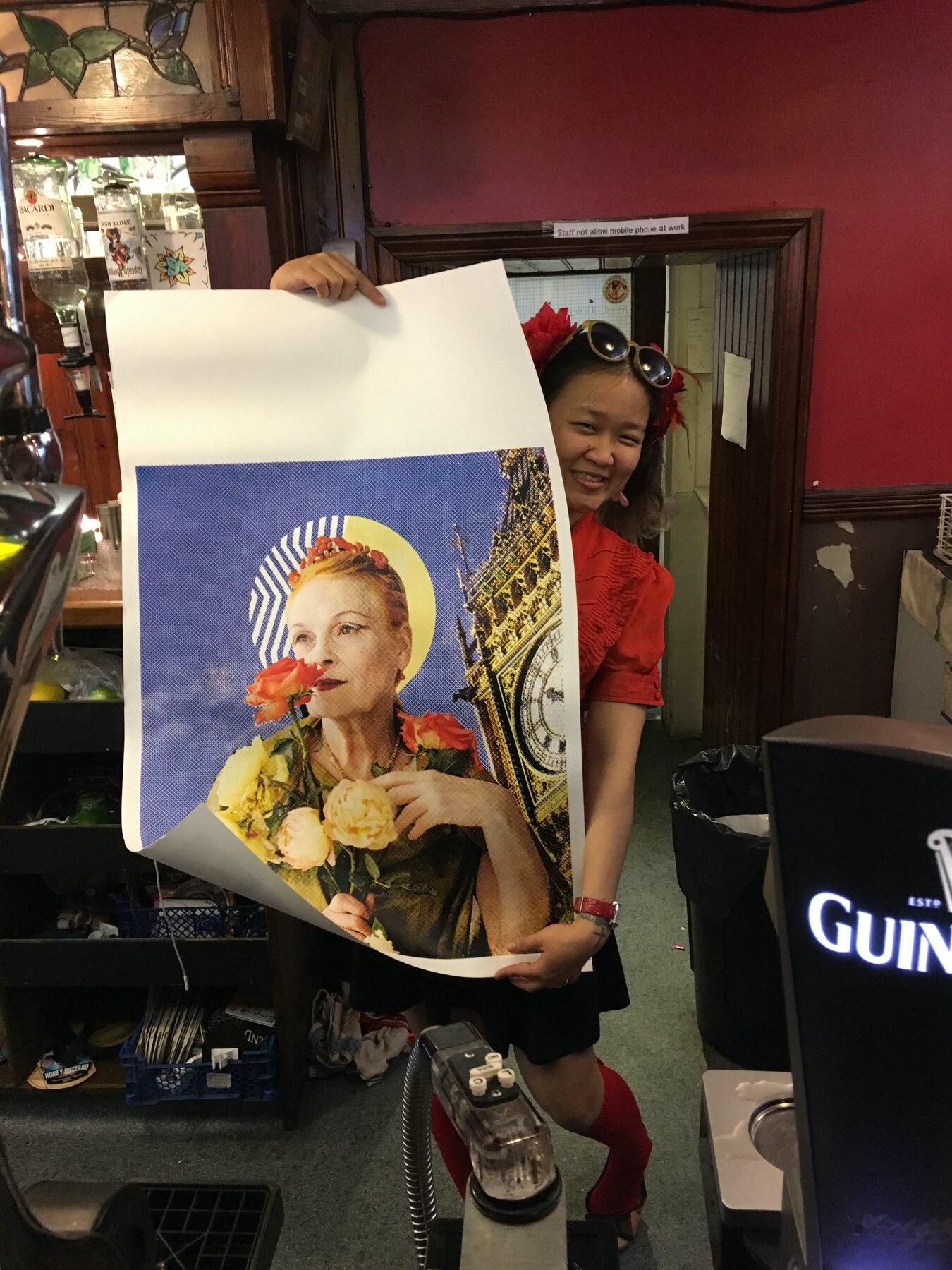
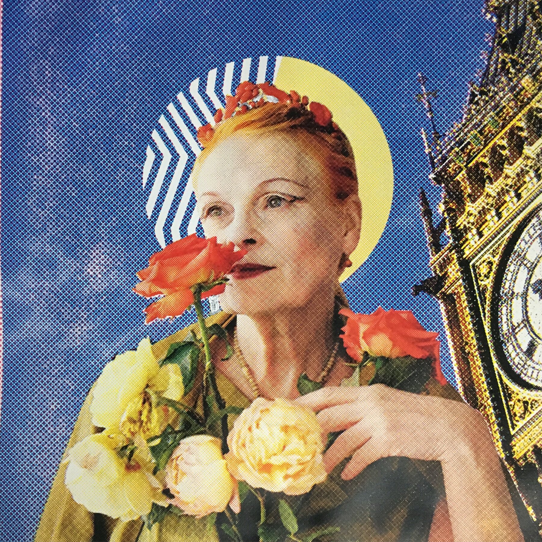
    One of the Saint with Flowers prints went out to the Golden Lion, held up behind the bar with the Guinness taps, a long way from a gallery wall.

    I like the prints better out in the world than framed and quiet. A pub, a gig, someone holding it up for a photo, the work doing something rather than being looked after. It travelled well, the kind of image that reads across a crowded room, her face and the rose carrying over the noise and the low light of the bar.

    Part of the Vivienne Westwood case study.

  • An alternative version

    An alternative version

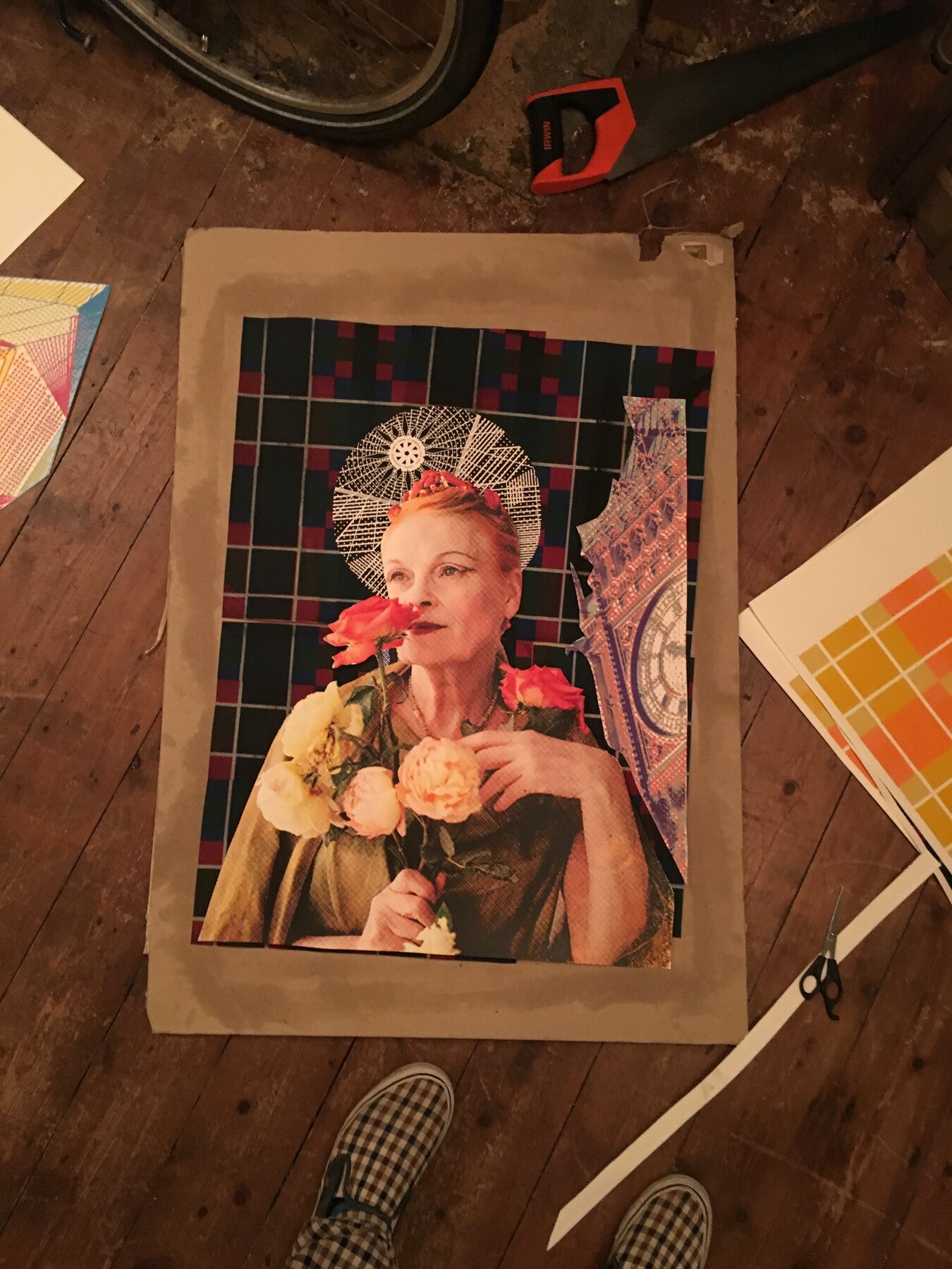
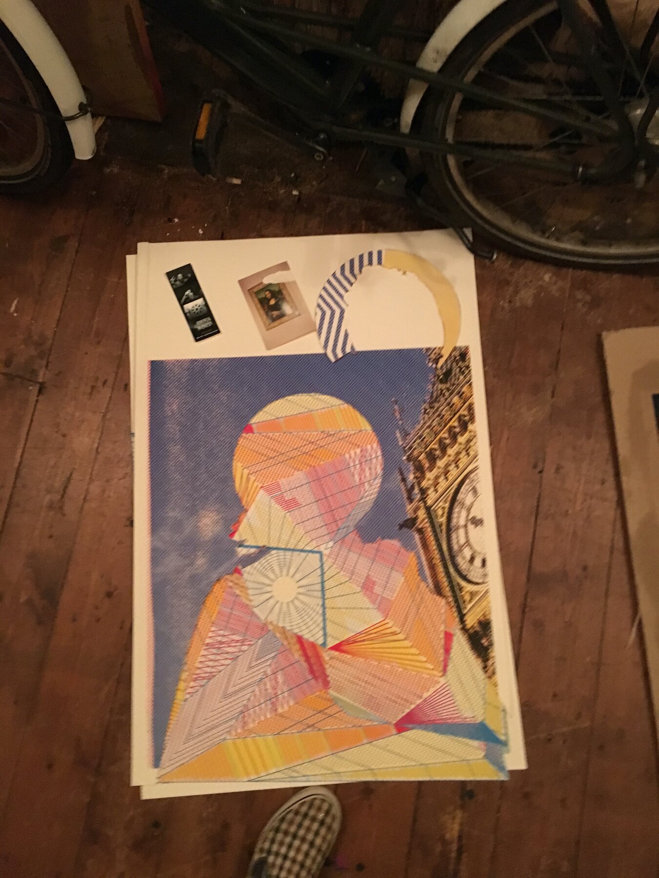
    After the show I kept pulling at the Saint with Flowers image. Laid out on the floorboards at home next to an alternative version, a looser line-drawn collage of the same portrait in blue and orange.

    Some of these never went anywhere. It is worth keeping the versions that did not make it, the ones that show where a finished image nearly went instead. The print you end up with is only ever one of several attempts, and this is one of the ones I passed over on the way to it.

    An alternative version, Moderate Studio journal, 2016

    Part of the Vivienne Westwood case study.

  • The exhibition and club night at Font

    The exhibition and club night at Font

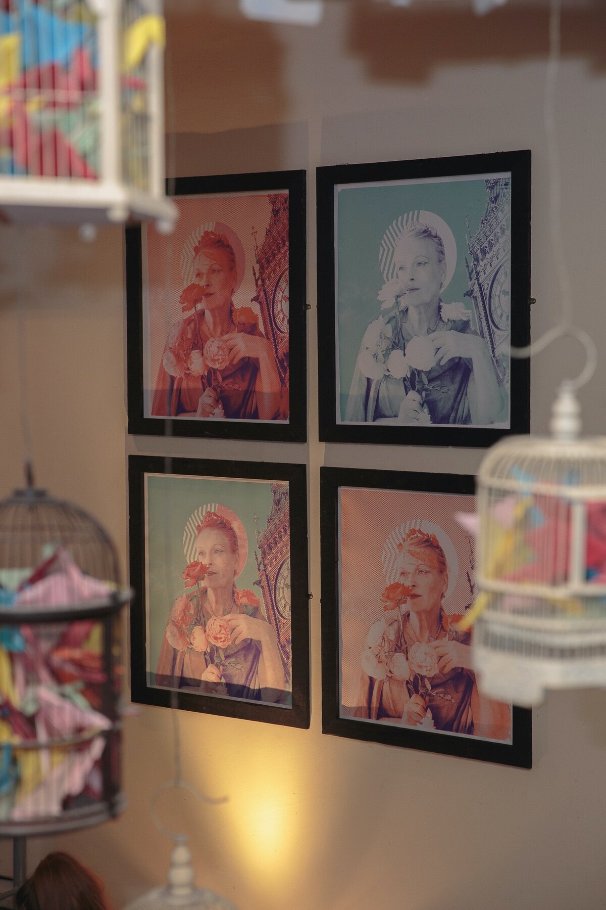
    The show opened at Font Bar in Manchester on 31 March. The three prints hung in rows around the room, and the evening ran as a club night as much as an exhibition, a DJ set, a costume competition, a room full of people in their own Westwood-inspired outfits.

    The competition winner took home a print of each of the three designs. Most of the night the work on the walls was a backdrop to the dressing up and the dancing, which felt about right for her.

    The photographs by the end are all movement and low light.

    The exhibition and club night at Font, Moderate Studio journal, 2016
    The exhibition and club night at Font, Moderate Studio journal, 2016

    Part of the Vivienne Westwood case study.

  • Printing, every which way

    Printing, every which way

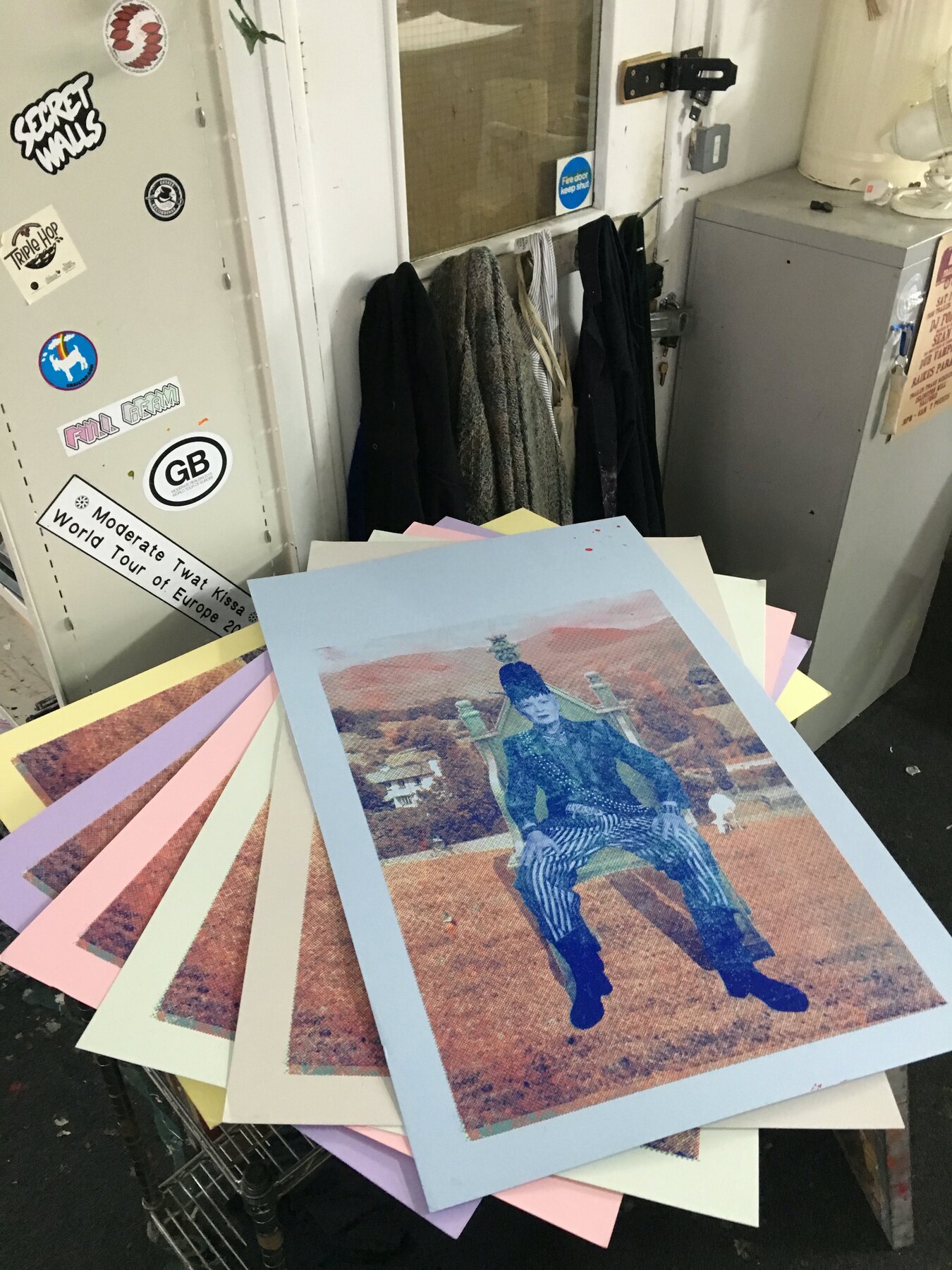
    Then the printing. The three images run again and again in different colourways, the halftone dots opened right up so the faces break into pattern when you stand close. Test sheets stacked on every surface, some clean, some deliberately off.

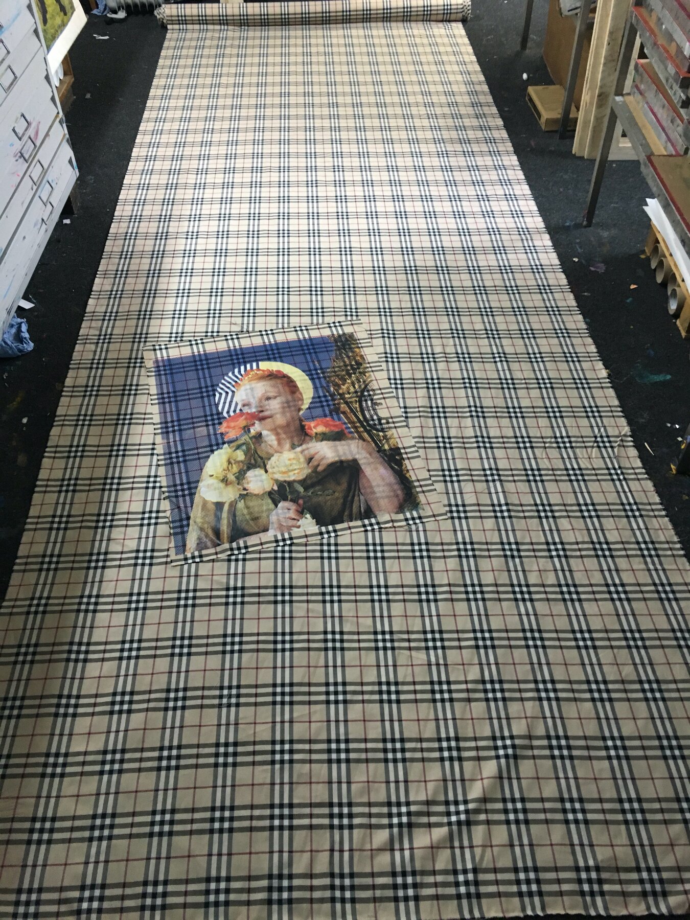
    One of them, Saint with Flowers, went onto fabric, composited over a check pattern for the curtains at the show. Print on paper, print on cloth, the same face coming back in tartan.

    Weeks of this before the walls were ready.

    Printing, every which way, Moderate Studio journal, 2016
    Printing, every which way, Moderate Studio journal, 2016

    Part of the Vivienne Westwood case study.

  • The same image, over and over

    The same image, over and over

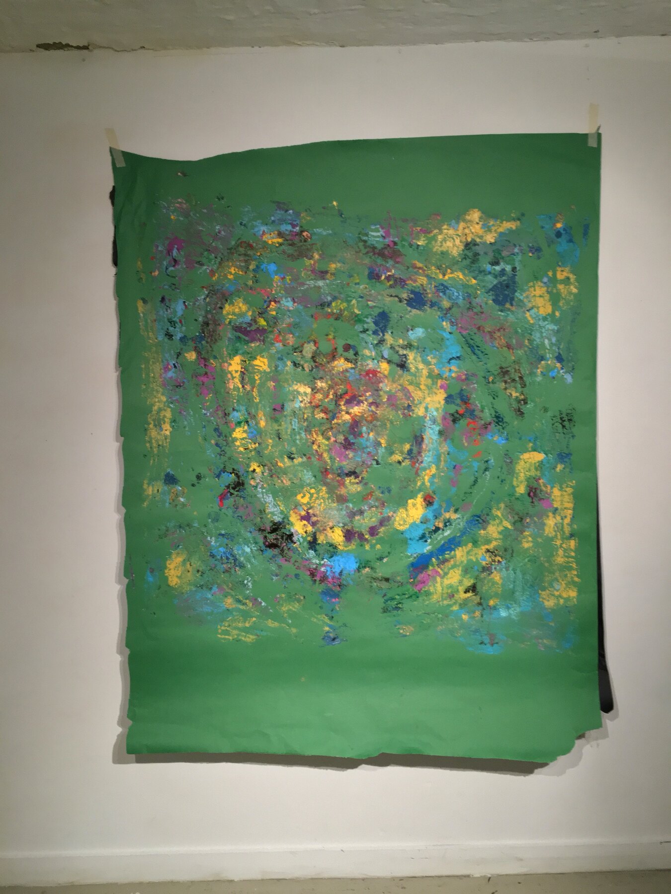
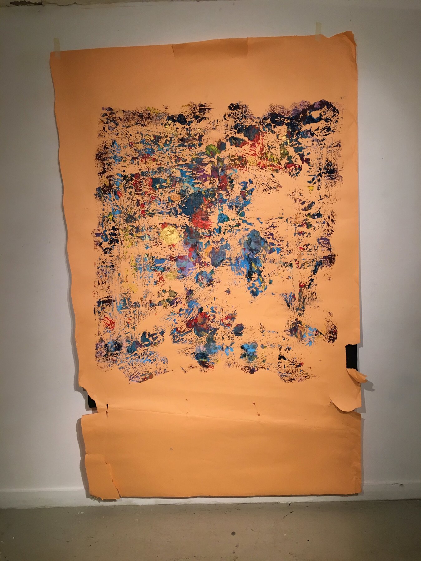
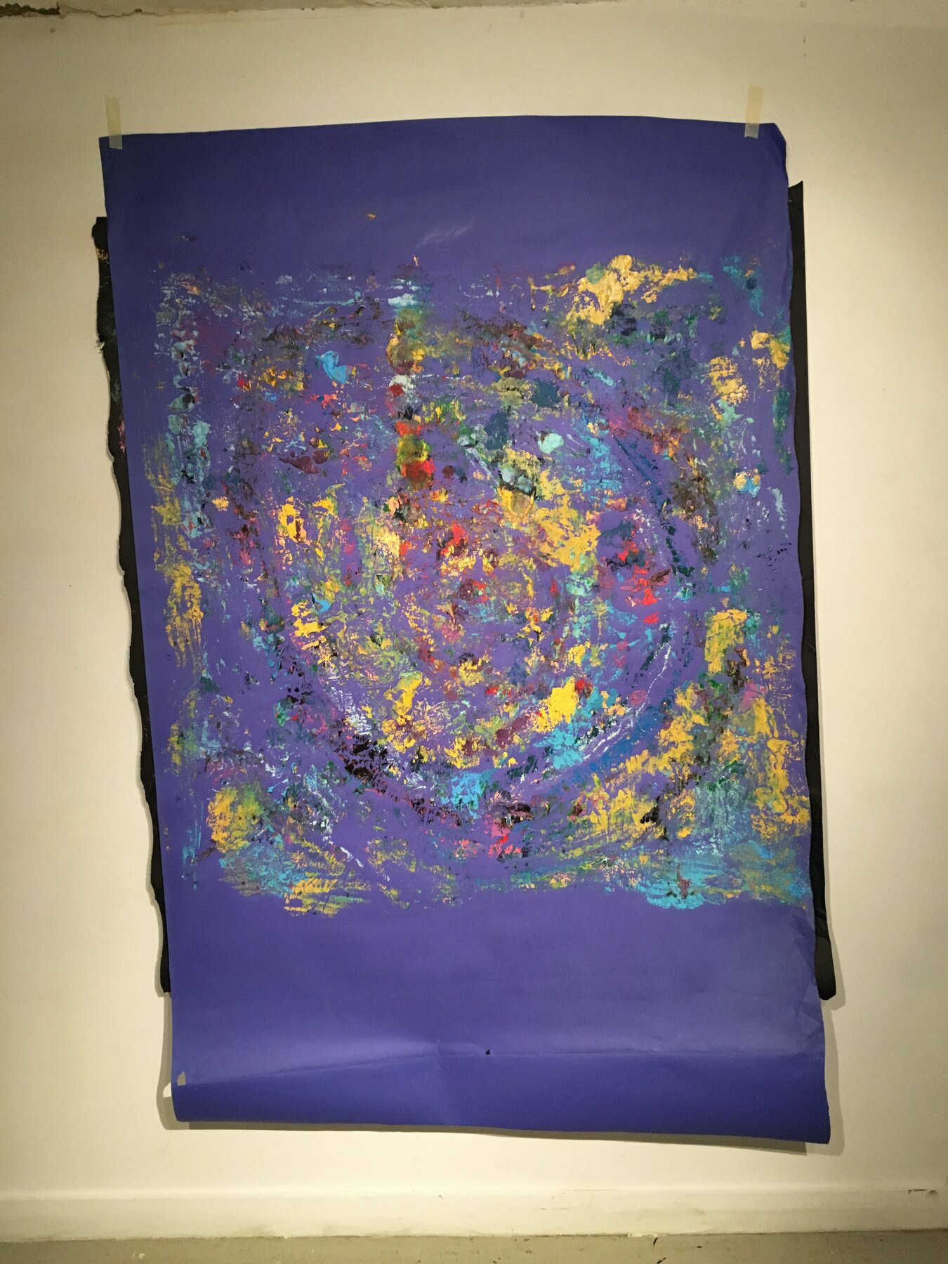
    By March there was a whole set of rubbings. The Bowie image pulled again and again onto different grounds, green, orange, blue, deep purple, bare cloth. Each one came off slightly different, the same spiral shifting with the colour behind it.

    I hung and photographed them one at a time. Laid out together they read less like copies and more like a single thing seen under changing light.

    It was the most I had ever made from one night’s work.

    The same image, over and over, Moderate Studio journal, 2016
    The same image, over and over, Moderate Studio journal, 2016

    Part of the David Bowie case study.

  • A roll of Burberry

    A roll of Burberry

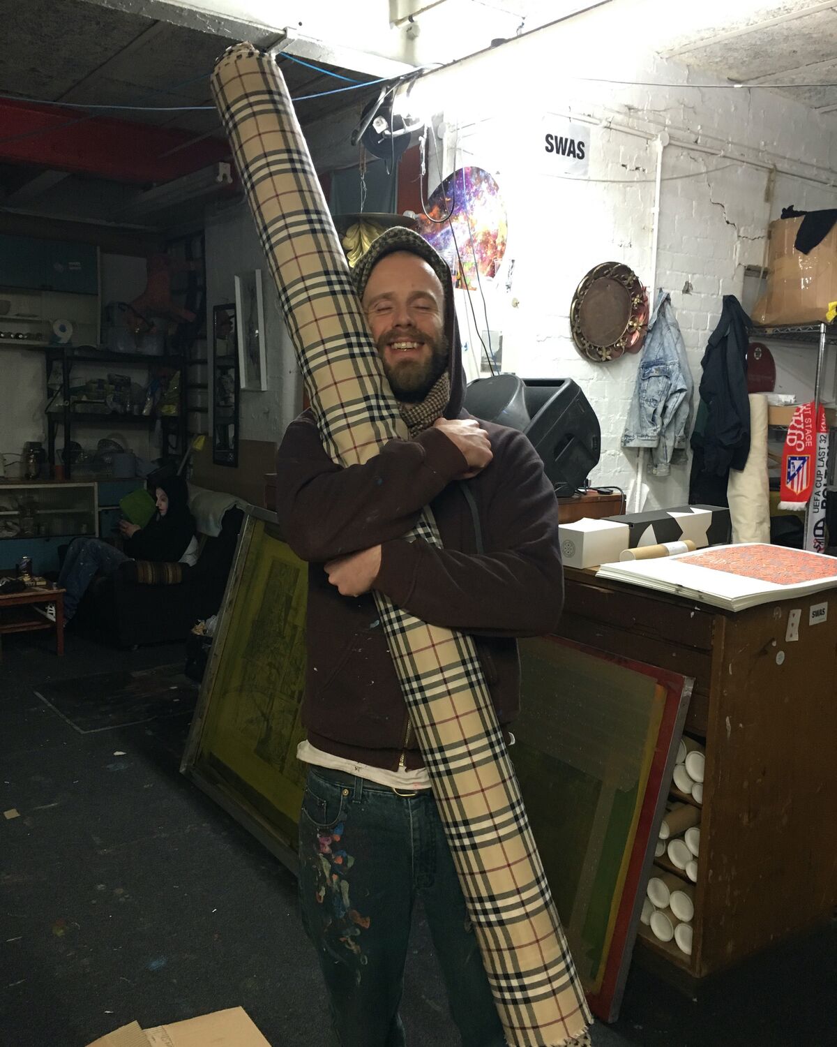
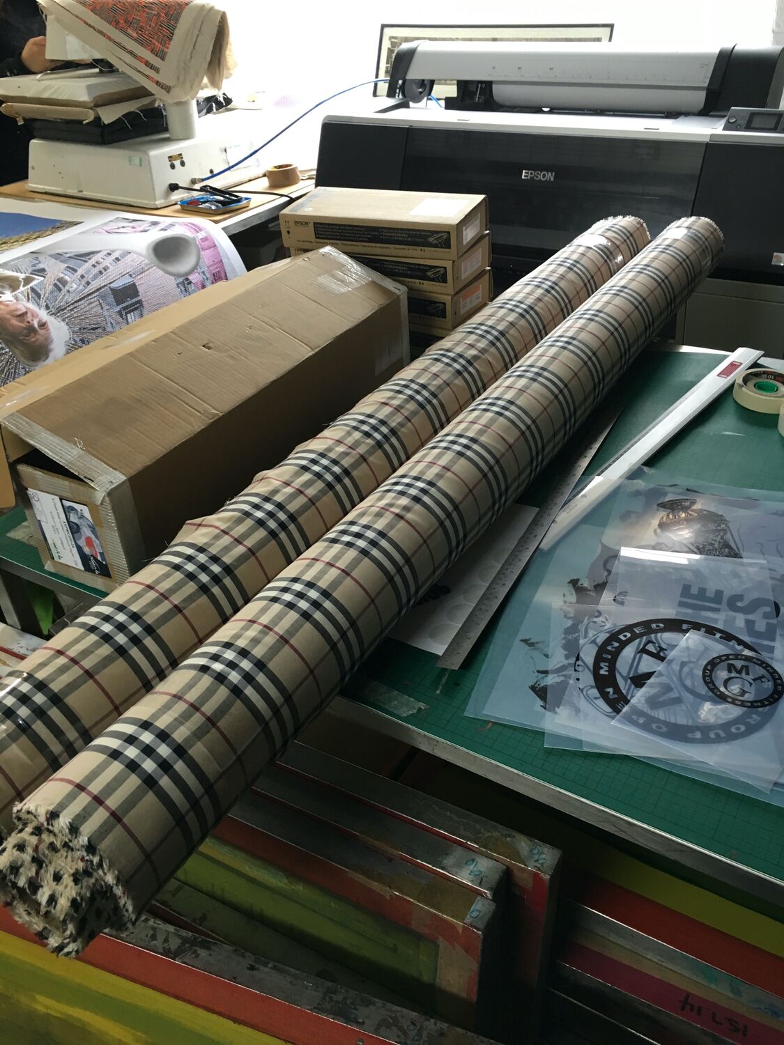
    A full roll of Burberry check, picked up from my fabric wholesaler over in Cheetham Hill, the whole nova-check pattern, camel and black and red, wound onto a bolt taller than I am. In the photos it is sitting across the print bed and then up on my shoulder on the way out, which gives a sense of the size of the thing.

    A roll like this is half the fun of the work, a great bolt of a pattern everybody knows landing in the studio to do something with. The check is about as far from my own geometry as a pattern gets, rigid and posh and instantly readable, which is exactly why it was worth having around to play against.

    A roll of Burberry, Moderate Studio journal, 2016
  • MCR

    MCR

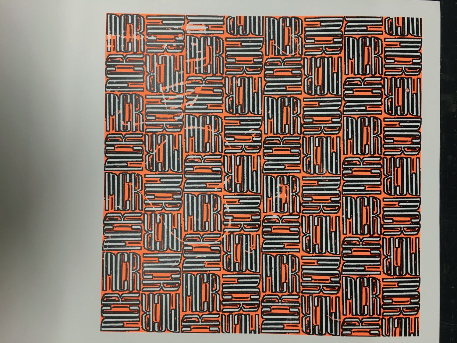
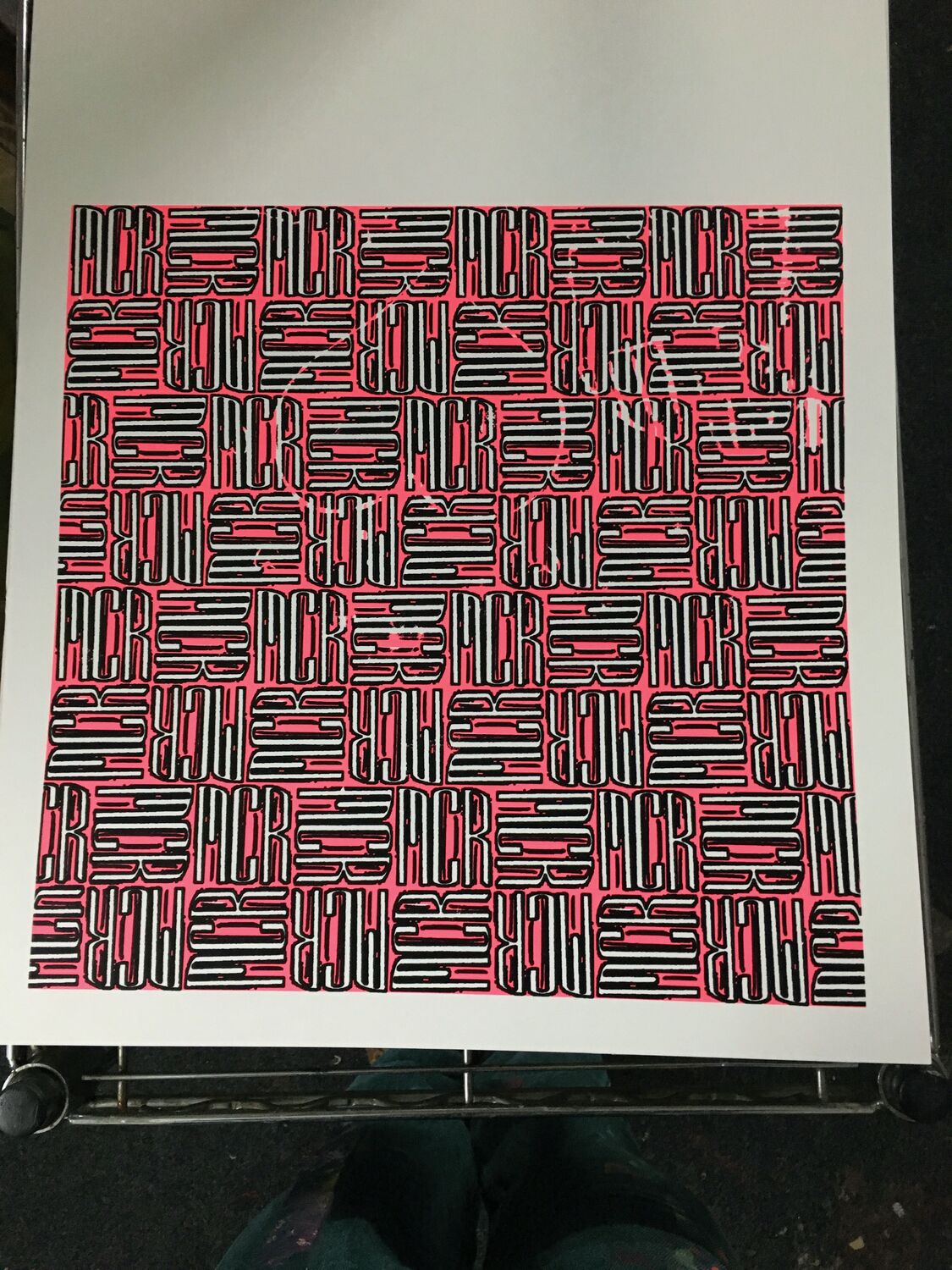
    A fabric and wallpaper design built entirely out of the letters M, C and R, the three letters woven over and under each other in red, grey and black until they stop reading as text and turn into a dense basket-weave. Step back and it is just pattern. Look closely and the whole thing is Manchester, said over and over.

    It is a way of putting the city into the cloth without a logo or a skyline, just the initials everyone here uses, tangled up into a repeat. Printed on both fabric and paper, one of a run of designs from around then that took a word and turned it into a surface you could wear or hang.

    MCR, Moderate Studio journal, 2016
    MCR, Moderate Studio journal, 2016

    Part of The Pattern Works.