
Brand identity
Wine & Wallop
A brand identity for the Wine & Wallop bars in Didsbury, Prestwich and Knutsford. A round logo that works like a stamp, built out into a set of colourways, a monogram and a wordmark, so it holds up on a window, a menu, a pump clip or a sign.
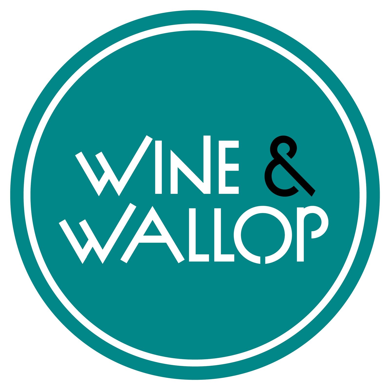
The Roundel
The core mark: WINE & WALLOP set in a clean circle, a stamp you can drop anywhere. Drawn to sit in any single colour, so it runs in teal, hot pink, gold or plain black outline depending on where it lands.
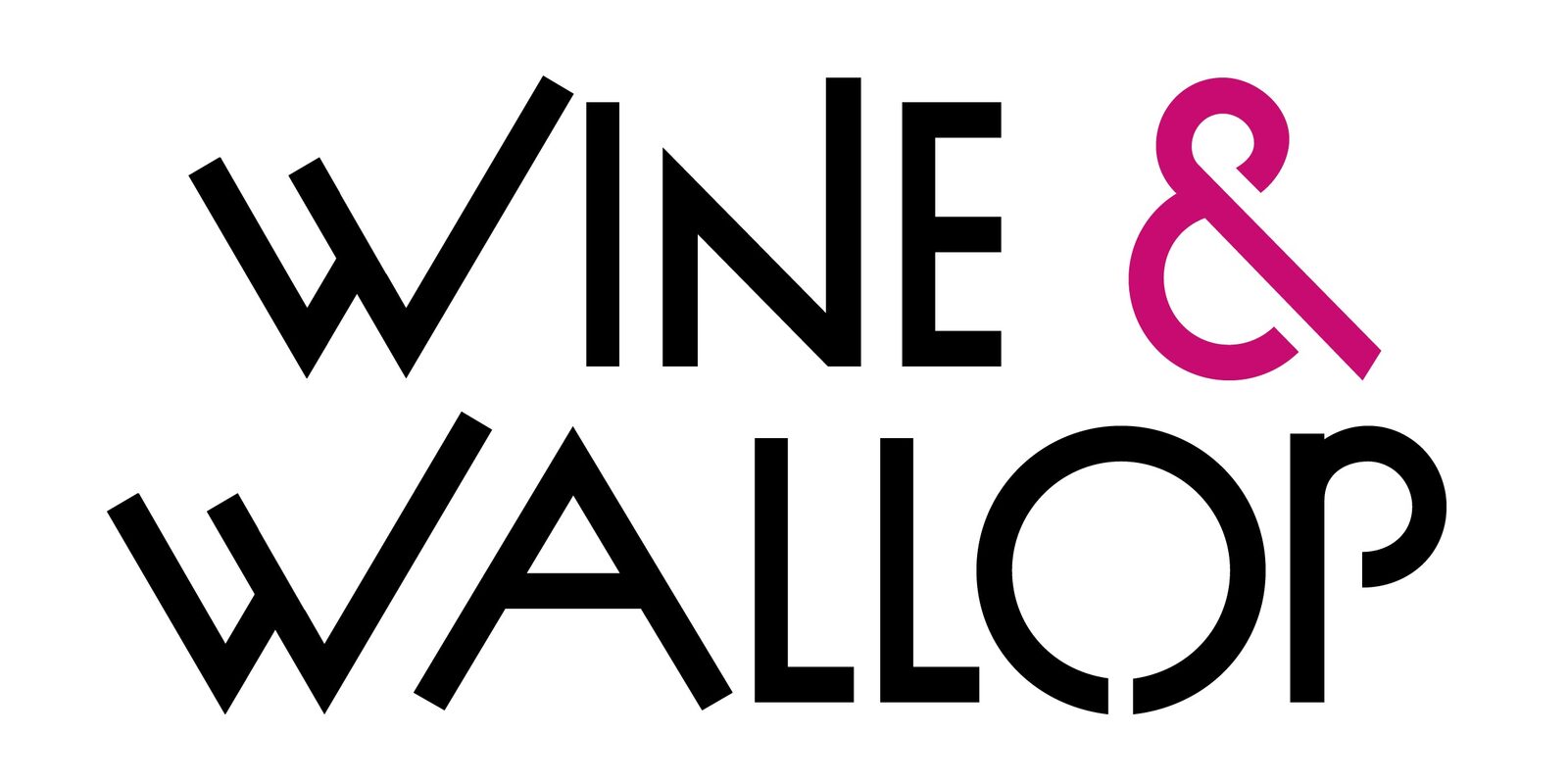
Monogram and Wordmark
A W&W monogram for the tight spots, and a horizontal wordmark with a pink ampersand doing the lifting, for the places a circle will not fit.

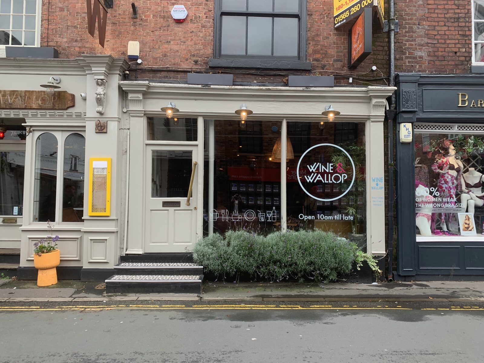
On the Street
Out in the world on the Knutsford shopfront, in the window and over the door, the same mark that scales from a badge to a whole frontage.
Questions
Can you build an identity for my place?
Yes, from a single logo through to a full set of marks, colourways and signage.
Can it grow later?
Yes. A good mark is built to stretch to new sites and new uses.
Selected Work