Category: Journal

  • Qualia

    Qualia

    Qualia, a print I made for Design Manchester, shown in the CIS Tower. It is a dense field of fine geometric line-work, overlapping grids and star shapes drawn in thin ink on white, with the title set small along the bottom: Qualia, individual instances of subjective, conscious experience. Qualia is the name of my piece, not the show.

    Qualia is a philosophy term for the raw feel of an experience, the redness of red, the particular way a thing seems to you. The drawing is an attempt at that in line, a pattern involved enough that no two people track it quite the same way. Framed up plain in black, made to hang in an office tower given over to art for the festival.
  • The Wallop mural

    The Wallop mural

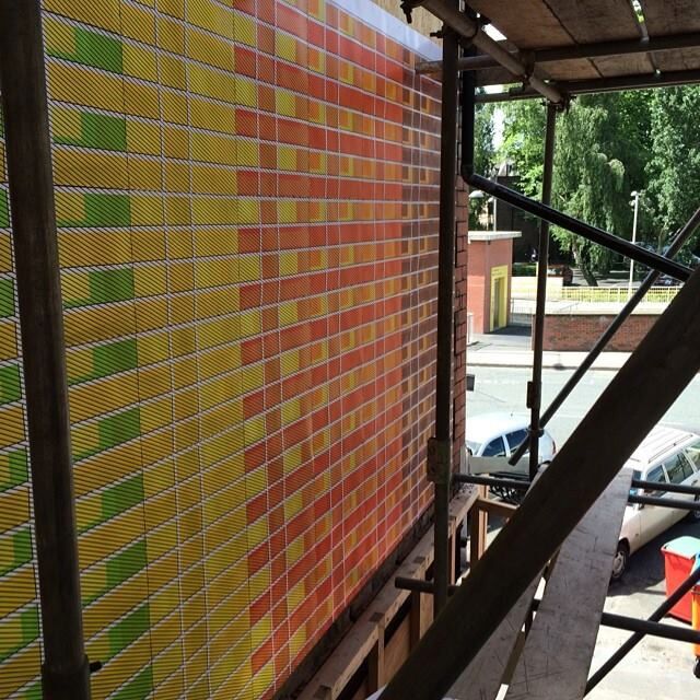
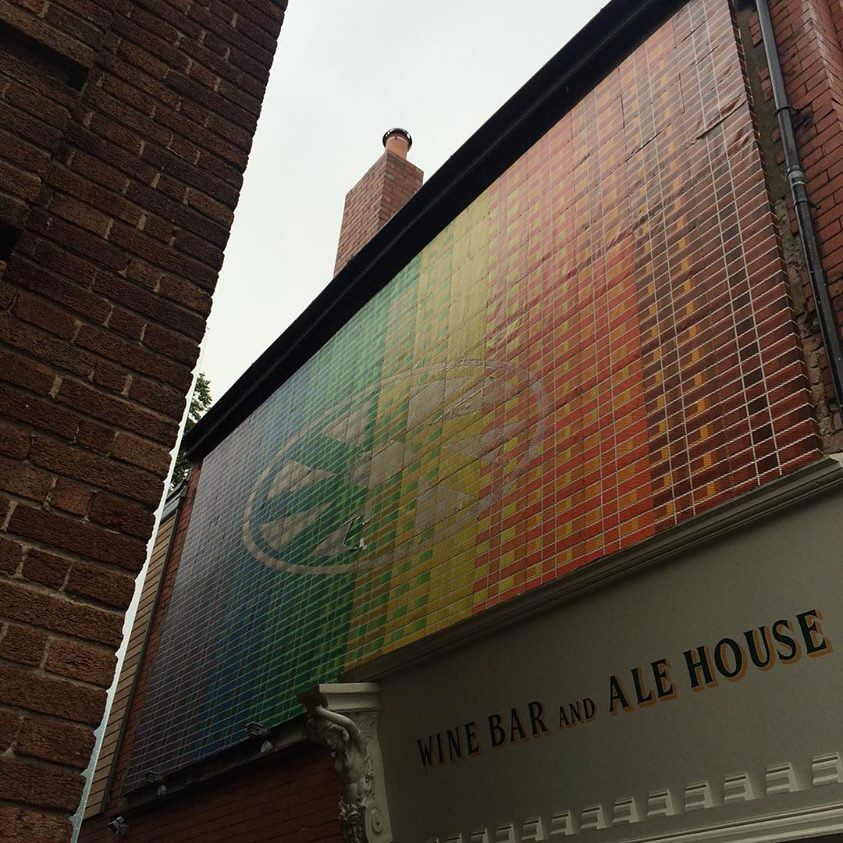
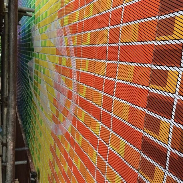
    A mural on the outside wall of Wine and Wallop, the wine bar and ale house in Didsbury. It runs the full spectrum across a woven grid of small squares, red through orange, yellow, green and blue, with a big circular burst set into the middle. I hand screen printed the whole thing and then pasted it up over the side of the building, off scaffolding.

    Working at that size changes the pattern. Up close on the scaffold it is just coloured squares and diagonal lines, but from the street it pulls together into one glowing field of colour. A good chance to take the studio geometry outdoors and put it somewhere large and public, printed by hand and stuck straight onto the wall.

    The Wallop mural, Moderate Studio journal, 2014
    The Wallop mural, Moderate Studio journal, 2014

    Part of The Pattern Works.

  • Martha

    Martha

    The first picture with Martha the hearse, driving back to Manchester after buying her in London, June 2014.

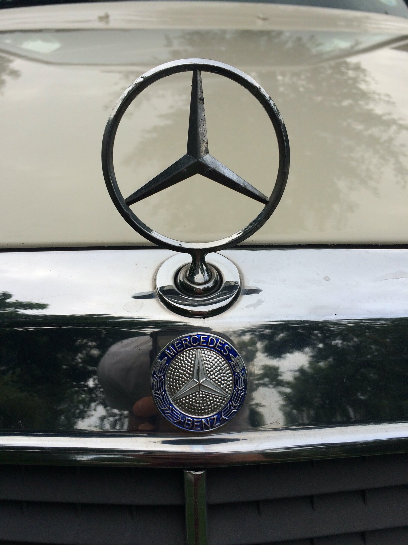
    Martha was a 1989 Mercedes hearse, cream, bought from a funeral director in London and driven back to Manchester. For eight years she was less a car than a project: a mobile studio, a gallery, a sound system, a thing that turned up.

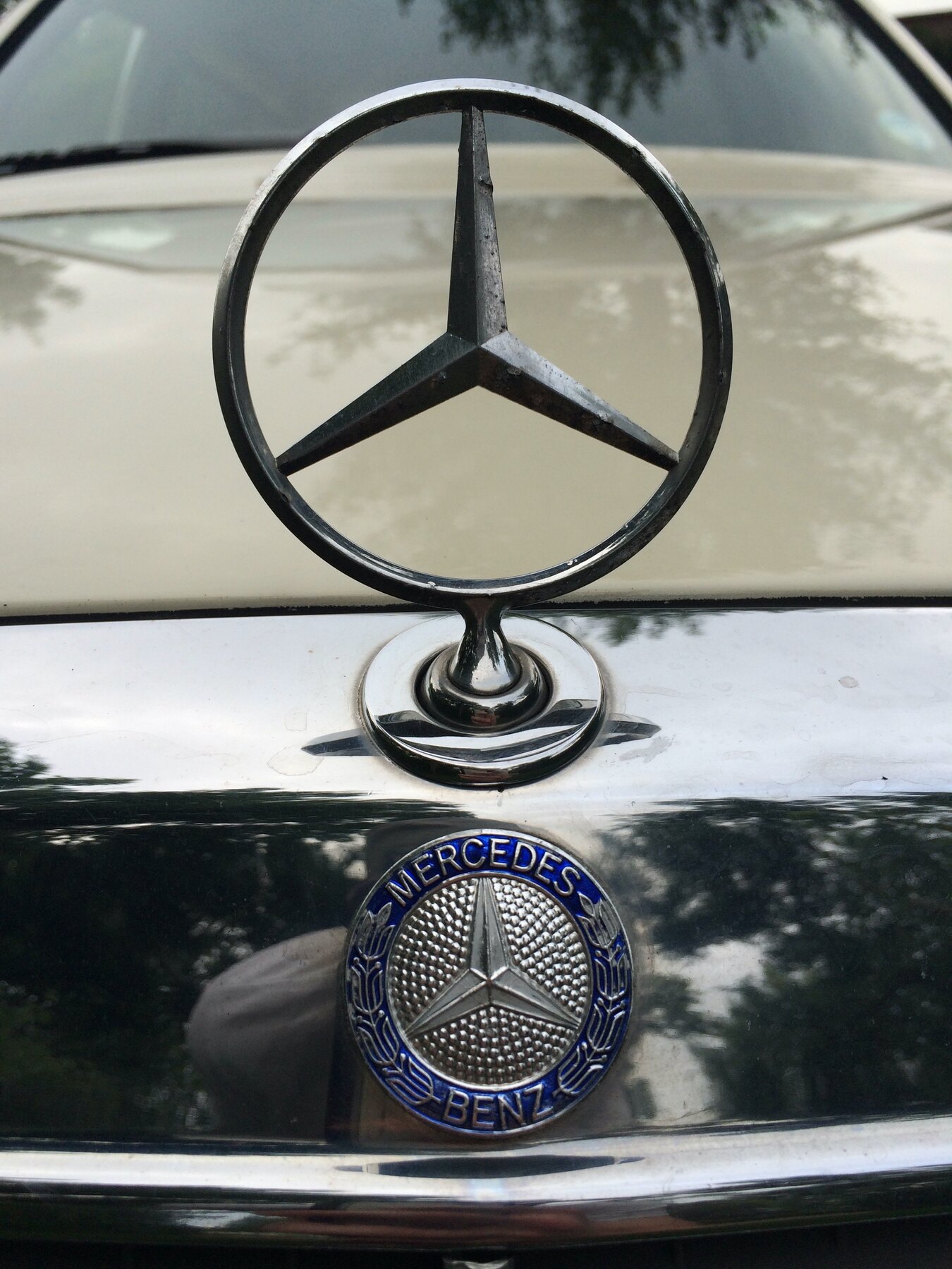
    A hearse carries all its associations with it, ceremony and endings, and putting one to ordinary use on ordinary streets was most of the point. This is her more or less as she was, the star and the badge on the bonnet, parked against a wall in the daylight.

    Martha, Moderate Studio journal, 2014
    Martha, Moderate Studio journal, 2014

    Part of the Remembering Martha case study.

  • Club Tragicana

    Club Tragicana

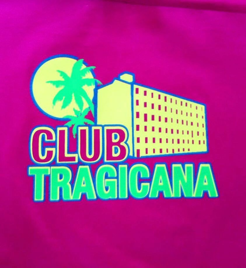
    Club Tragicana, the identity for a club night, a hot pink logo with a palm tree and a tower block where the sun should be. A play on Club Tropicana with the holiday swapped for a Salford high-rise, sunshine and concrete in the same little badge.

    Most of what I do at the Mill has a name and a look before it has anything else. Getting the joke into the logo, so the night has a face to put on a flyer, is half of putting the night on at all.

    Part of the Islington Mill case study.

  • MTK Records

    MTK Records

    The first release on MTK Records, my record label, was Dub Vampire’s Lying Motherfucker. I directed and filmed the video for it, and the promo was this: the title written across a UKIP billboard, over the politicians’ faces, on a wall in Manchester. A record about lying politicians, advertised by defacing one of their posters.

    MTK put out music I liked by people I knew, with the artwork and the videos made in-house. This first one set the tone, a dub record with a rude title and a political streak, promoted by treating a Farage poster as a blank space asking to be corrected.

  • The Little Dragon photoshoot

    The Little Dragon photoshoot

    A band photoshoot in front of the Kath Kidston on Acid fabric, with the pattern hung as a backdrop and one of the group in a skirt made from it. This was part of testing the same design as something you could photograph against and wear, not just paper a wall with.

    The pattern turns out to work hard in a picture like this, busy enough to fill the frame and hold its own behind people. A domestic homeware print, scaled up and turned into a set for a shoot, which is about as far from a tea towel as it was meant to get.

    Part of the Kath Kidston on Acid case study.

  • Jimmy Jesus

    Jimmy Jesus

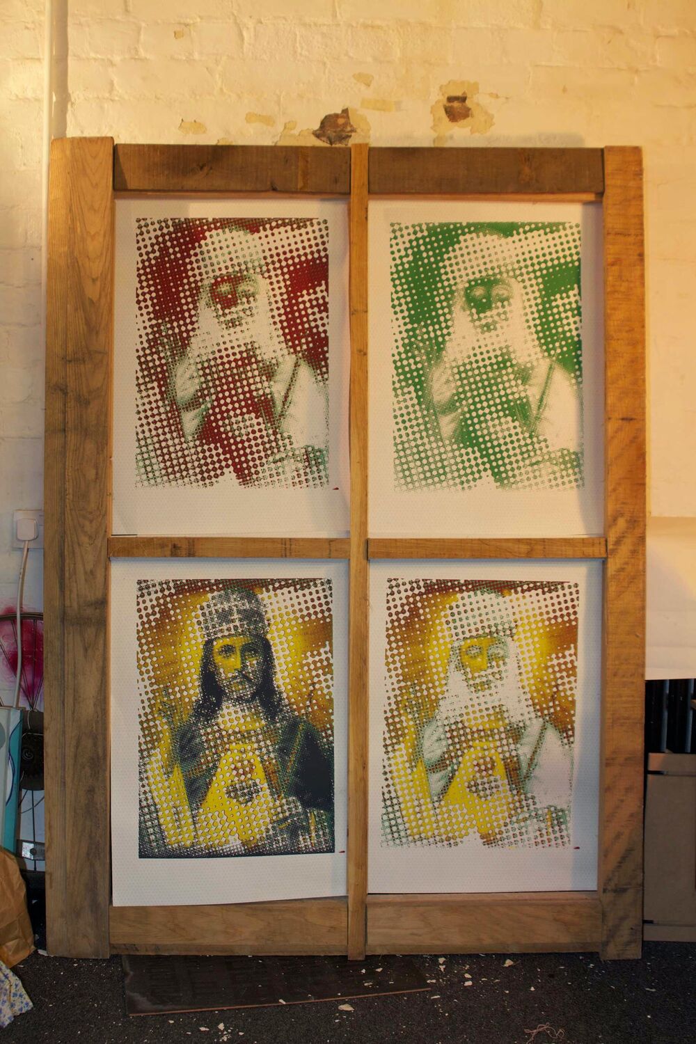
    Jimmy Jesus, a set of halftone screen prints that play one image off against another. Built from layered bitmaps, the dot pattern is set so that a portrait of Jimmy Savile, printed in green, reads instead as an image of Jesus, depending on how close you stand and how you look at it. Printed out across four colourways, red, green and gold, and hung together on a rack in the studio.

    It is a piece about how an image reads, and about the gap between how a man was seen at the time and what he turned out to be. The halftone does the work, the same field of dots resolving into two very different faces depending on where you are standing.

  • Hyper Grotto

    Hyper Grotto

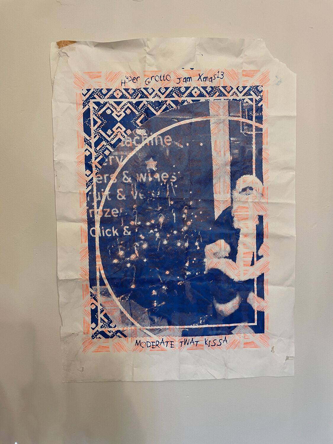
    A print from Hyper Grotto, a Christmas art jam back in 2013. A blue and white image, a figure worked into a dense patterned ground with the title and the date hand-lettered around the edge, printed up and folded and kept. One of the older things in this run, from the years when Christmas meant a jam and a print rather than a shop.

    Not much survives from a night like that except the odd sheet. This is one of them, creased and a bit foxed, which is about right for something made fast at a party more than a decade ago.

  • Kath Kidston on Acid

    Kath Kidston on Acid

    Kath Kidston on Acid, a whole range built out of a single repeating pattern. Geometric floral forms borrowed from mass-market British homeware and pushed, through scale and colour, into something louder and more disorienting. The name is a play on Cath Kidston, whose things my mum used to buy.

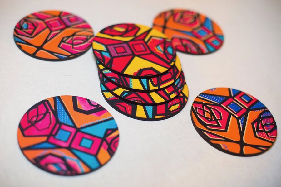
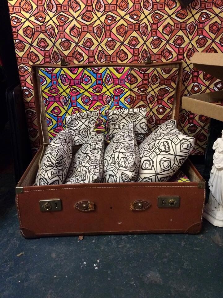
    Here it is as a Christmas display: the pattern as wallpaper behind a white tree, coasters, printed baubles packed in a case. The point was to test whether one design could hold together across clocks, fabric, wallpaper and the rest, and still read as the same idea in every format.

    Kath Kidston on Acid, Moderate Studio journal, 2013
    Kath Kidston on Acid, Moderate Studio journal, 2013

    Part of the Kath Kidston on Acid case study.

  • A Westwood suit in a field

    A Westwood suit in a field

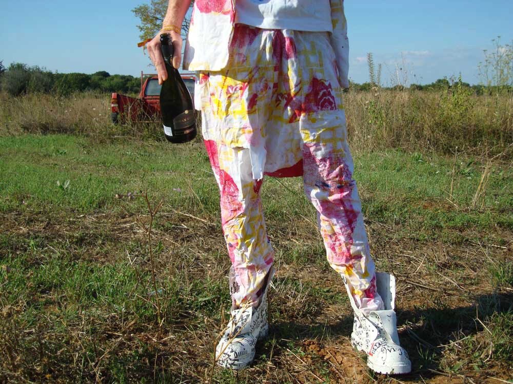
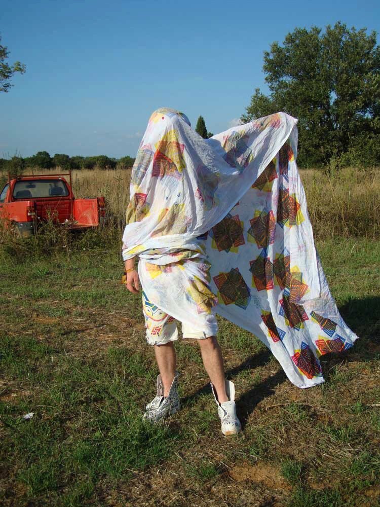
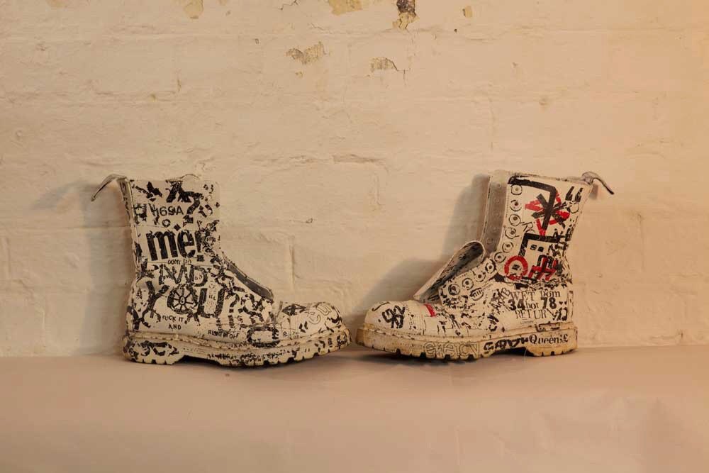
    The first Vivienne Westwood thing I made was a set of clothes. A floral two-piece and a pair of boots covered in hand-drawn scribble, worn out into a field in Croatia and photographed against the dry grass and a parked car.

    This was August, out at Outlook Festival. Tailoring and pattern worn as an argument rather than a costume, less about copying her than borrowing the attitude.

    A test of an idea that would come back three years later as a room full of prints.

    A Westwood suit in a field, Moderate Studio journal, 2013
    A Westwood suit in a field, Moderate Studio journal, 2013

    Part of the Vivienne Westwood case study.