Author: Jermyn

  • A Moderate Realism commission

    A Moderate Realism commission

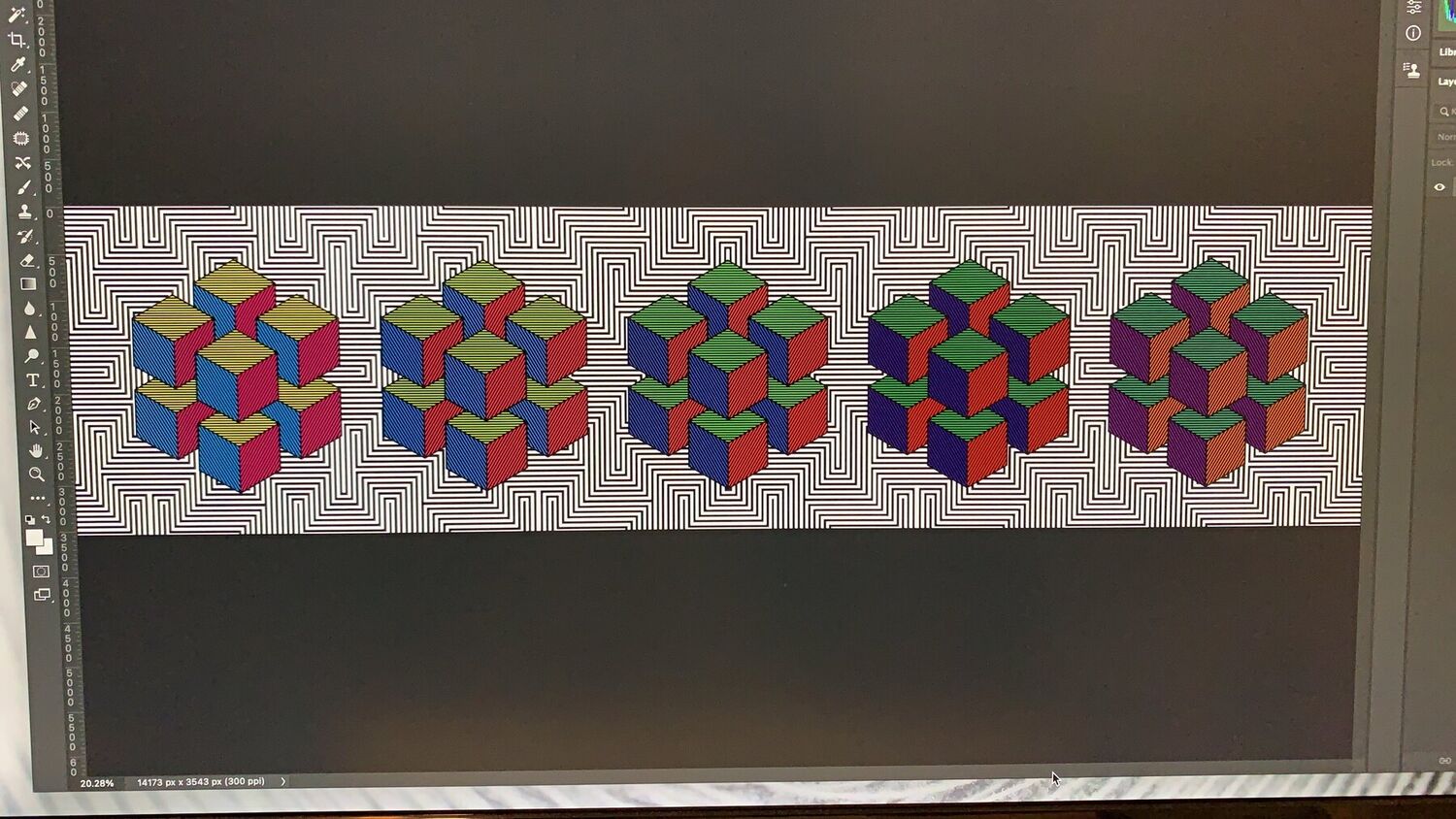
    The back of the board is the point of it. The front sells advertising, and that pays for artists to show work on the back and for community groups to use it, rotating through rather than fixed. The first piece was a commission for Moderate Realism, my own art practice, to fill it.

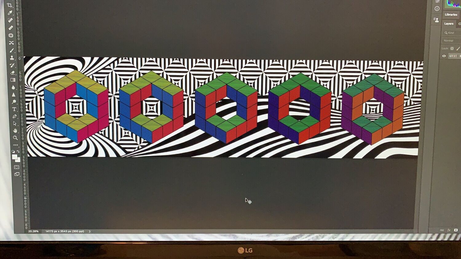
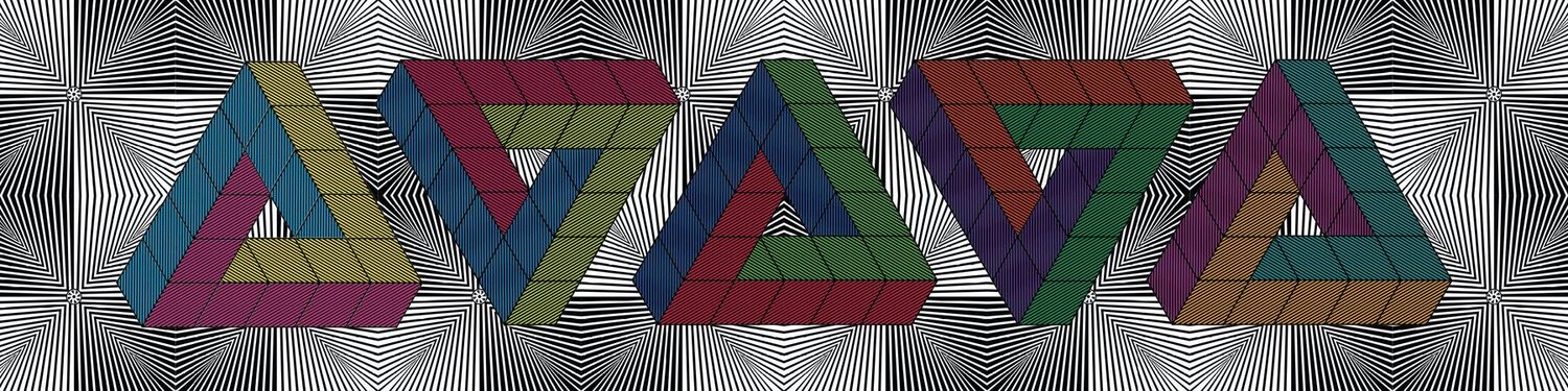
    I worked through a run of geometric designs, op-art hexagons and cubes and black-and-white swirls, before settling on a row of interlocking impossible triangles in red, blue, green and purple. Something for the street to look at that is not trying to sell it anything.
    A Moderate Realism commission, Moderate Studio journal, 2021
    A Moderate Realism commission, Moderate Studio journal, 2021

    Part of the Artvert case study.

  • Out around Manchester

    Out around Manchester

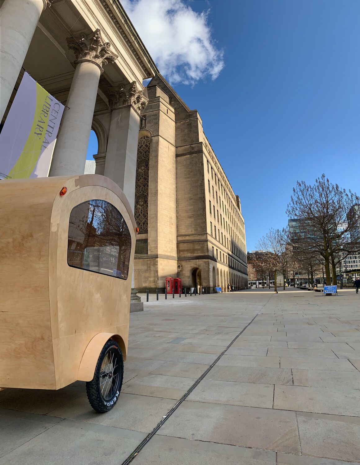
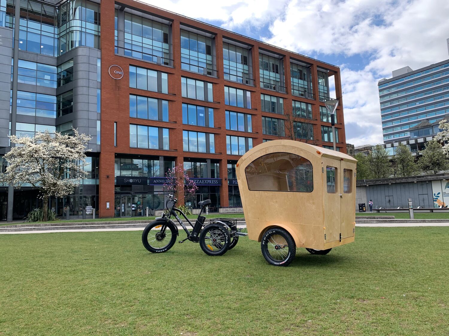
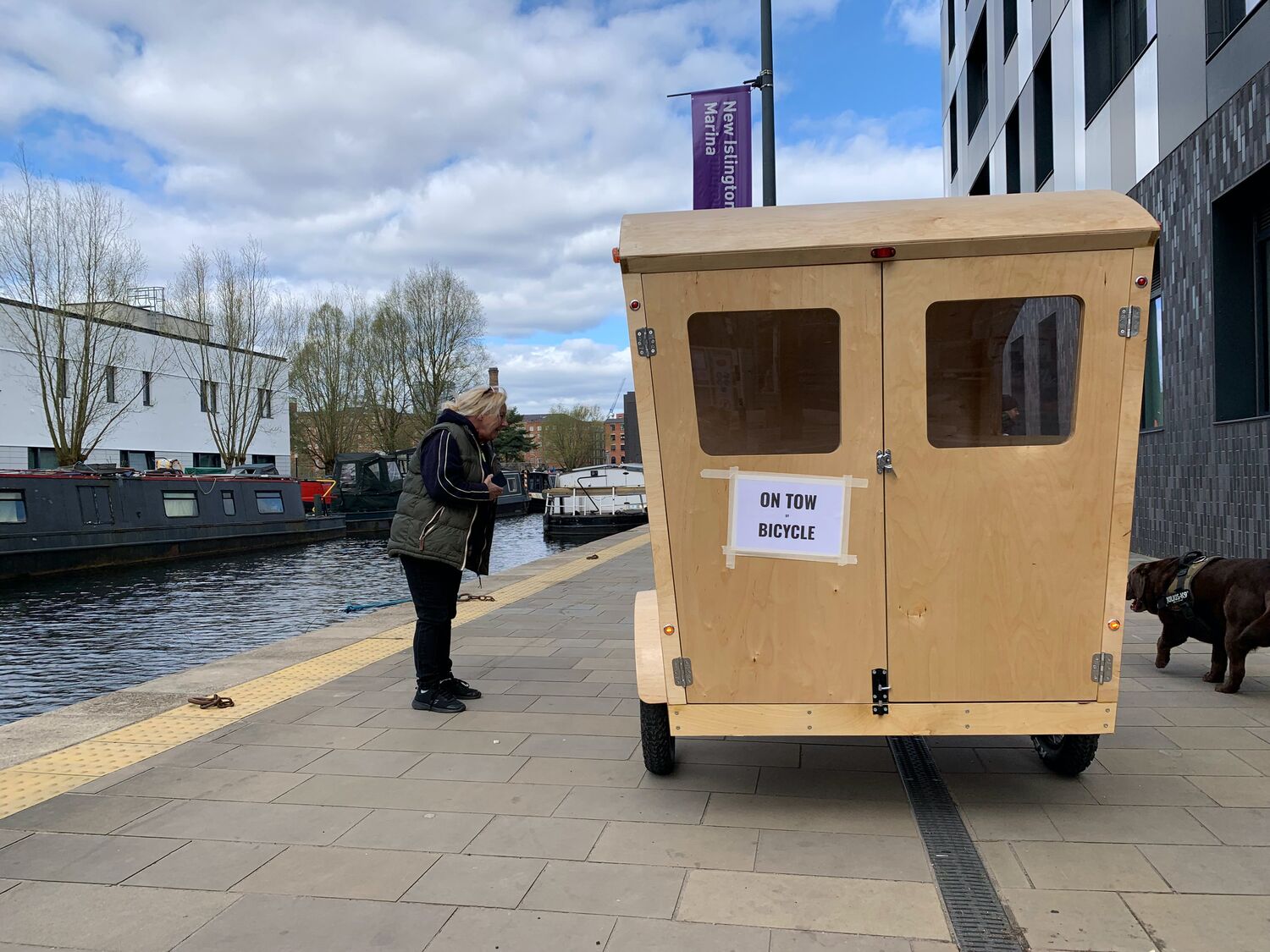
    The M-Wagon out around central Manchester, photographed against the places it was made for: Manchester Central, St Peter’s Square, the canals and the tower blocks. A little plywood cabin parked in front of the big civic backdrops it was built to move between.

    This is the M-Wagon doing its actual job, being a thing that turns up. A meeting room you can wheel to a spot in the city, open the doors on, and use, then hitch back up and take somewhere else the next day.

    Out around Manchester, Moderate Studio journal, 2021
    Out around Manchester, Moderate Studio journal, 2021

    Part of the M-Wagon case study.

  • Testing the M-Wagon

    Testing the M-Wagon

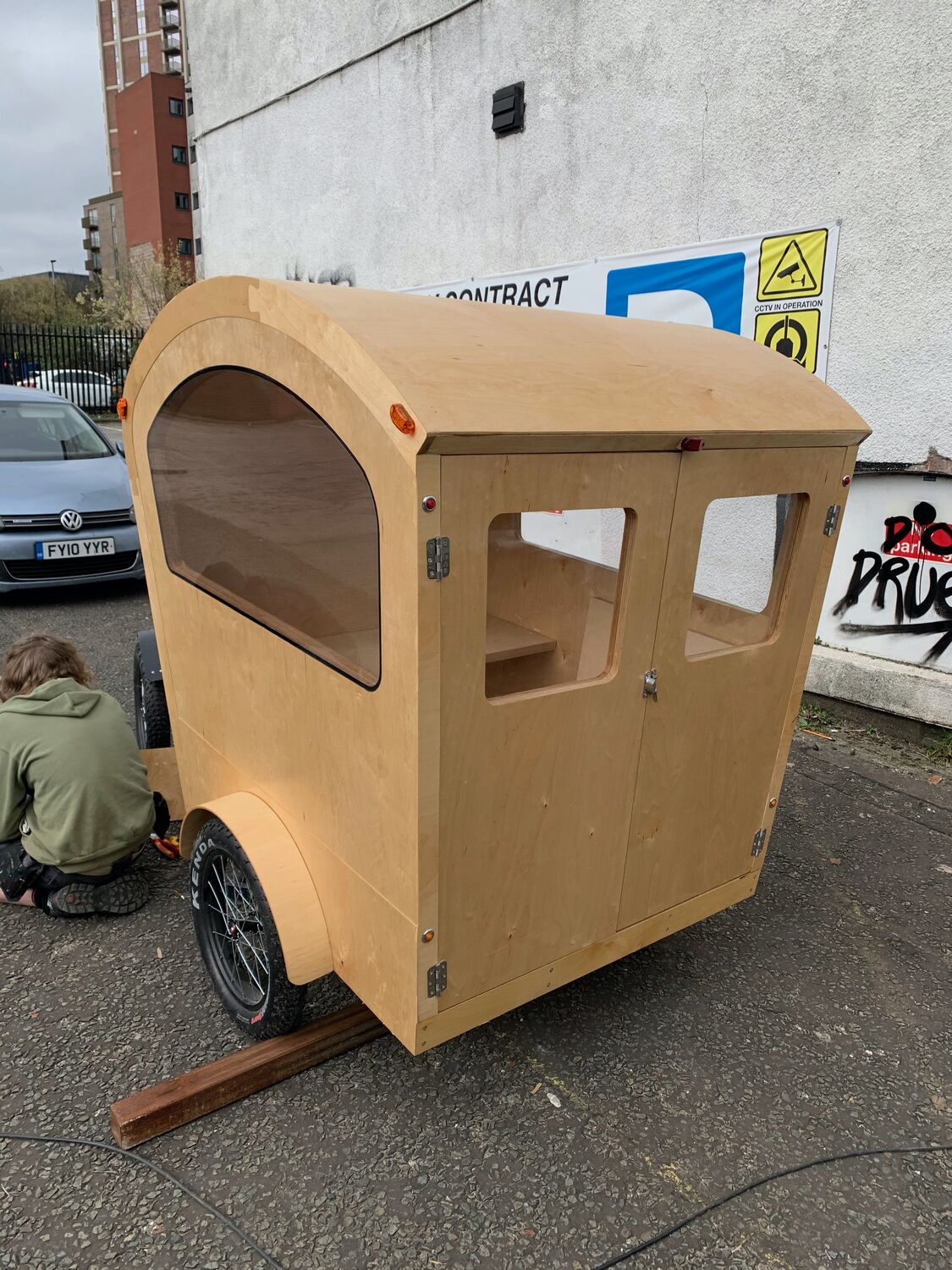
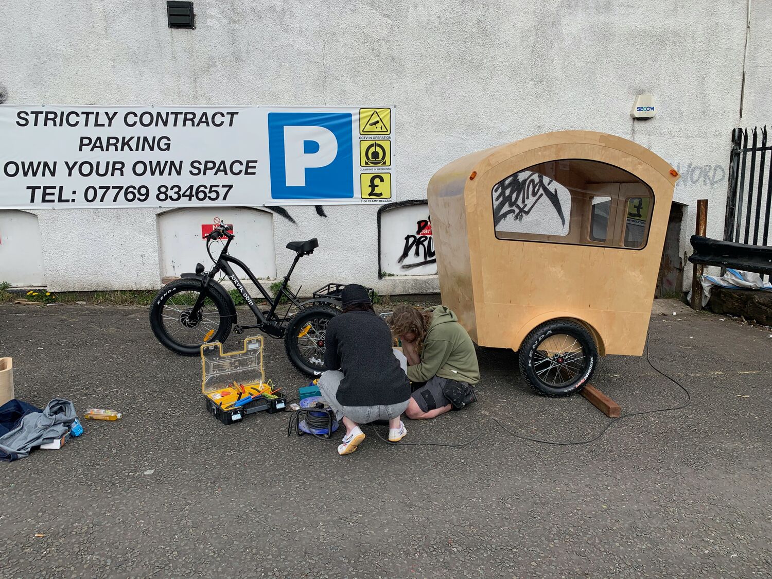
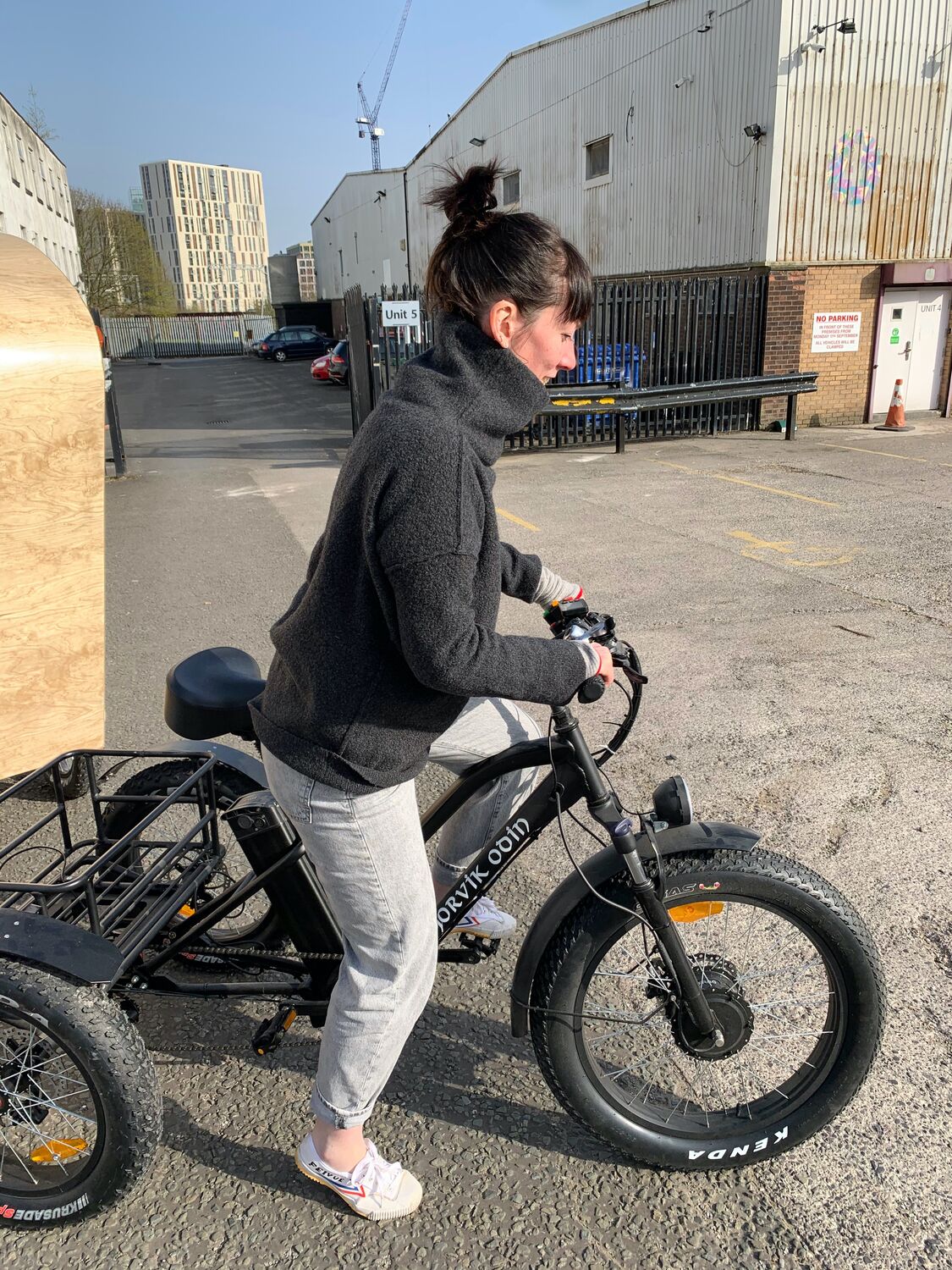
    Testing the M-Wagon out in a car park, hitching the cabin to the electric trike and seeing how it rode. The first proper go at moving it under power, wheels and trailer sorted out on the ground before taking it any further.

    It is one thing to build a cabin that looks the part in a studio and another to tow it down a real road with a real corner in it. This was the day of finding out that it worked, that you could sit on the trike and pull a small plywood room along behind you.

    Testing the M-Wagon, Moderate Studio journal, 2021
    Testing the M-Wagon, Moderate Studio journal, 2021

    Part of the M-Wagon case study.

  • Printing the twenties

    Printing the twenties

    Printing the notes properly in March 2021. The Saint Sebastian figure in yellow and purple, run onto real twenties, a few to a sheet. Screen-printing onto money is a fiddly business: the notes are small and slippery and worth twenty pounds each before you have so much as touched them, so every misprint costs you actual currency.

    Marked #covid19, the finished notes carry the whole idea in one object. A Renaissance martyr, a modern hashtag, and legal tender you have quietly defaced. Care and endurance printed onto the exact thing the pandemic had made everyone count.

    Printing the twenties, Moderate Studio journal, 2021
    Printing the twenties, Moderate Studio journal, 2021

    Part of the COVID: £20 Notes case study.

  • Brexit

    Brexit

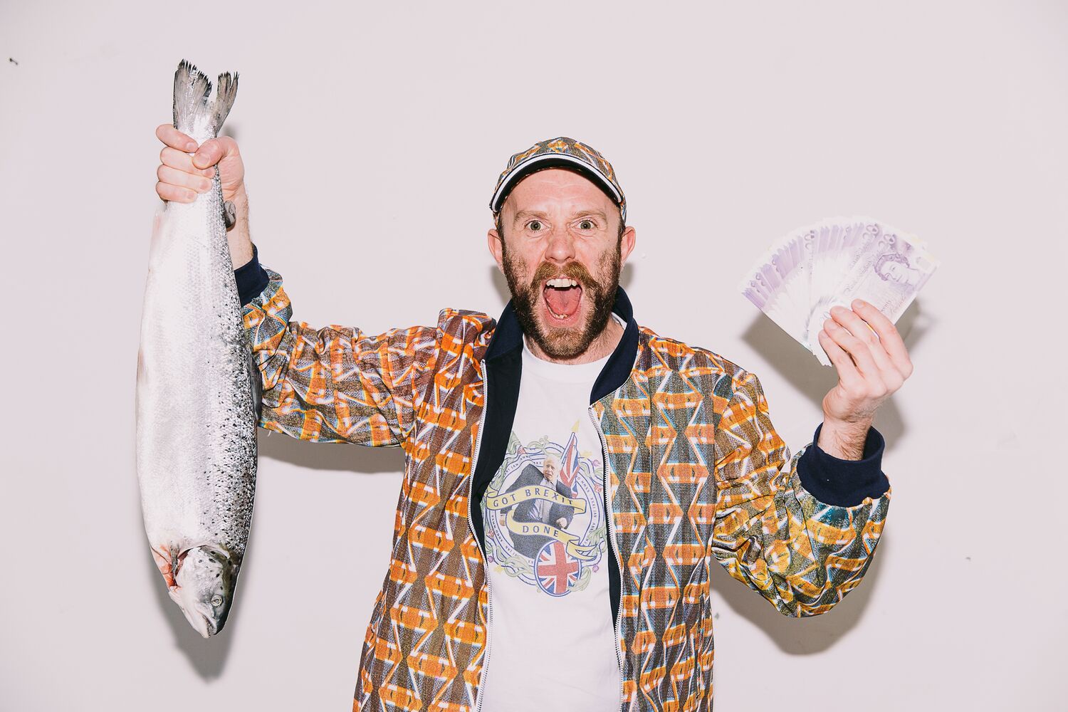
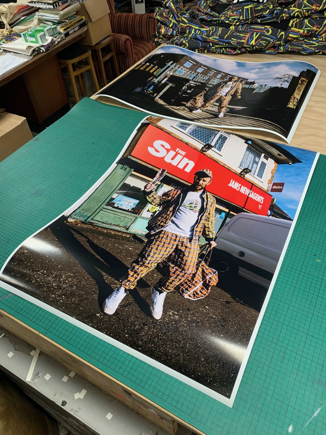
    The Brexit series in the studio. Me in the tracksuit holding a salmon on a plain white ground, then the same set-up with a fist of twenty-pound notes, then a print of it laid over a copy of The Sun. A fish, some cash and a tabloid, which between them cover a fair bit of what the whole argument seemed to run on.

    The tracksuit does the work. Worn straight and photographed straight, no slogan and no placard, it leaves you to decide whether it is patriotic, satirical or just a loud bit of sportswear. That was the point: to perform the symbols rather than argue with them, and see what came back.

    Brexit, Moderate Studio journal, 2021
    Brexit, Moderate Studio journal, 2021

    Part of the Brexit case study.

  • Remnants

    Remnants

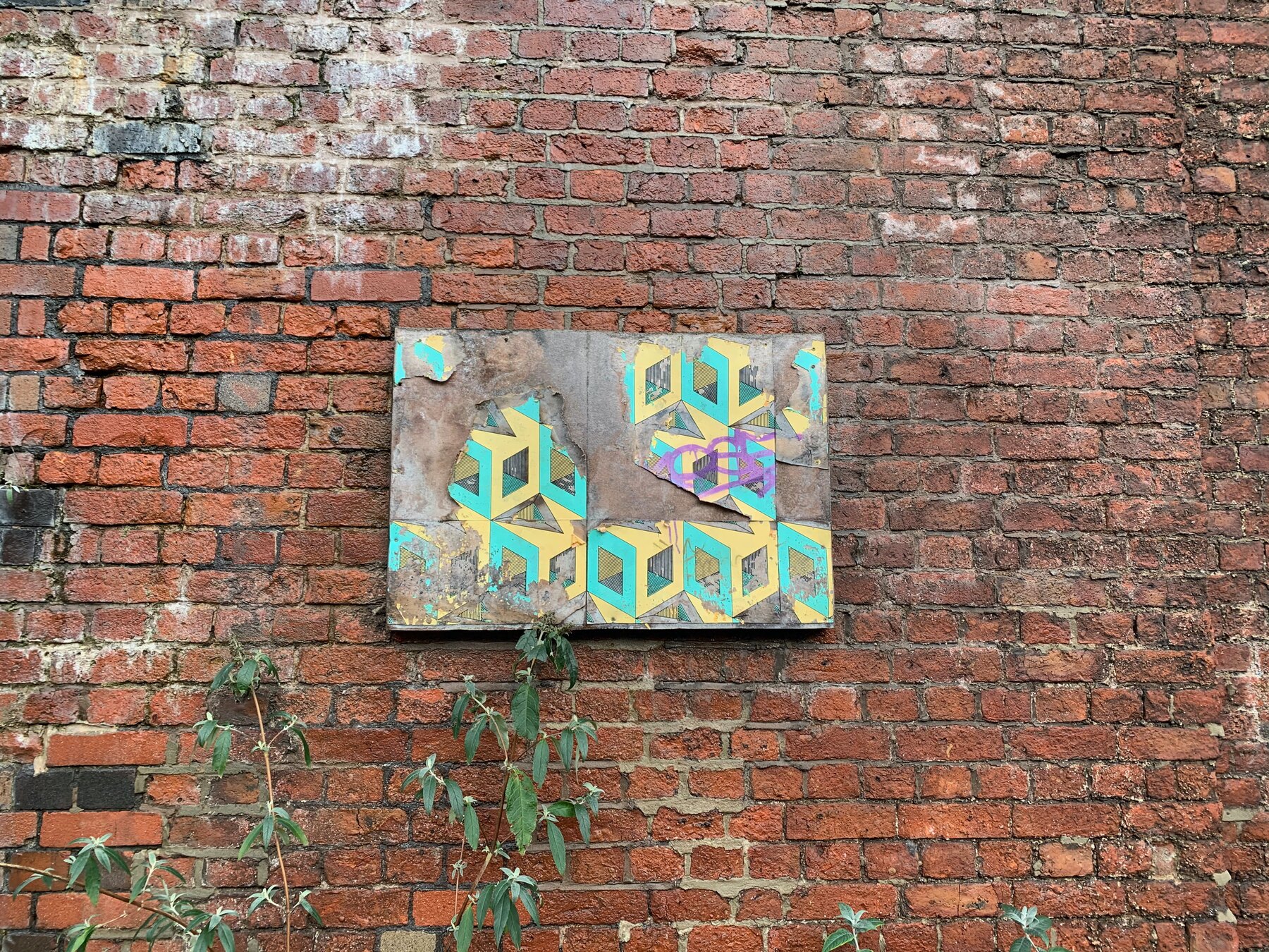
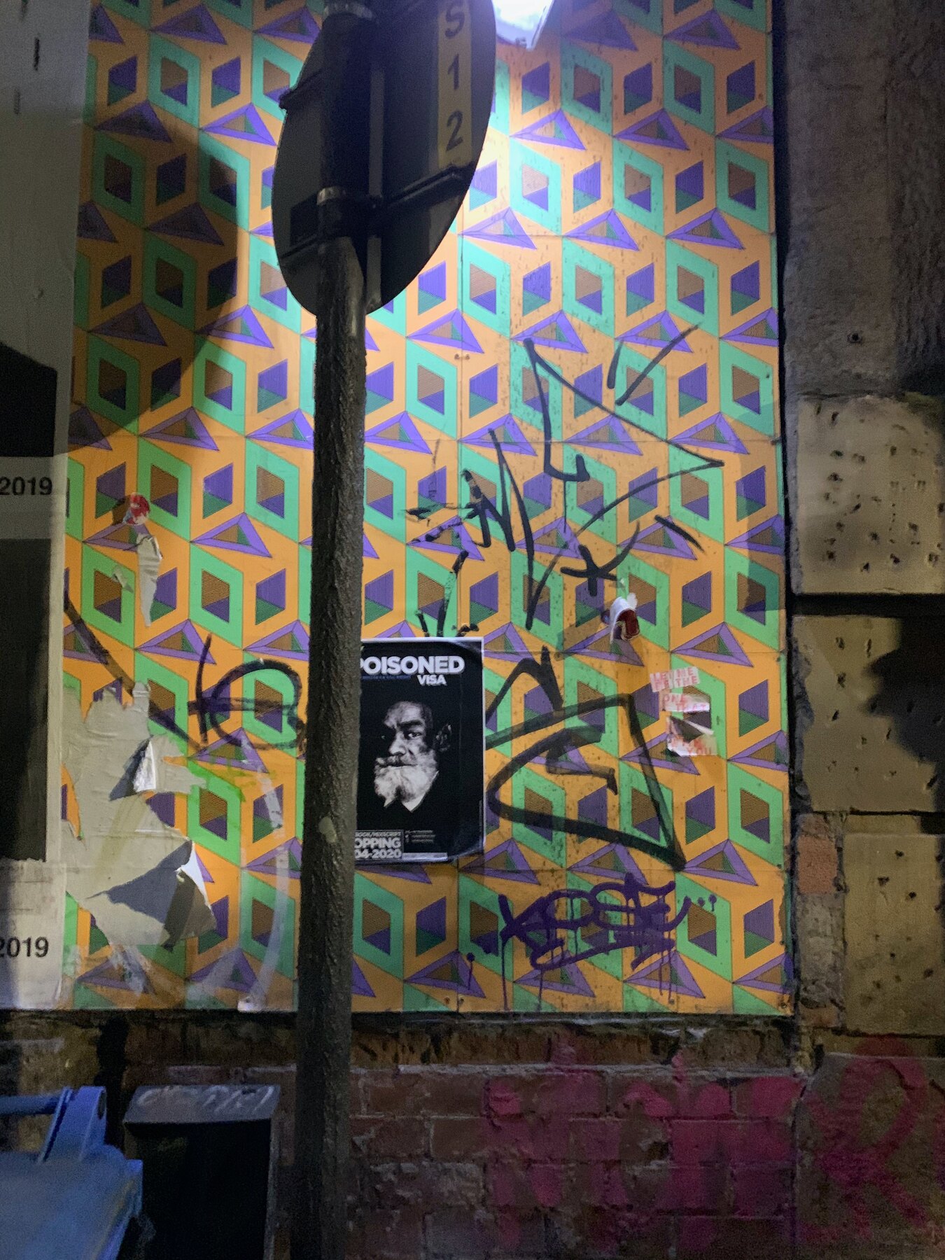
    Found some of the 2016 campaign still clinging on. A weathered board of the green pattern on a bare brick wall, ivy coming through; another survivor in a back alley under a streetlight, graffiti layered over and around it.

    Four and a half years of Manchester weather and paste-overs, and the geometry still reads.

    Street work is supposed to be temporary. Some of it never got the memo.

    Remnants, Moderate Studio journal, 2021

    Part of The Palace Is a Refuge.

  • Branding Levenshulme

    Branding Levenshulme

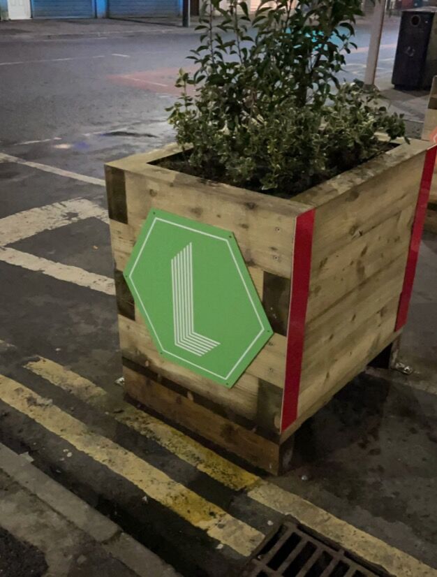
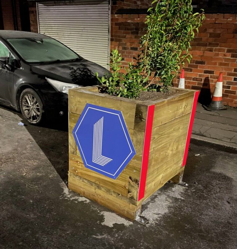
    A place-branding design for Levenshulme, the Manchester neighbourhood, done for the council. The mark is a single L built into a hexagon, clean and modern, tried out on the wooden street planters around the area in green and blue. A logo for a place rather than a product, meant to belong to the whole district.

    Branding somewhere you know is a careful job. It has to feel like it grew out of the place rather than being stuck onto it, plain enough to sit on a planter or a sign without shouting. This one was for the council and in the end it got shelved, which is how a fair bit of place-branding goes. The mark still stands up on its own, an L in a hexagon, whether or not it ever went official.

    Branding Levenshulme, Moderate Studio journal, 2021
    Branding Levenshulme, Moderate Studio journal, 2021
  • Taking on the board

    Taking on the board

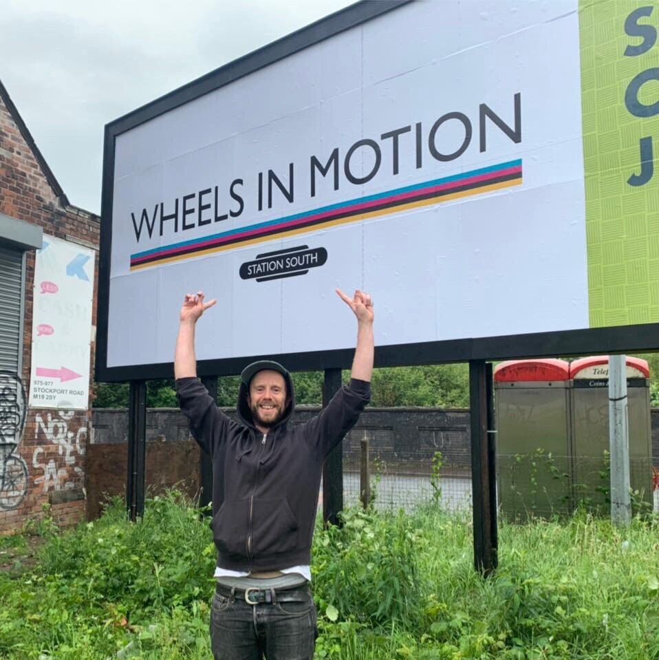
    The board was already on the site when we took Station South on. An old advertising hoarding that had stood in the field for years, taken over rather than built. This is it carrying an advert again, Wheels in Motion across the front, a paying customer on a billboard with a new purpose.

    That is the whole idea of Artvert in one photograph: a board selling advertising space on the front to pay for the art and the community work that go on the back, and to help fund the station behind it. Worth standing in front of with your arms in the air.

    Part of the Artvert case study.
  • The Monica Grove room

    The Monica Grove room

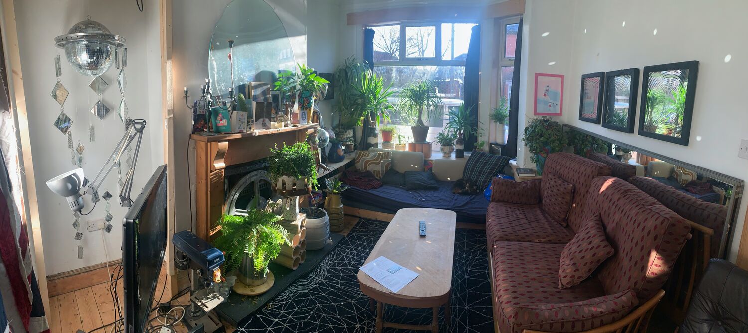
    The living room at Monica Grove, which is about as full a picture of how I live with the work as any. A mirror ball and a cluster of etched mirror offcuts on one wall, a big oval mirror over the fireplace, framed prints in a row, a jungle of plants along the window, an old microscope, a patterned rug, everything catching the low winter sun.

    A room like this is not staged, it is just accumulated: years of making and finding and keeping, all landed in one space and left to get on with it. The work does not live on a white wall somewhere else, it lives here, in among the plants and the light and the day-to-day, which is where I think it is happiest.

  • Drawing on money

    Drawing on money

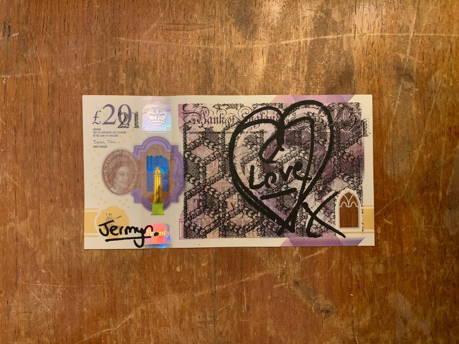
    Working out the twenty-pound note piece at the end of 2020. A real Bank of England twenty with a heart drawn over it and the word love, and the first go at the other design, a figure from Gerrit van Honthorst’s Saint Sebastian printed straight onto the note. Trying it by hand before committing anything to a print run.

    Two readings of what the year had left, put onto the one thing everybody had been anxious about and short of at once. A heart for the care and a martyr for the endurance, both onto money, because money was where so much of the fear had settled.

    Drawing on money, Moderate Studio journal, 2020

    Part of the COVID: £20 Notes case study.