
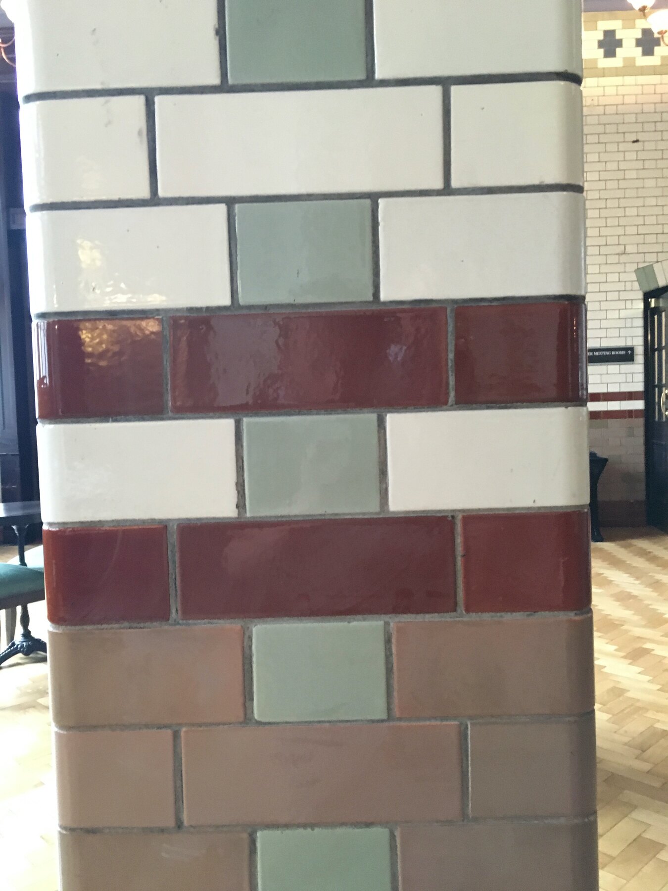
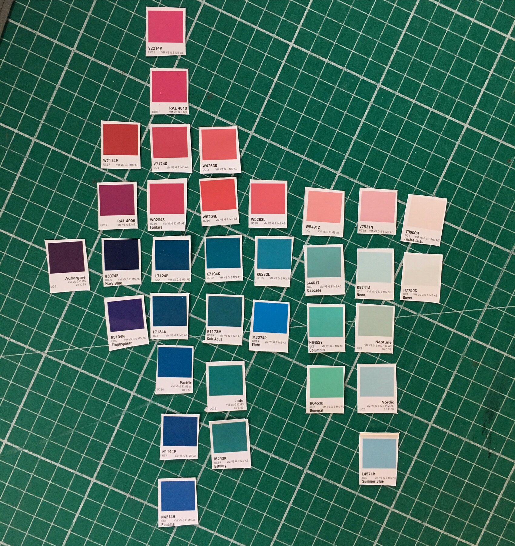
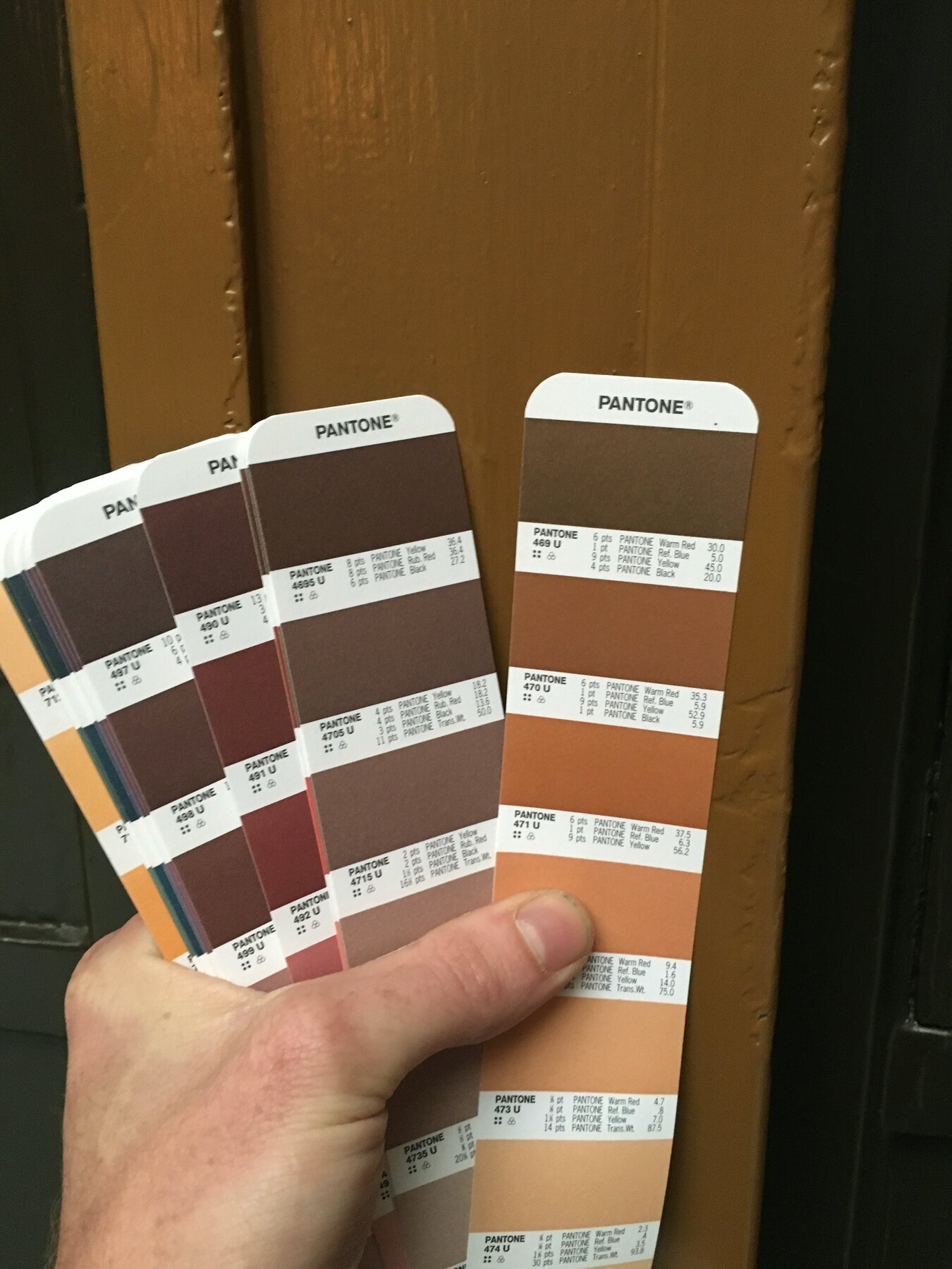
Two days with Pantone books at the Palace, then a cutting mat full of swatches back at the studio. Colours held against terracotta, glazed tiles, marble, oak. Some fall straight out. Others sit right.
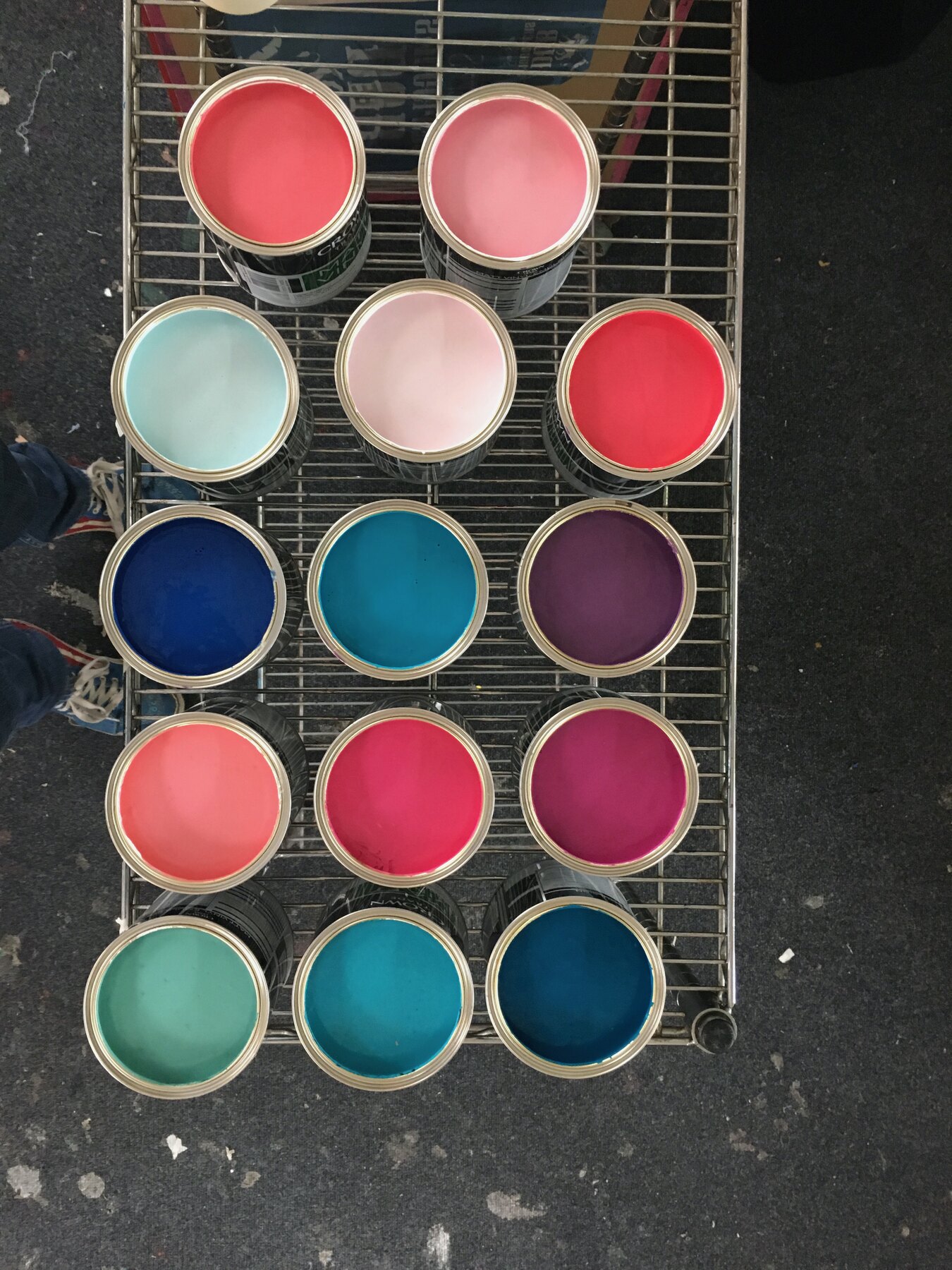
Paint mixed and lined up on the rack: pinks, teals, deep blues, a plum. The palette has to hold its own inside an interior that ornate without shouting at it. Swatch grids taped down, crossed out, rearranged.
Slow, unglamorous work that decides everything that follows.
Part of The Palace Hotel Commission.