
Brand identity
Wine & Wallop
A brand identity for the Wine & Wallop bars in Didsbury, Prestwich and Knutsford, made in 2022. A round logo that works like a stamp, built out into a colour for each bar, a monogram and a wordmark, so it holds up on a window, a menu, a pump clip or a beer mat.
The Brief
I have worked with Justin, who owns Wine & Wallop, on creative projects for quite a few years. Touring the venues, it was clear there was no coherent brand. Logos from different eras were in use at once: one on the outside of a building, another on the menus, another on social media. So I wrote a brief and started building one.
The Roundel
The core mark: WINE & WALLOP set in a clean circle, a stamp you can drop anywhere. A circle works at both ends of the scale. It reads as a tiny social avatar and as a large logo across a window. Drawn to sit in any single colour, so it runs in teal, pink, yellow or plain black outline depending on where it lands.
A Colour for Each Bar
The colours were already there. Each venue carries a lot of colour, and so did much of the artwork and branding used before. I went back through the old work, pulled those colours out, and gave one to each bar: pink for Didsbury, teal for Prestwich, yellow for Knutsford. One mark, three bars, each with its own.
Monogram and Wordmark
A W&W monogram for the tight spots, and a horizontal wordmark with a pink ampersand doing the lifting, for the places a circle will not fit.
On the Street
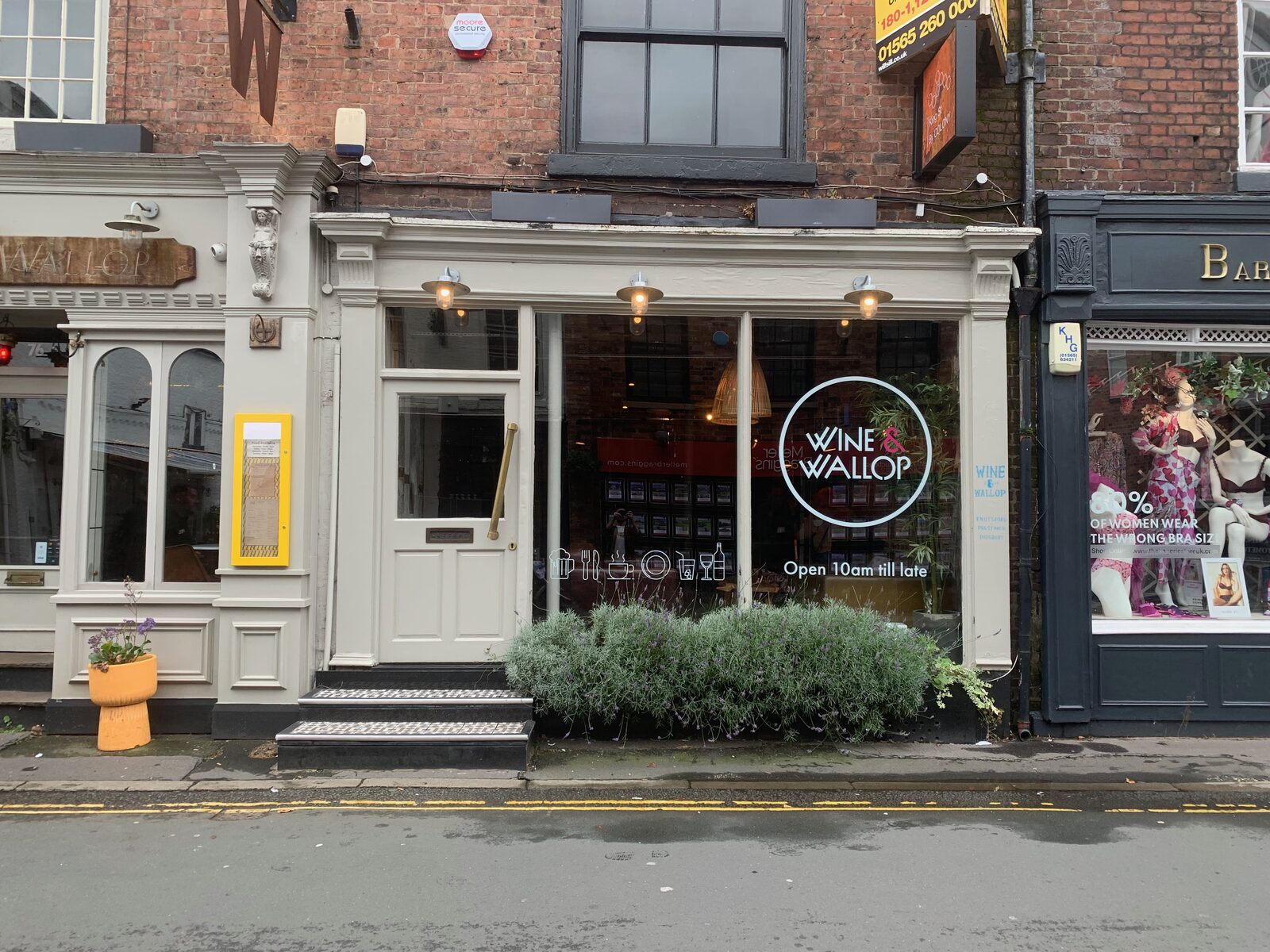
The identity went up across all three venues, from the shopfronts down to the beer mats and t-shirts. Knutsford shows it at full size, in the window and over the door, the same mark that scales from a badge to a whole frontage.
Questions
Who designed the Wine & Wallop logo?
Mark Jermyn at Moderate Studio, in 2022, as part of a full identity for the three bars.
What colours are the Wine & Wallop bars?
Each bar has its own: pink for Didsbury, teal for Prestwich, yellow for Knutsford, with black as the constant.
Can you build an identity for my place?
Yes, from a single logo through to a full set of marks, colourways and signage.
Can it grow later?
Yes. A good mark is built to stretch to new sites and new uses.
Selected Work