Author: Jermyn

  • A run of printed cloth

    A run of printed cloth

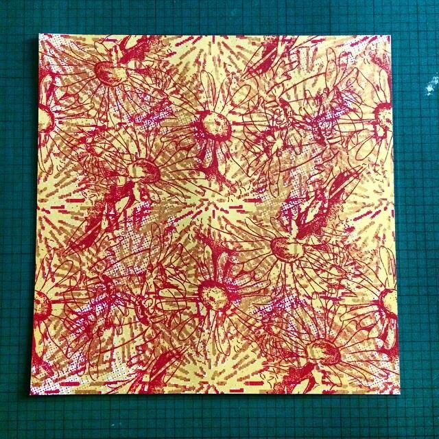
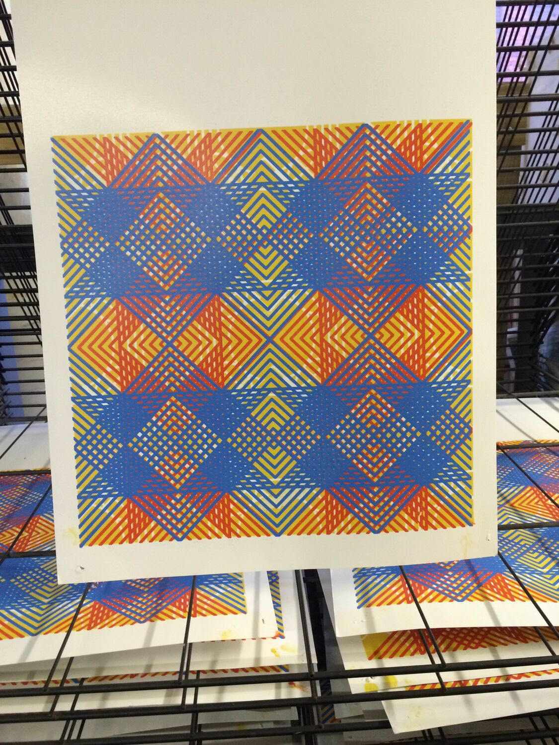
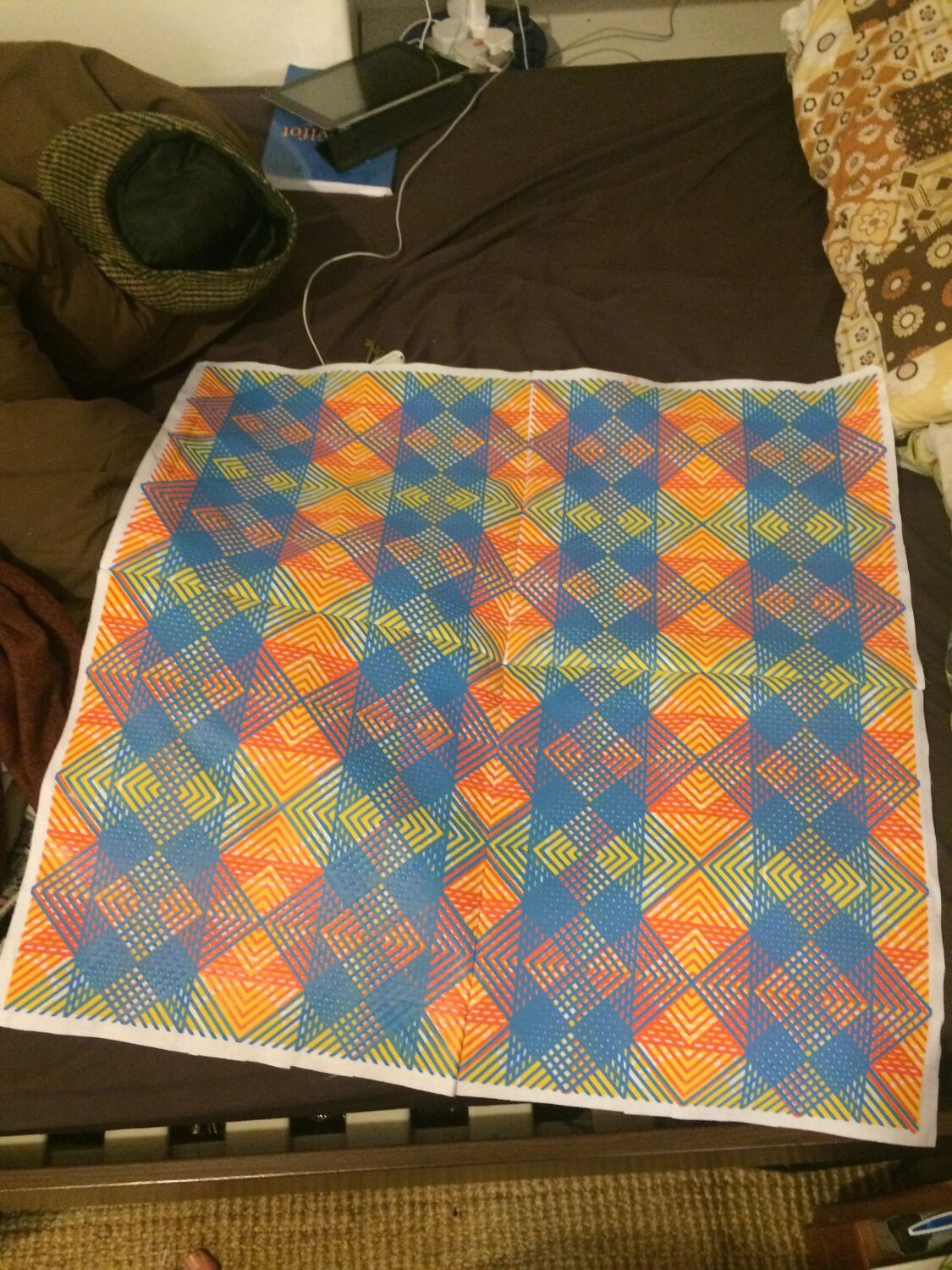
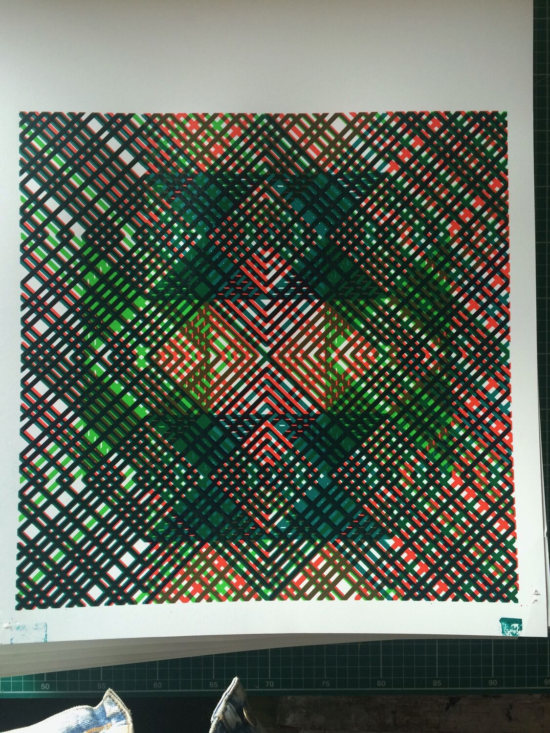
    A run of hand-printed fabric and wallpaper from the studio, all the interlocking geometric patterns I was working through at the time, printed up in different colourways and combinations. Blue and orange diamonds, red and green grids, the same repeat reading completely differently depending on which inks went down and in which order.

    Most of these were samples and one-offs, printed to see what a pattern did at length across cloth rather than on a single sheet. Some became wallpaper, some fabric, some just things to have around the studio. This is the everyday work underneath the named commissions, the constant printing that kept the patterns moving on.
    A run of printed cloth, Moderate Studio journal, 2015
    A run of printed cloth, Moderate Studio journal, 2015

    Part of The Pattern Works.
  • Clothes from the offcuts

    Clothes from the offcuts

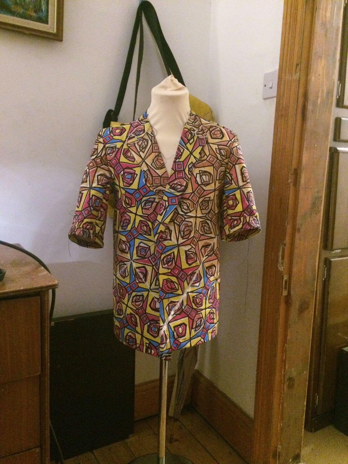
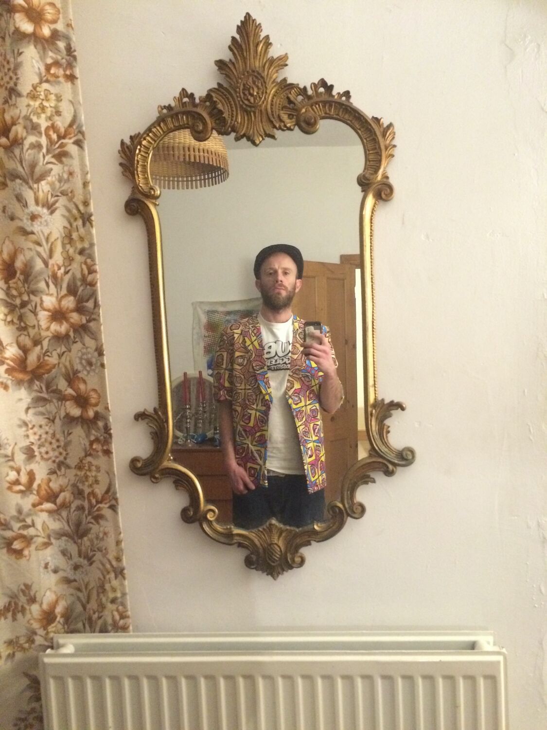
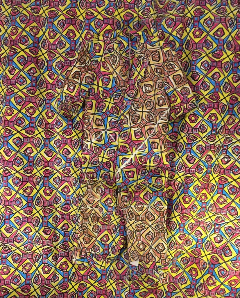
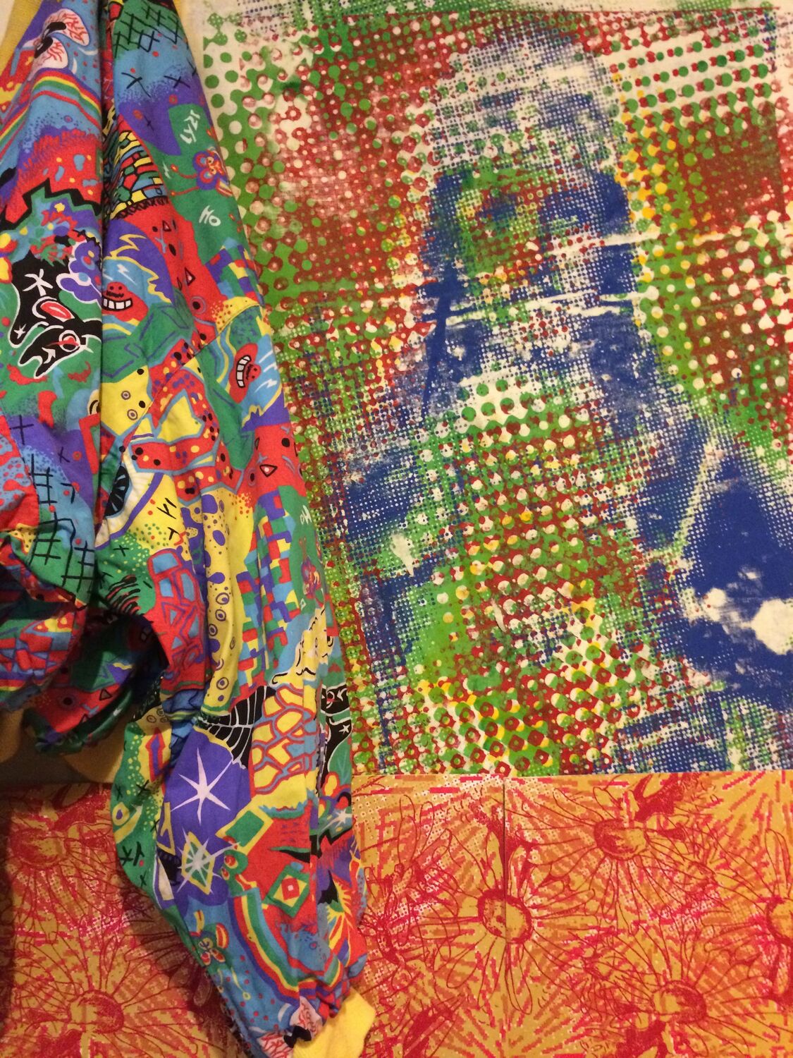
    Clothes made from the leftover Kath Kidston on Acid fabric. A shirt and jacket run up from the offcuts, here on a stand and then on, the same disorienting floral now cut as something to wear rather than hang.

    Later in the year the fabric turned up again as a full set, curtains and shirts and the jacket together. It was the same test as the products: one pattern, as many formats as it could stand, from wallpaper to a coaster to a jacket, and still holding as one thing.

    Clothes from the offcuts, Moderate Studio journal, 2015
    Clothes from the offcuts, Moderate Studio journal, 2015

    Part of the Kath Kidston on Acid case study.

  • The large-format side

    The large-format side

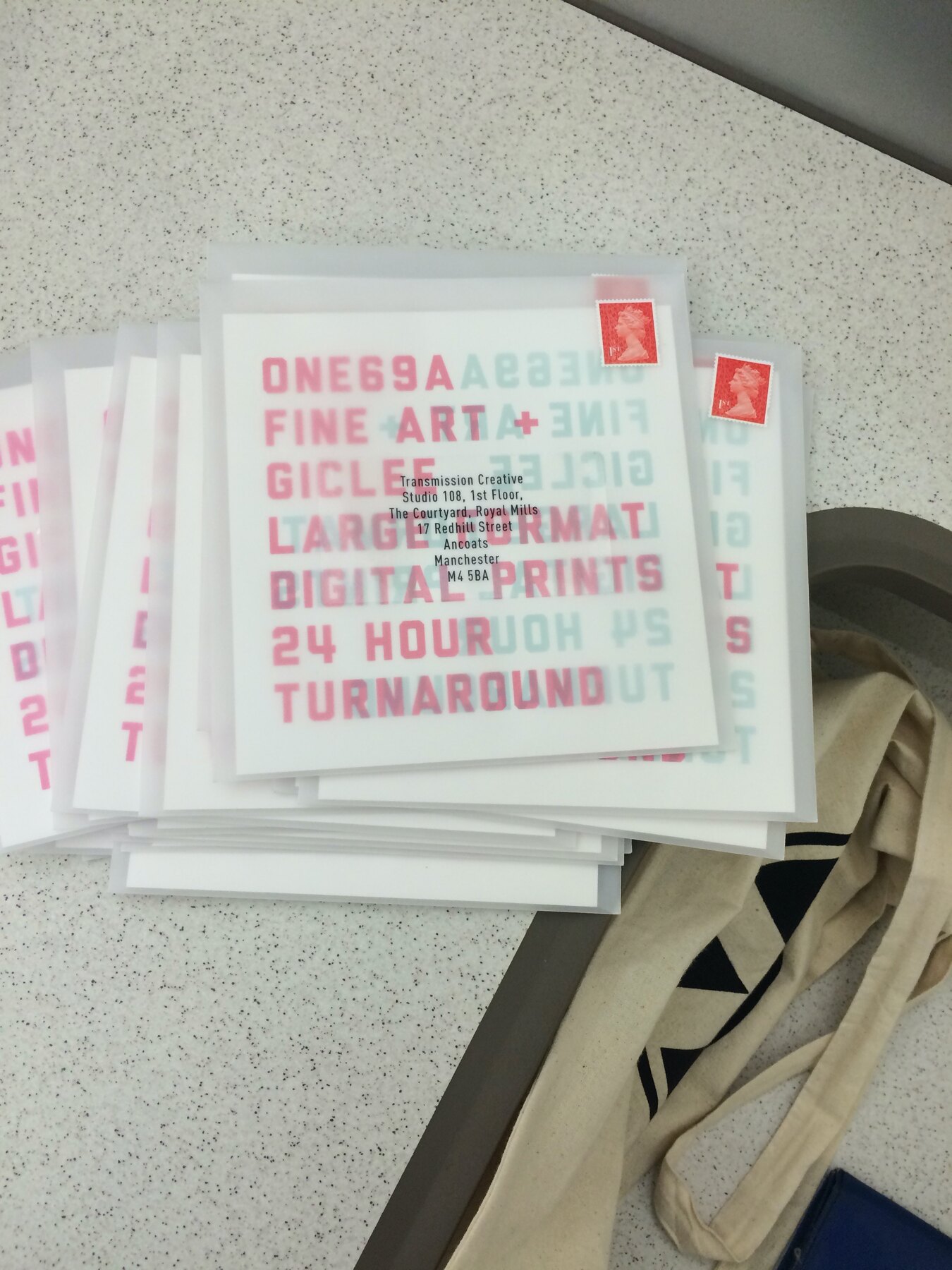
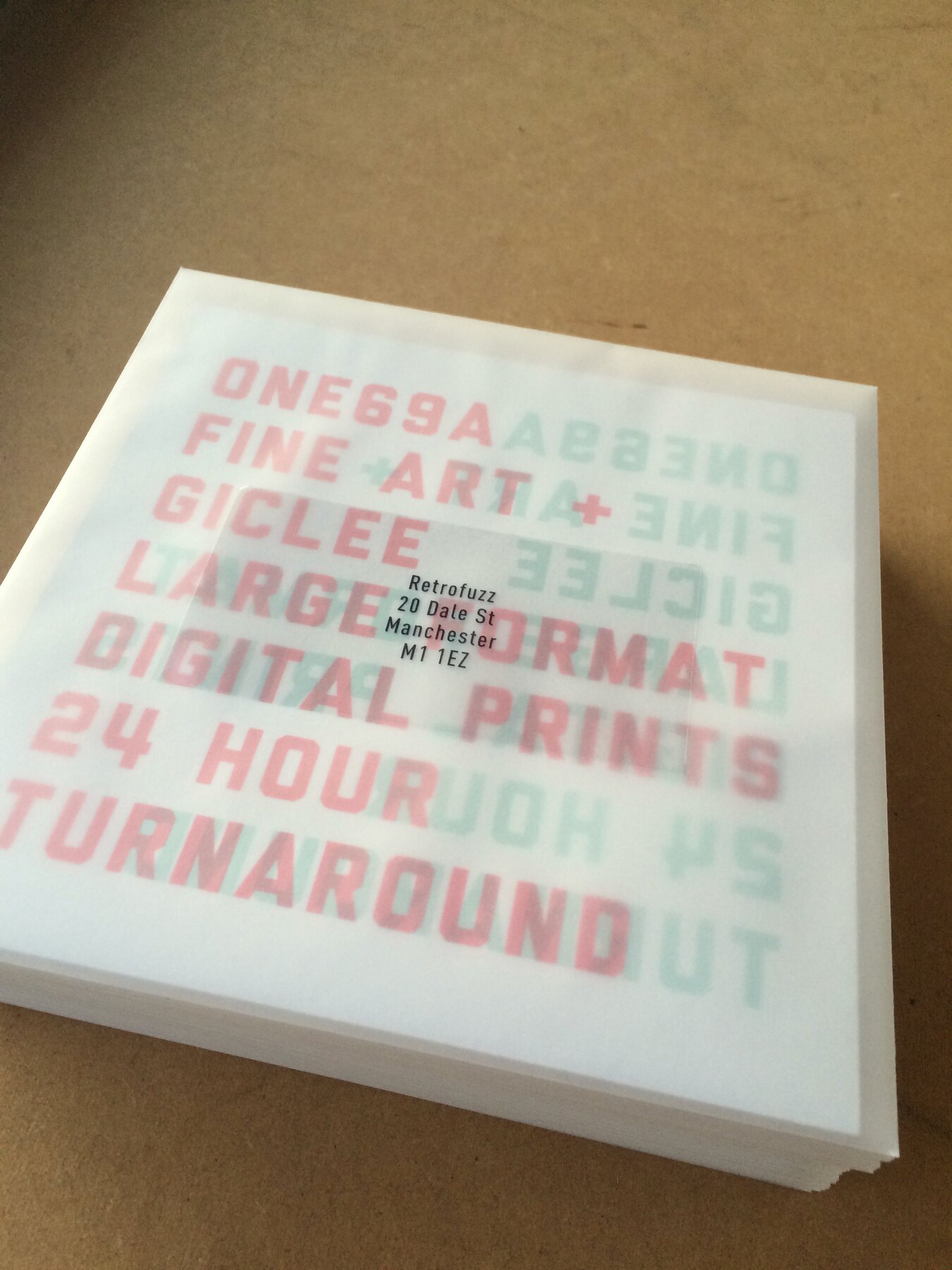
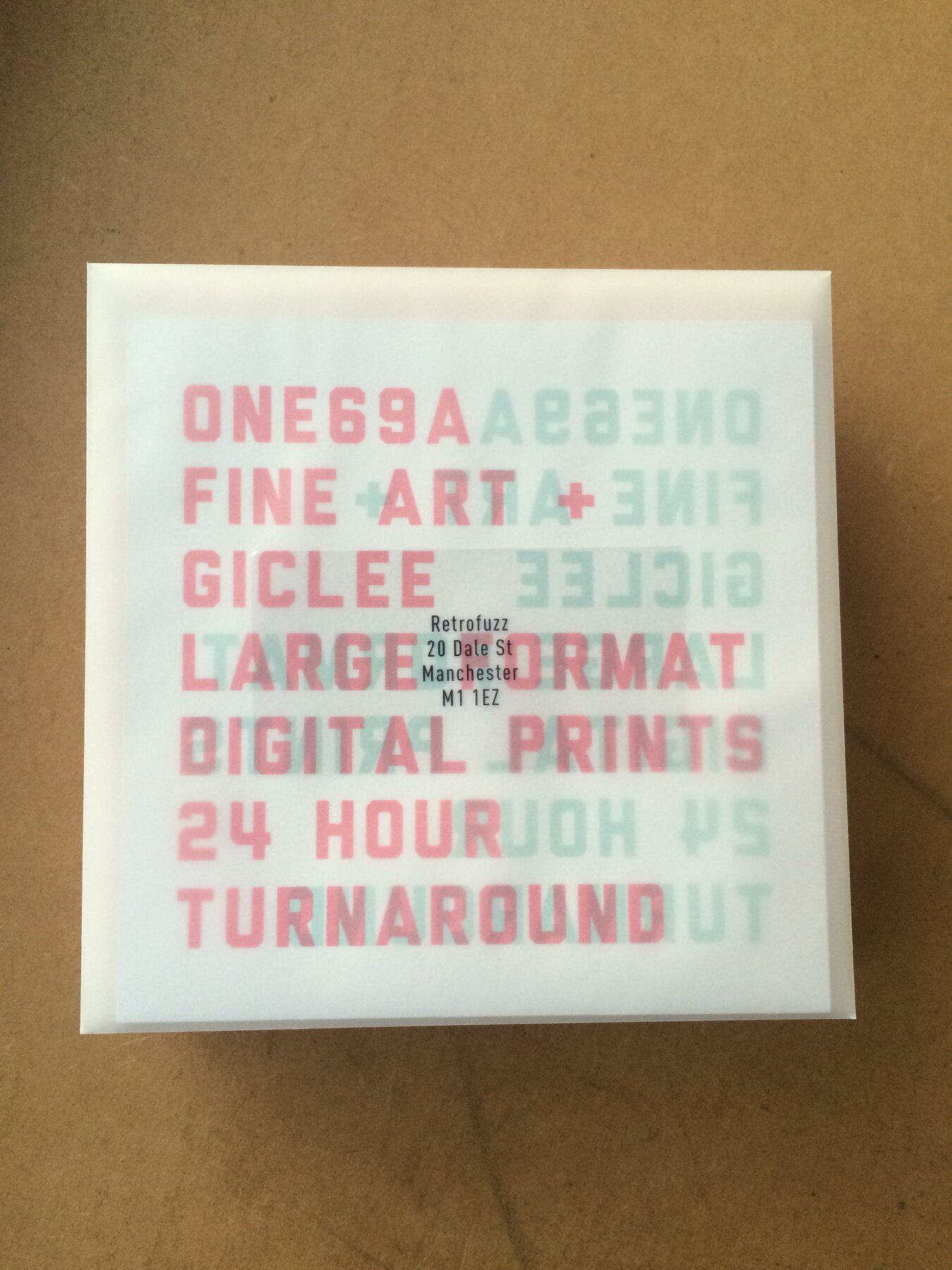
    one69A grew a second arm: two large-format giclée printers for high-end art prints, quick turnaround, aimed at designers and artists. We printed samples and posted them out to studios around Manchester to show what the machines could do.

    Screen printing is slow and physical. Giclée is the opposite, quiet and exact. Running both meant we could take on almost any kind of print job that came through the door.

    The large-format side, Moderate Studio journal, 2015
    The large-format side, Moderate Studio journal, 2015

    Part of the one69A case study.

  • A plan for the year

    A plan for the year

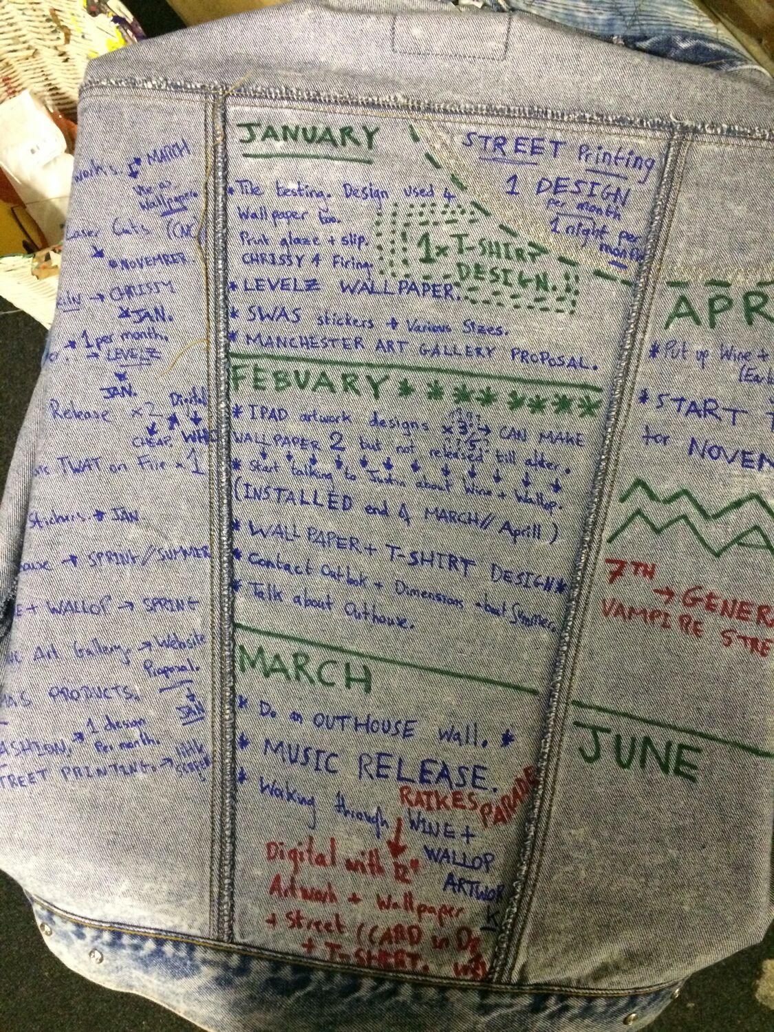
    The back of Vera’s denim jacket, where I wrote out my whole plan for the year. Month by month down the denim, January to June and on, every goal and deadline I meant to hit, written straight onto the jacket she gave me so I would have to look at it.

    She gave me the jacket before she died, and turning it into a to-do list for 2015 was a way of taking her along. A hard year to start, planned out on the back of a coat that had been hers, so that getting through it and doing the work were the same thing.

    Part of the Remembering Vera case study.

  • New Year at the Mill

    New Year at the Mill

    A New Year’s Eve warehouse party at Islington Mill, with The Bug and Flowdan on a Void sound system, and the poster I made for it. Black and white line-drawn speaker stacks and heavy type, the sort of flyer that tells you how loud it is going to be before you have read a word.

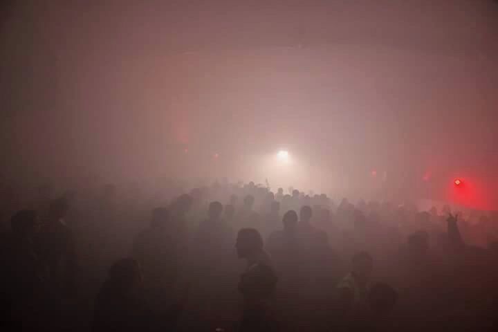
    Then the other side of it: the room full of smoke and red light with the crowd in it, and the morning after, a small drift of party wreckage left in the corner of an empty white room. A good night, reduced to a poster and a pile of rubbish.

    New Year at the Mill, Moderate Studio journal, 2014
    New Year at the Mill, Moderate Studio journal, 2014

    Part of the Islington Mill case study.

  • In her memory

    In her memory

    Vera’s denim jacket, the one her best friend passed on to me, photographed next to two things I made after she died: a figure of Jesus I drew and screen-printed, and a wallpaper I designed and hand-printed in her memory. The jacket covered in patches and paint, the prints bright beside it.

    Making things was the only response I had. A screen print, a length of wallpaper, a jacket kept and photographed, all of it a way of keeping busy and keeping her close at the same time. Grief and print work, done in the same few weeks, in the same room.

    In her memory, Moderate Studio journal, 2014

    Part of the Remembering Vera case study.

  • A piece of street art

    A piece of street art

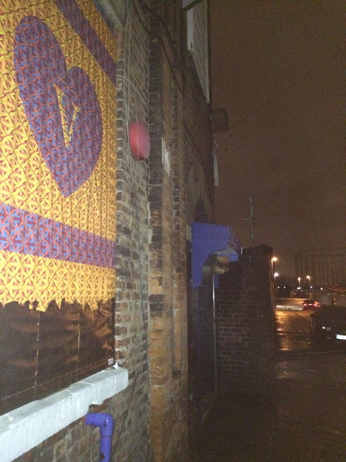
    A piece of street art I made for Vera, put up at a street art jam at Wellington Mill studios. I made it from the wallpaper left over from my 3 Wise Monkeys install, offcuts of a hand-printed design given a second life as a marker for her, pasted up on a wall in the dark.

    It felt like the right way to mark it. Not a plaque or a bench, but a printed thing put up out in the weather, the sort of quiet, temporary marker that suits a person more than stone does. Made at a jam with other people painting around me, and left to last as long as it lasted.

    Part of the Remembering Vera case study.

  • Vera

    Vera

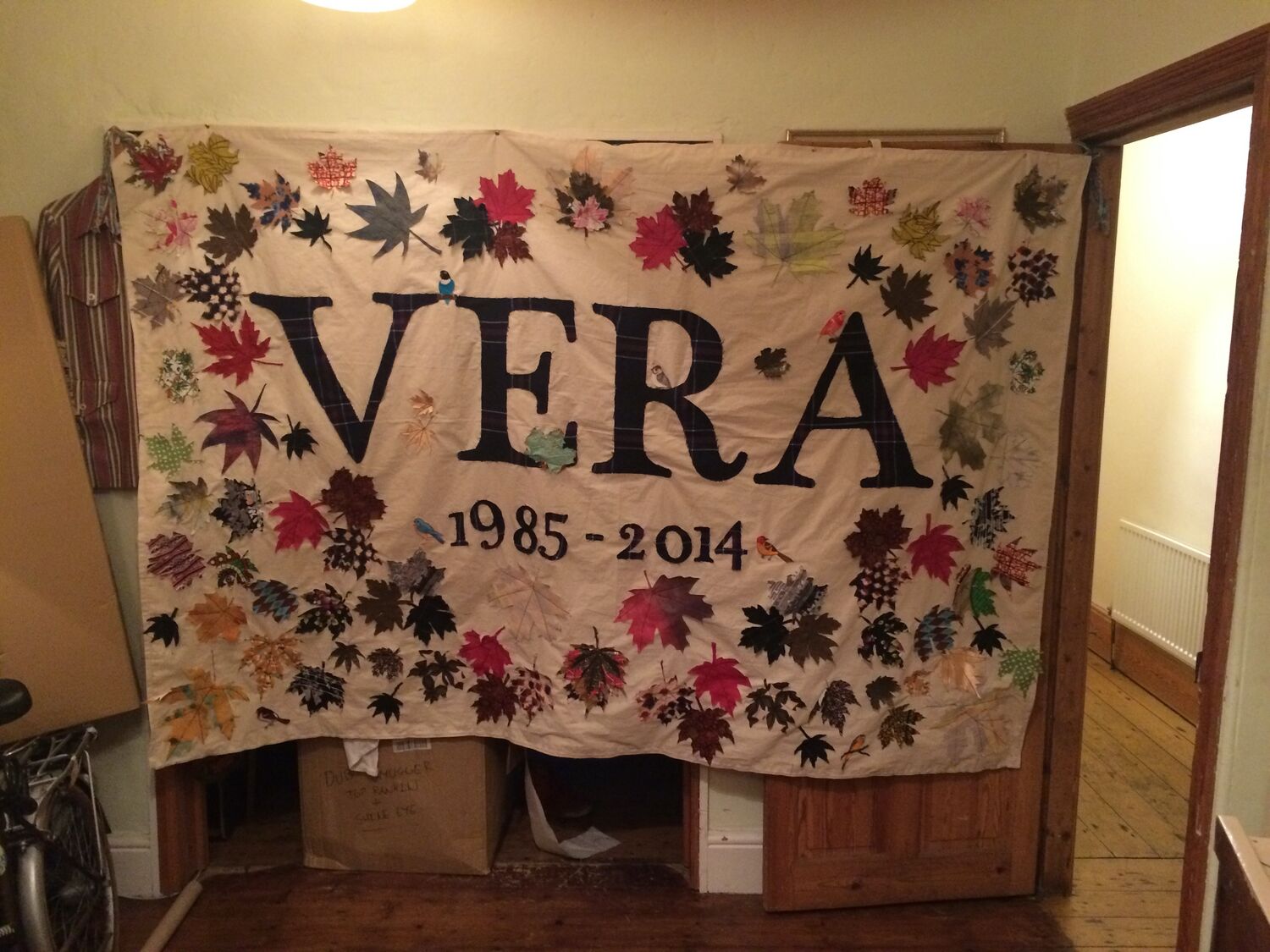
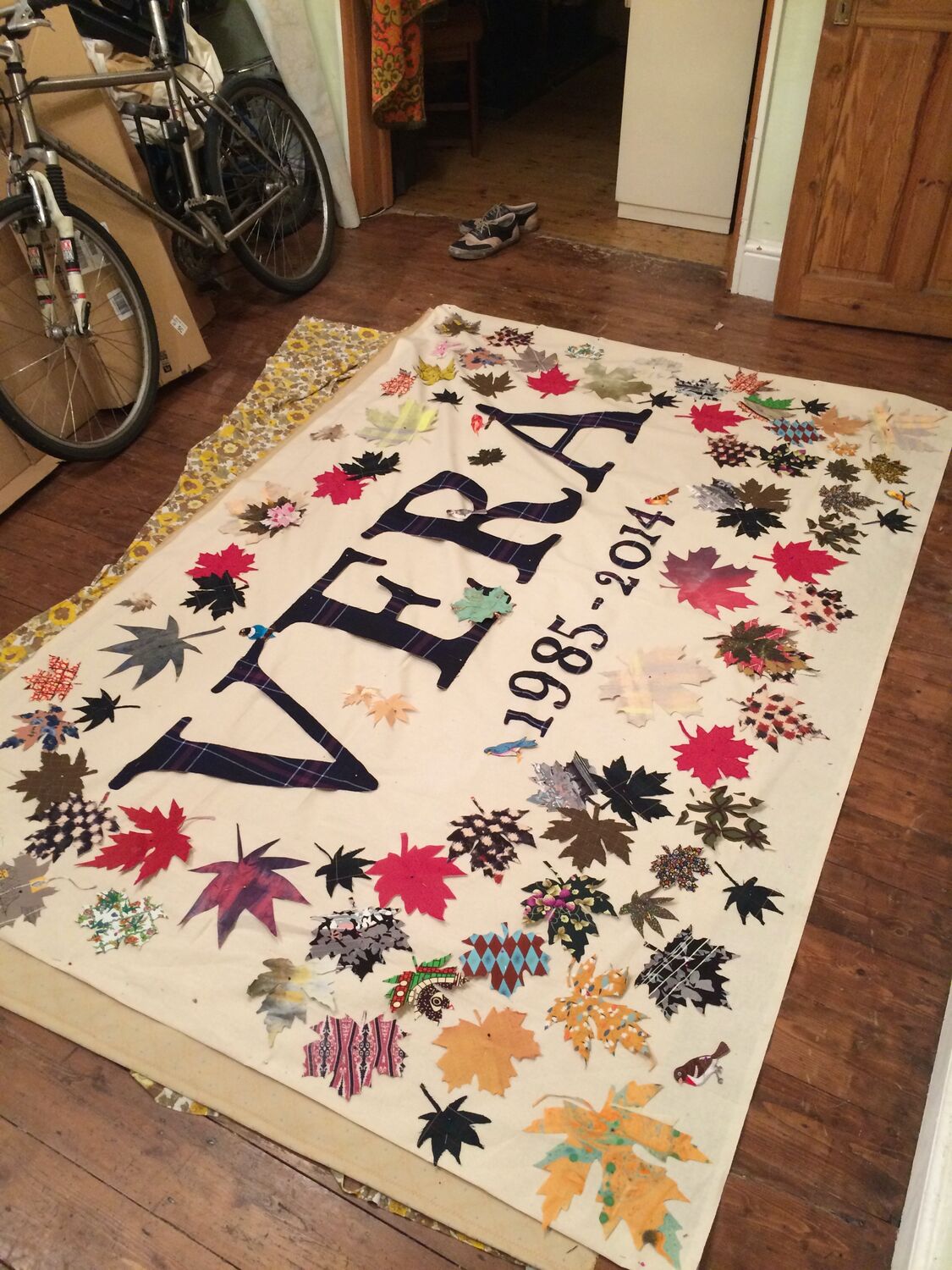
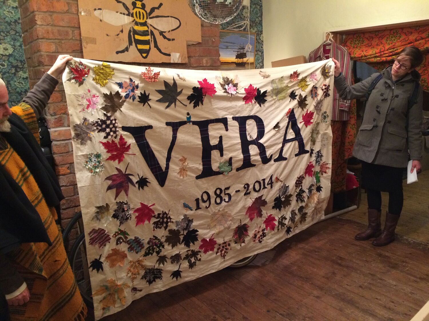
    My friend Vera died in 2014, in a vehicle accident, at twenty-nine. This is the banner I made for her: VERA, 1985 to 2014, in big serif letters on a cream ground, ringed with fabric leaves.

    She loved kicking through fallen leaves, so I asked the people who knew her to send me a leaf each, cut from fabric, and I sewed them all into a border around her name. Reds and browns and golds, dozens of them, one from everyone who wanted to be in it. Here it is laid out on the studio floor, and held up between two people so you can see the whole thing. A soft, autumn-coloured thing to carry a hard year.

    Vera, Moderate Studio journal, 2014
    Vera, Moderate Studio journal, 2014

    Part of the Remembering Vera case study.

  • The second release

    The second release

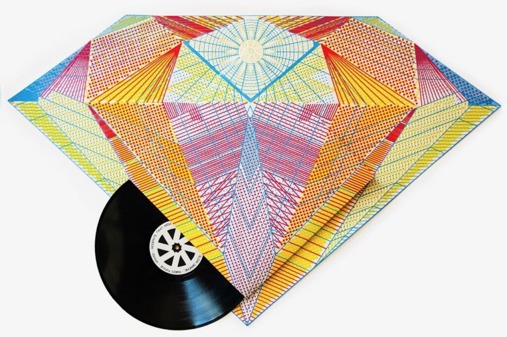
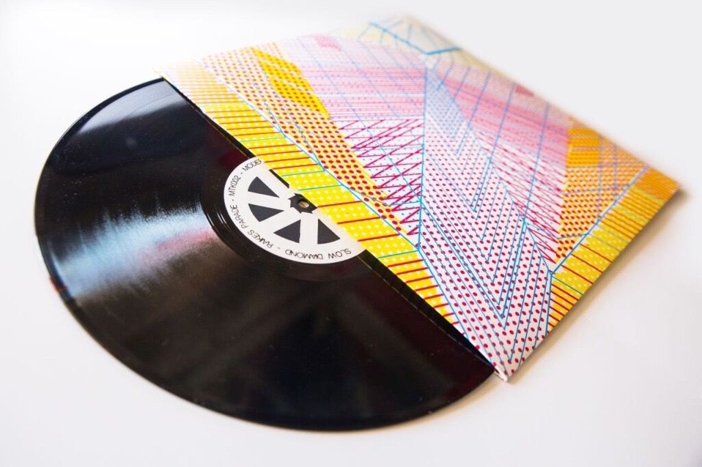
    The second MTK release, a concept record by Raikes Parade, out on vinyl in a sleeve I designed. A kaleidoscope of geometric rays in pink, yellow and blue folded around a plain black twelve-inch, the pattern doing the job a picture disc might, all on the outside.

    A small label putting out a handful of records is mostly an excuse to make the artwork, and this was the one where the sleeve mattered as much as the music. A record you would keep out on the shelf face-forward, for the cover as much as the sound.

    The second release, Moderate Studio journal, 2014
  • Martin Creed at the Mill

    Martin Creed at the Mill

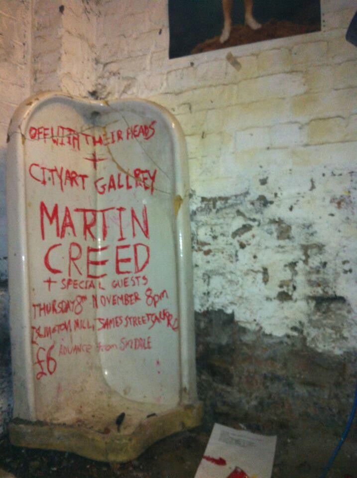
    A poster I designed and printed for Martin Creed and his band at Islington Mill, for a night put on by Off With Their Heads and the City Art Gallery. Magenta screen-printed type over a halftone photo, the sort of thing that looks better for being printed by hand and slightly off-register.

    Creed is a Turner Prize artist who also makes music, so it was a good fit for a night that treated a gig poster as a print in its own right. One of the bigger names to come through a small room in a mill in Salford.

    Martin Creed at the Mill, Moderate Studio journal, 2014

    Part of the Islington Mill case study.